How To Make A Bar Graph In Excel
There are a range of graphs and charts you can choose from in Excel, for example, Line charts, Pie charts, and Scatter charts. They help you visualize and present your data, whether you are a professional or an amateur. If you like to learn more about different charts and graphs available in Excel, make sure you visit our Blog titled “A Basic Guide To Charts And Graphs In Excel”.
In the present blog, we are focusing on what a bar chart is and how it’s created.
What is a Bar Graph?
A Bar Chart, also known as a Bar Graph, is a graphical representation of your data in forms similar to pillars. A Bar Chart is the horizontal version of a Column Chart. This means that Column Charts are Vertical. So, the major distinction is based on its orientation.
Types of Bar Graphs in Excel
Let’s go over different types of Bar Graphs.
Bar chart: the distinctive feature of a Bar chart is that it has horizontal bars. There are 3 main types of bar charts that can be presented in both 2-Dimensional and 3-Dimensional form.
- Clustered Bar
- Stacked Bar
- 100% Stacked Bar
Column chart: the distinctive feature of a Column chart is that it has vertical bars. There are 4 types of column charts that can be presented in both 2-Dimensional and 3-Dimensional except for the last one which is only 3-Dimensional.
- Clustered Column
- Stacked Column
- 100% Stacked Column
- 3-D Column
Now that you have an idea about the different types of bar graphs, the next part will unfold how it’s created in Excel.
How to Make a Bar Graph
In this section, we are going to show you how to create a bar chart step by step:
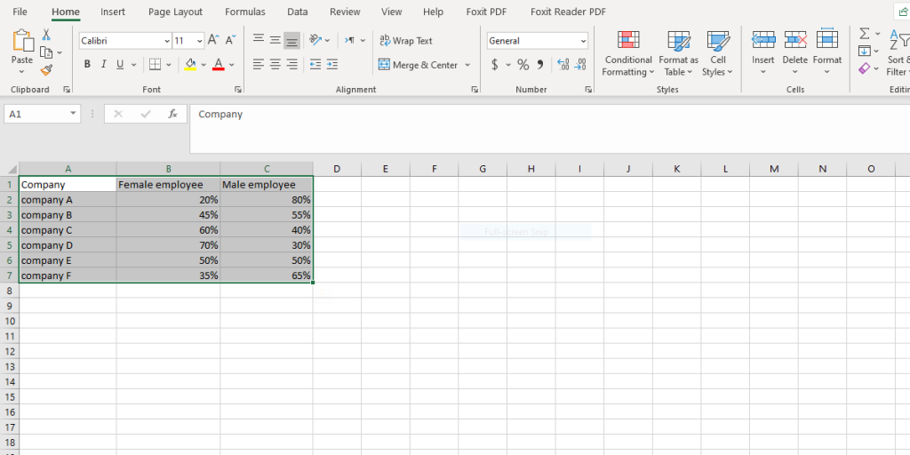
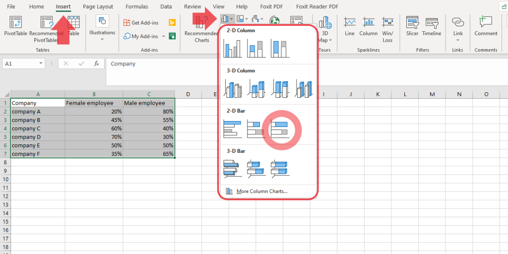
- Select the data that you want to make a bar chart for, in this case, 1A:7C.
- Go to the Insert tab in the Toolbar. Click on the Bar Chart icon and select the type of chart you want from the drop-down menu. We have selected the 100% Stacked Bar Chart based on our data.
Tip: As your mouse hovers over each chart in the Charts group, a preview is displayed.
- Now, the chart appears on your worksheet. The horizontal bars represent the percentage of male and female employees for each company. The percentage of female employees is shown in blue and the male percentage in orange. You can see that each percentage value contributes to a total of 100% for each horizontal bar.
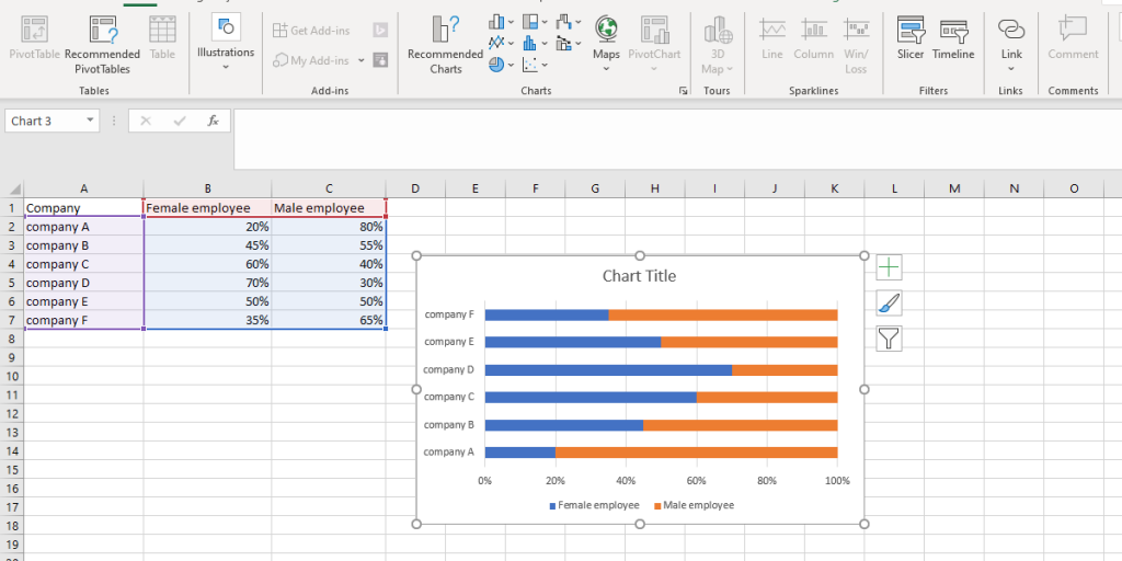
- Next, let’s add a title to the bar chart. To replace the title, click on “Chart Title” at the top of the graph and type the title of your choice. In this blog, we have entered “ Portion of male and female employees” as the bar chart title.
Finally, you have finished making a horizontal bar graph; great!
When to Use the Bar Graph?
When it comes to bar charts there are preferences based on the type of data you are dealing with. It would be better to choose Bar charts when the category text is too long. However, if your category text is too long and you also want to show duration, clustered Bar charts are the best option.
If your aim is to visually compare values across a few categories, you can use Column or Bar charts. To be more specific, you can use Clustered Charts (both 3-D and 2-D) to compare values across a few categories. You can use Stacked Charts (both 3-D and 2-D) to compare parts of a whole, compare parts of a whole across categories and show parts of a whole change over time. 100% Stacked Charts (both 3-D and 2-D) are used to compare the percentage that each value contributes to a total, and show how each value contributes to changes over time. Finally, you can use a 3-D Column Chart to show data in a third axis, which will show some columns in front of others.
It is also important to consider the following points when deciding on the chart you want to choose. Remember to pick a clustered column chart when the order of the categories is not important.
We are here to support you and your business by offering cost-effective Excel automation solutions, contact our Excel Automation Services. Feel free to reach our Excel consulting team and make an appointment.
Our experts will be glad to help you, If this article didn’t answer your questions. ASK NOW
We believe this content can enhance our services. Yet, it’s awaiting comprehensive review. Your suggestions for improvement are invaluable. Kindly report any issue or suggestion using the “Report an issue” button below. We value your input.