A Basic Guide To Charts And Graphs In Excel
When you have an Excel worksheet full of data and numbers, sometimes it’s hard to understand the meaning behind them. An Excel graph or chart is a helpful tool to visually represent the data on a worksheet. It can graphically show what’s happening in the report you’re presenting so they can easily make comparisons and conclusions. Here is the complete guide to using an Excel chart.
How to create Excel graphs
Creating an Excel graph is straightforward and simple. First of all, you need to select the cells that contain the data you would like to use. Make sure to include the names of columns or rows so the graph will be more practical and informative.
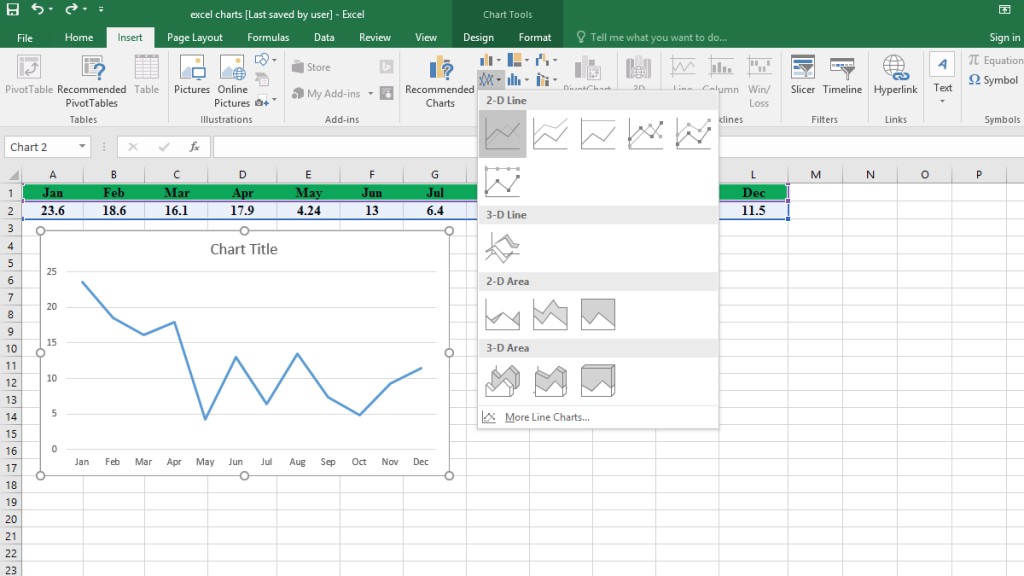
Then go to the Insert menu and choose from the Charts section.
Excel Chart Types
There is a range of charts you can choose from. You can pick different types of graphs and charts and show the same result using a different graphic. Each chart is explained as follows:
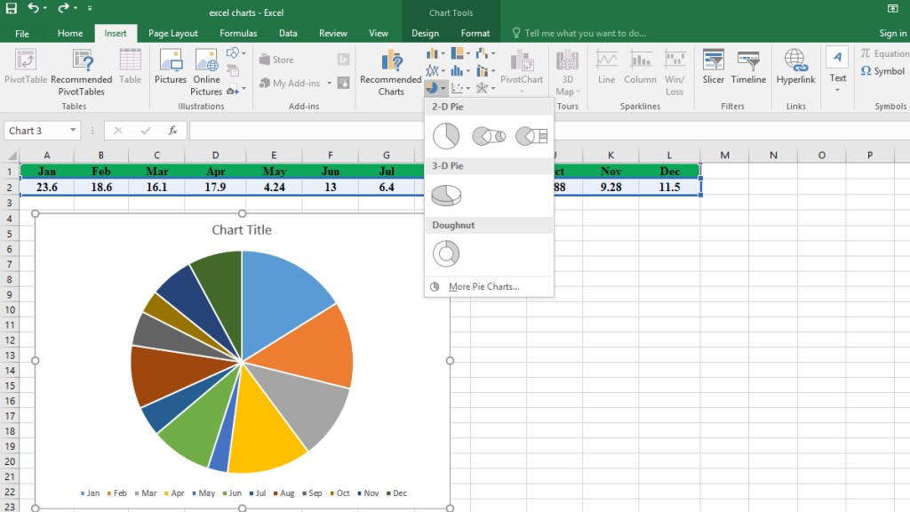
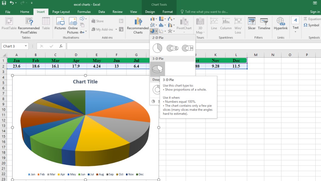
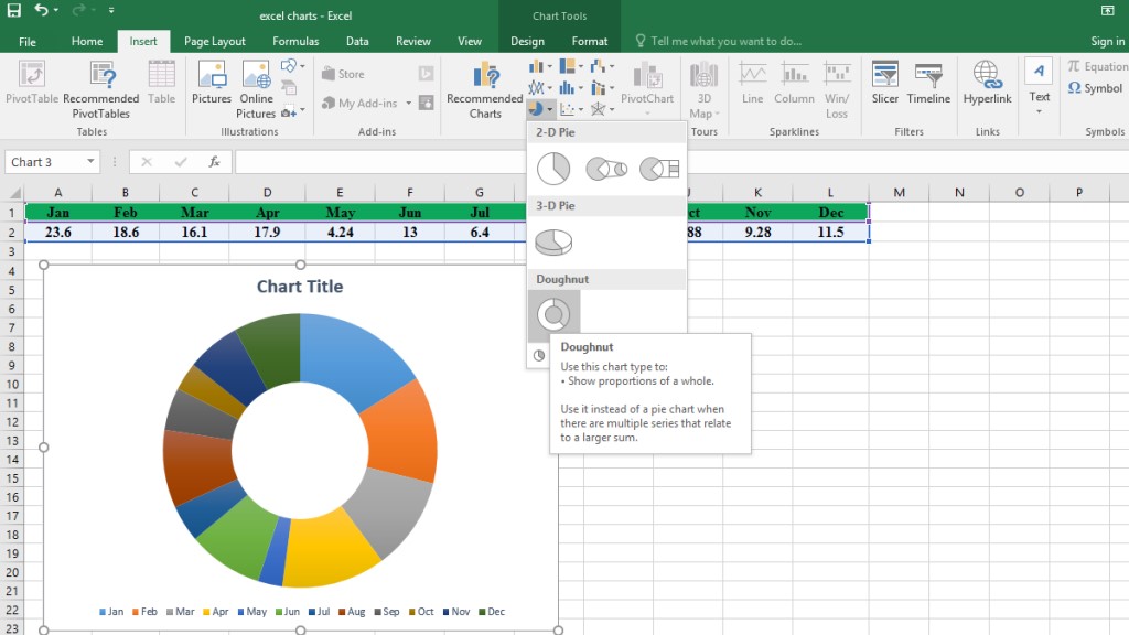
Pie Charts and Graphs in Excel
A Pie Chart in excel is a circular chart that is divided into portions to show different numbers. The higher the number, the bigger the slice. That’s how this type of graph helps you understand the statistics in a graphical type.
Pie Charts have different graphics that makes it possible for the user to choose the preferred type from 2-D Chart, 3-D Chart, and Doughnut Chart, which are the most common types of Pie Chart.
Please note that Pie Charts are useful when you have only one set of data. Otherwise, it is not possible to do a comparison using this graph. Moreover, it works better with a small number of data points. It won’t be so helpful if a large number of data is used. Generally, it’s not recommended to use this type of Excel graph for more than 5 slices. The result might not be clear enough for the audience. So as a rule of thumb remember to keep it for representing up to 5 data.
For more advanced visualizations, such as dashboards with key performance indicators, learn how to draw gauge charts in Excel.
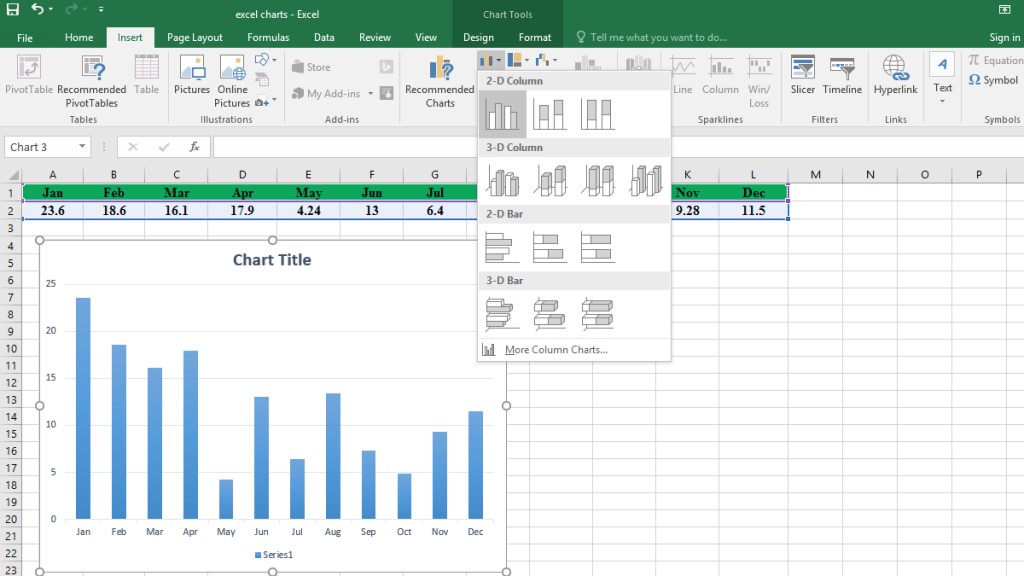
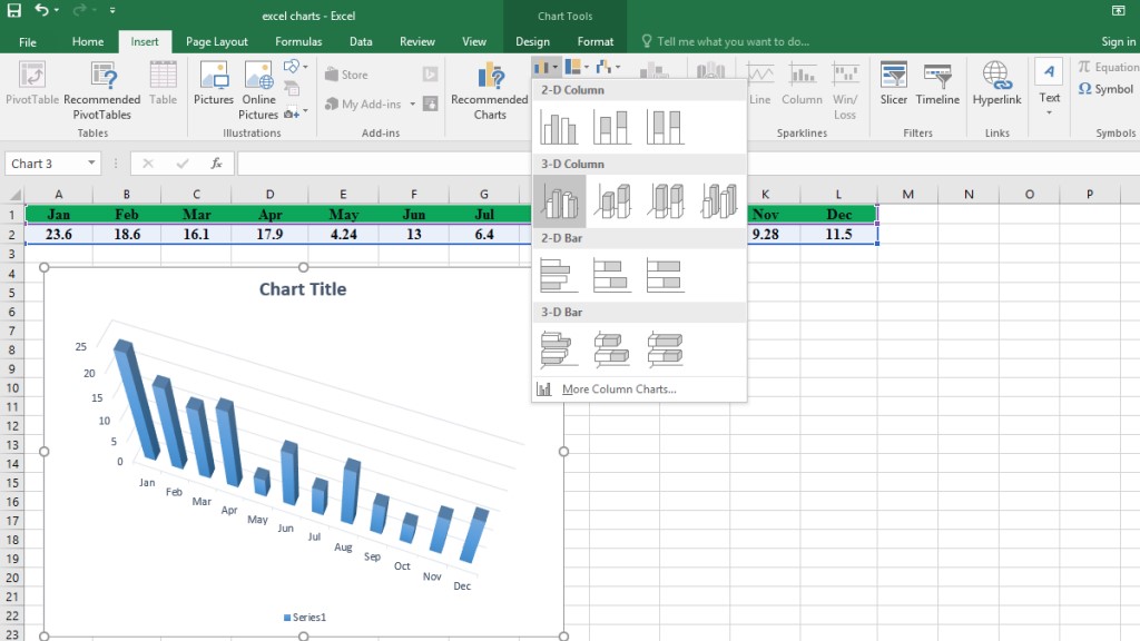
Bar Graph In Excel
Bar graphs and column graphs are fairly similar to each other. They both represent the values by the height of the rectangular. The more the value is, the higher or longer the bar will be. Their main difference is that a bar chart is horizontal, and a column chart is vertical. Both can be used to show comparisons between two or more data over a period of time.
For example, if you want to compare the sales of January with the sales of the same month last year, a bar graph can easily show you which time you had more sales. In other words, even if you miss the numbers and statistics, you can visually see the difference.
However, you should also know that it’s still not recommended to use this chart to show a large amount of data. The best result is for a maximum of 12 data sets.
Like the pie chart, bar charts also have different graphics including 2-D and 3-D. They all give you the same result but they are just visually different.
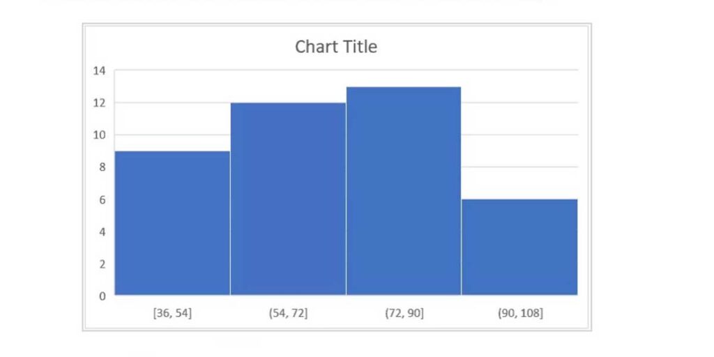
Histogram In Excel
A Histogram chart is used when we want to analyze the frequency of numerical data. This feature has been added to Excel from the 2016 version onwards. Therefore, it might not be available in the previous versions. To create a histogram, at least data of one column is needed.
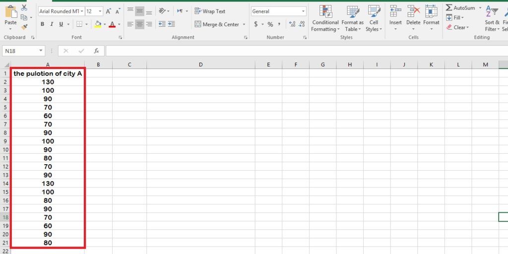
- Therefore, select the numerical dataset that you want to analyze and create a chart.
- In the next step, go to the Insert menu, Chart Section, and click on Insert Statistic Chart.
- Select Histogram from the drop-down menu.
It’s possible to customize the design of this graph. To learn more about what options you have, check out the blog about creating histograms in Excel.
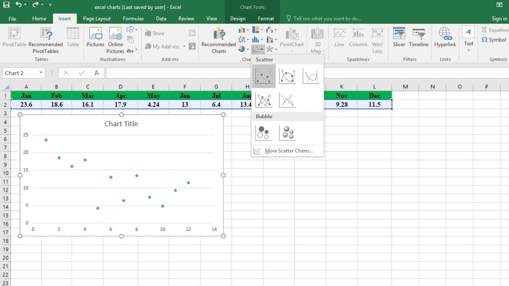
Scatter Plot In Excel
The Scatter Chart is an XY graph that is used to compare the relevance of two sets of data. For example, if you have two columns that have related numerical values, you can represent the relationship between two variables on the Xand Y-axis. Therefore, the scatter plot or scatter chart on Excel is used when you have two numerical sets that correlate together, for example, a person’s weight and height or relation between the price of a product and its sales. However, you also need to know that these types of charts aren’t appropriate for visualization of proportions. The main target here is showing the relevance among two values or a few data series.
If you want to learn more about the uses of this chart, read the blog about how to create scatter plots in Excel.
A Scatter Plot Chart can easily turn into a Line chart, which is one of the most useful charts for showing data changes over time; it’s continuous numeric data that is displayed by connected lines. The Scatter Plot Char can be created in a 2-D or 3-D version too. It’s also available in Standard, Stacked, and Percentage formats.
You can also make your chart more visually appealing by adding Data Markers. It is easy to add markers if your chart doesn’t include them yet. Follow these steps:
- Right-click on the line you want to add the marker.
- Select Format Data Series.
- Click on the Paint Cane icon, which is Fill & Line.
- There are two options under this menu: Line and Marker. You need to click on the Marker.
- Open the Marker Option and select Built-in. You can now edit the Type and Size of the Marker.
- It is also possible to change the color, border or anything that is related to the appearance of the chart.
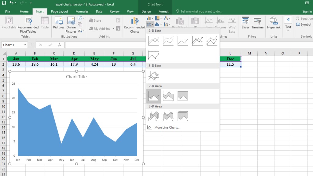
Area Charts in Excel
Area charts are another way to visualize data values (various data series) that change over time. In an Area chart, data is plotted on the x- and y-axis.
In other words, Area charts are essentially Line charts. The main difference between them is the filled area below the line (by color). This area makes the matter more precise and clear.
Principally, it’s used when the trend is required to be displayed with the magnitude instead of single data values.
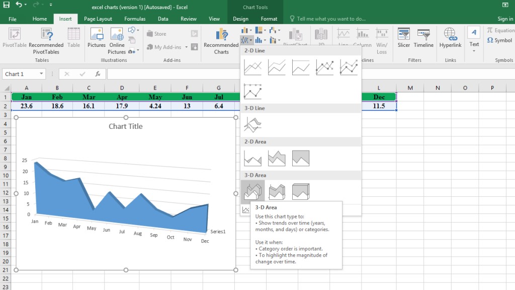
Area charts in Excel are grouped in Standard 2-D and 3-D types; stacked and percentage formats.
It’s beneficial when there are various time series, and we want to expose the relation of each set to the whole data.
A stacked area chart is the deployment of a standard area chart. The goal is to show the progress of the data of different series on the same graphic.
If some part of the chart was hidden by another part, the Percentage format (100% Stacked Area Chart) could be helpful.
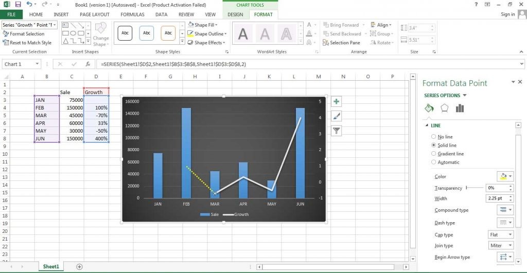
Secondary Axis In Excel
One of the other useful Excel graphs is the Secondary Axis. This graph shows the scale of two related columns with a combination of a bar chart and a line chart. As a result, it is possible to represent two different types of values without the need to use additional charts. Furthermore, this type of Excel graph also lets you compare data series that are measured in different units, for example, one column can have numeric data and the other may have percentages.
Please note that the secondary axis graph is more useful when the measurements of the two data series are different. If they are the same, you can easily compare them with a bar graph or a simple line graph. To learn more about how to use this graph, read about “How to Add Secondary Axis in Excel”.
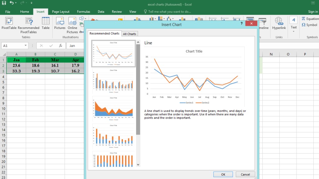
Recommended Chart
There is a really good option that tells you which chart is right for you. In fact, Excel provides a valuable option which suggests a chart based on your data set.
Excel analyzes the data and offers you a suitable chart. Having selected the data, you can click on the “Recommended Charts” tab which assembles a list of charts that Excel recommends you to use. A common question about the Recommended charts is “How many chart types does Excel offer?”. The answer is, it actually depends on the data series.
If you’re also looking to visualize team structures or reporting hierarchies, check out our step-by-step guide on Making Organization Chart with Excel & Visio.
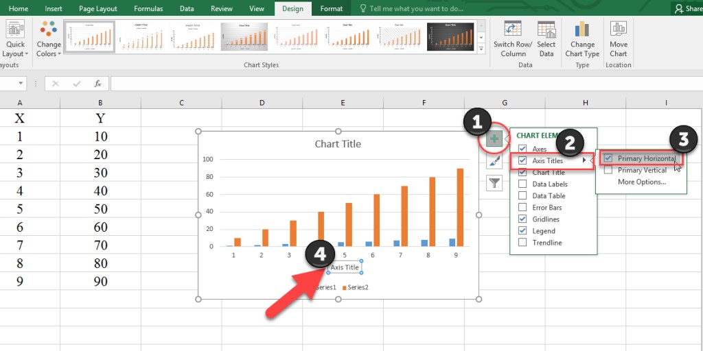
Axis Labels In Excel
It’s more readable for each chart we make in Excel to have more description. We can do that by adding axis labels for each chart. For example, we can explain on the chart that the X-axis is related to monthly sales, and Y-axis is the number of sales. Therefore, whenever anyone sees this chart, it’s easier to find out what it is showing.
Adding labels in Excel is very simple, read the different methods of adding labels in Excel.
Error Bars In Excel
Error bar is a line that shows the scale of a range or spread of data in the chart. Excel allows this bar to apply on a variety of Excel charts, such as bar charts, line charts or scatter points. There are three error bar types available on Excel: Standard error, Percentage, Standard Deviation. To learn more about how to use this bar on different Excel charts, check this blog about “How to Add Error Bars in Excel”.
Excel offers a variety of chart types including column, line, pie, bar, area, scatter, and more. If you’re looking to highlight how values increase or decrease across a sequence, you might find Waterfall Charts in Excel particularly useful.
Bottom Line
Excel charts are very useful to make a visualized report. These charts and graphs can help you represent the data easily and clearly. They can be designed to your preferred color or titles. As a result, learning them will make working with Excel become more fun and quick.
If you want a step-by-step tutorial focused on creating bar graphs specifically, check out our complete guide on how to make a bar graph in Excel.
Our experts will be glad to help you, If this article didn’t answer your questions. ASK NOW
We believe this content can enhance our services. Yet, it’s awaiting comprehensive review. Your suggestions for improvement are invaluable. Kindly report any issue or suggestion using the “Report an issue” button below. We value your input.