How To Make A Scatter Plot In Excel
One of the comparator charts in Excel is the Scatter chart.
What is the Scatter Chart?
The Scatter chart (XY graph or Scattering plot) is a 2D chart that compares the relevance of two sets of data. Both of the scatter axes contain numeric values.
When to Use the Scatter Plot?
In this tutorial, we learn how to create a scatter plot based on our data.
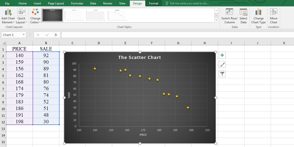
As we mentioned, the scatter plot shows the dispersion of numerical data sets and displays the correlation between them. So we have two sets of numbers in two columns.
Creating a Scatter chart
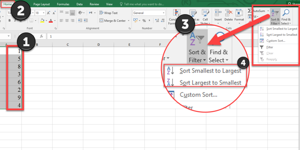
Before you create the scatter chart, you should arrange the numbers. To arrange the data in Excel, follow these steps:
- Select the data set.
- Go to the Home tab from the ribbon.
- Click on the Sort & Filter button from the Editing group.
- You have two options (better to select “sort smallest to largest”):
- Sort smallest to largest
- Sort largest to smallest
Now your data is sorted.
We have an example of the price of the tutorial package and price.
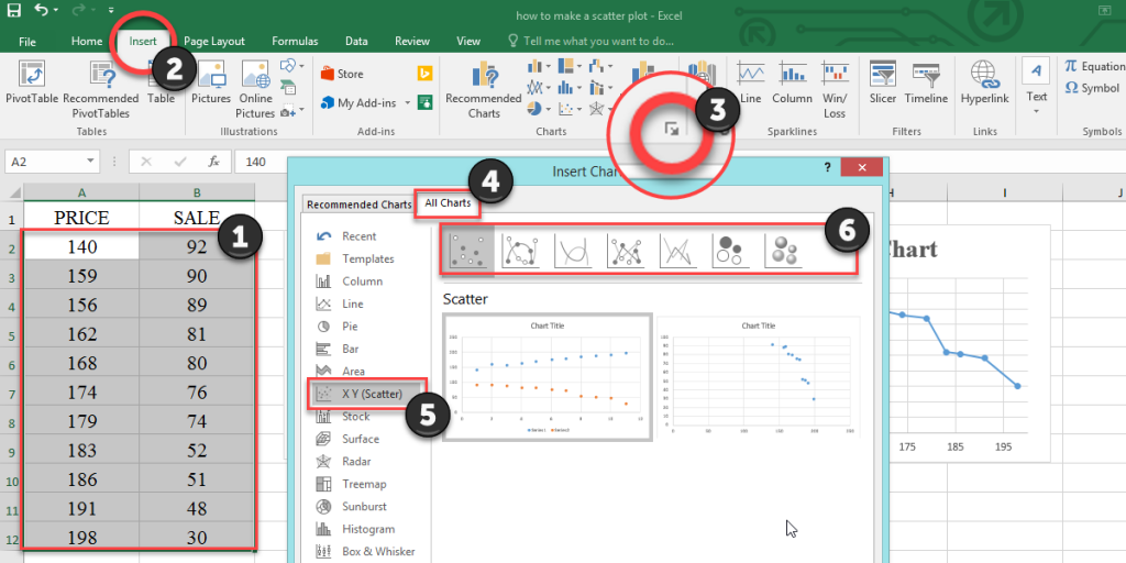
To create the scatter chart according to the example. Follow the steps below:
- Select the data.
- Go to the Insert tab from the menu bar.
- Select the scatter icon
 from the Charts group.
- There is no scatter icon! Click on the little arrow
 at the bottom of the chart group to see all charts.
 - When the Insert Chart dialogue box opens, go to the All Charts tab, select the X Y (scatter) and try the charts to find the right one.
- We chose the first chart
 for this example.
 for this example.
There are some things to keep in mind to make sure your chart works well:
- You should enter quantitative data.
- The data should be in two sets in two separate columns.
- The independent variables should be in the left column (because these variables will be plotted on the X-axis.)
- If you didn’t follow this, click on the chart area, go to the Design tab from the ribbon, click on the Switch Row/Column button
 .
.
 .
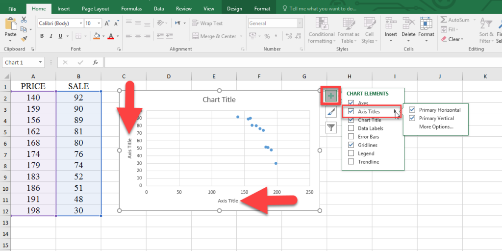
.Also, you can add axes titles, change the axes units, and other axes options.
To add axes titles, click on the chart area, click on the Chart Elements button ![]() next to the chart, check the Axis Titles checkbox, enter a title for your chart axes.
next to the chart, check the Axis Titles checkbox, enter a title for your chart axes.
To change the axis title, select it, enter = in the formula bar, select the cell related to the axes, and press Enter. By these steps, you link the axis title to the text.
To change the axes units, use the following steps (according to video1):
- Double click on the chart area to open the Format Chart Area pane.
- Click on the Chart Option.
- Select the Horizontal (Value) Axis option.
- Click on the Axis Options icon
 .
. - Select the Axis Options from the menu; you can change the bounds and units here.
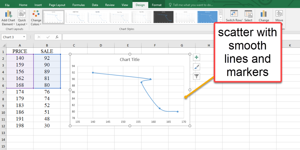
Other types of scatter chart:
- Scatter with smooth lines and markers.
- Scatter with smooth lines.
- Scatter with straight lines and markers.
- Scatter with straight lines
- Bubble
- 3-D Bubble
To see these charts follow these steps:
- Select your data.
- Go to the Insert tab.
- Click on the little arrow at the bottom of the chart group to see all charts.
- When the Insert Chart dialogue box opens, go to the All Charts tab, and select X Y (Scatter).
All scatter types have the same way to create, but their usage is different. The scatter charts with lines are better to use when you have few data points.
Scatter plots are great for visualizing data points, and to predict future trends, you can use extrapolation. Check out our guide on how to extrapolate in Excel for detailed steps.
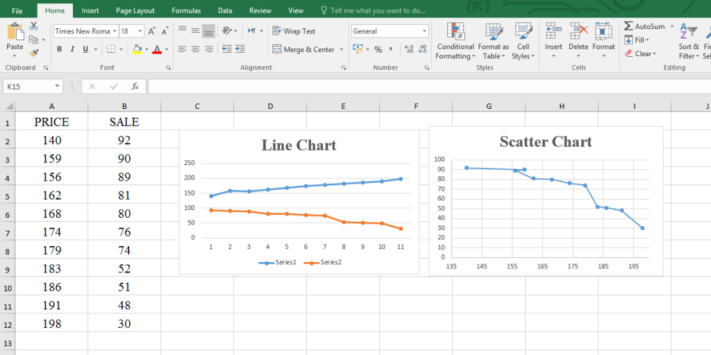
Line or Scatter?
The scatter chart looks similar to the line chart, but there is a difference between them. In a line chart, we compare data that could be text and add time scale, but scatter graphs represent data scatter, focal points, correlation coefficients, etc.
So the main point is, do not use these two interchangeably. According to picture 6, we plot the example (price and sale) as a line chart.
Scatter Plot and Correlation
The CORREL function in Excel calculates the correlation coefficient between two variables. According to the relation between variables, there are three types of correlation coefficient:
- Positive correlation: means two variables are directly related.
- Negative correlation: means two variables are indirectly related.
- No correlation: two variables have no relation.
Using the CORREL function for the scatter plot helps interpreting and analyzing data.
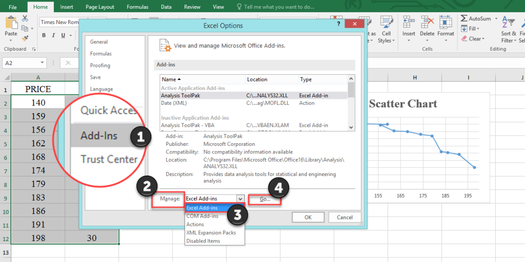
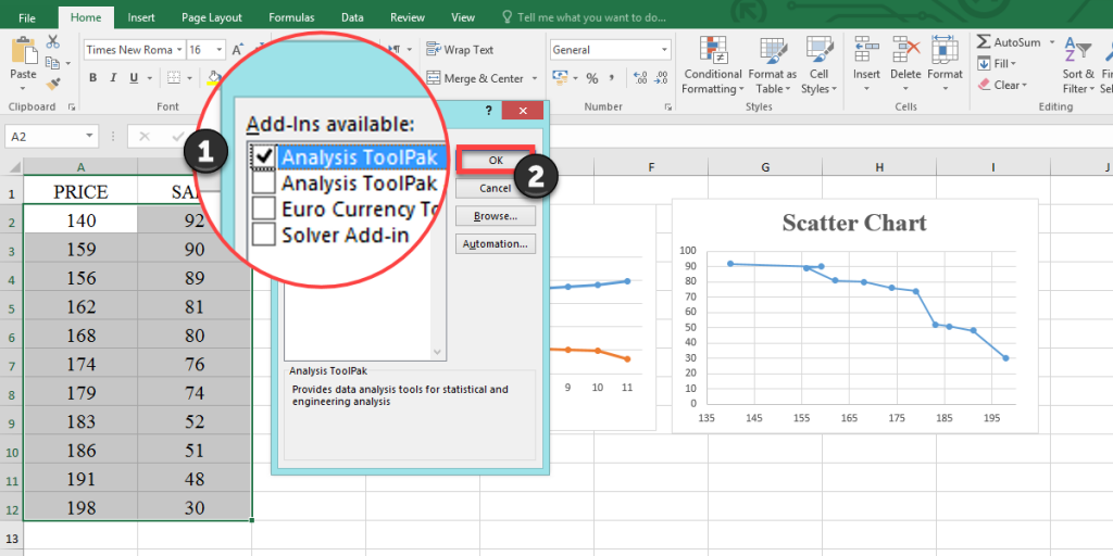
First, you need to enable the Data Analysis toolPak.
- Go to the File tab from the ribbon.
- Select the Options to open the Excel Options dialogue box.
- Go to the Add-Ins.
- Select the Excel Add-ins from the Manage menu, then click on the Go button.
- Check the Analysis ToolPak checkbox from the Add-Ins dialogue box.
- Press OK.
Now to use the CORREL function, follow these steps (according to video 1):
- Go to the Data tab.
- Select the Data Analysis tool
 .
. - Select the Correlation tool from the Data Analysis dialogue box.
- Press OK to open the Correlation dialogue box.
- Input your data to the Input Range.
- Turn on the Output Range and select an empty cell.
- Press OK.
Add a Trendline to Scatter Plot
You can display visual data trends by adding a trendline to your scatter chart.
- Click on the chart area.
- Select the Chart Elements button
 next to the chart.
 - Check the Trendline checkbox.
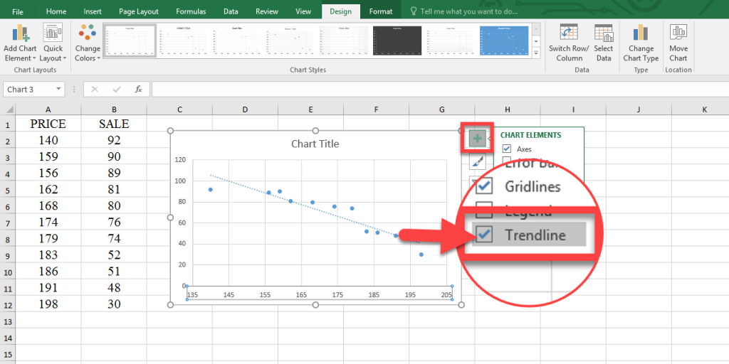
If you click on the little arrow next to the trendline checkbox ![]() , you can see trendline options by clicking on the “Trendline” or “more options” under the “Trendline.” such as:
, you can see trendline options by clicking on the “Trendline” or “more options” under the “Trendline.” such as:
- Display Equation on chart
- Display R-squared value on the chart
- Set intercept
You can connect with us and ask our experts for your inquiries and get more Excel Support Services.
Reduce costs, accelerate tasks, and improve quality with Excel Automation Services.
Our experts will be glad to help you, If this article didn’t answer your questions. ASK NOW
We believe this content can enhance our services. Yet, it’s awaiting comprehensive review. Your suggestions for improvement are invaluable. Kindly report any issue or suggestion using the “Report an issue” button below. We value your input.