How to Make Pie Charts and Graphs in Excel
Microsoft Excel contains a variety of charts and graphs for data visualization. One of these graphs is the pie chart, which can show a lot of information in a small amount of space. In this blog, we are going to discuss pie charts and their features.
What is a Pie Chart?
A pie chart is a useful tool for displaying different values as a proportion of a whole. It is a circle which is divided into slices that represent a percentage of the total. You can add numbers as percentages or their actual values. There are three types of pie charts: 2-D, 3-D, and doughnut charts.
When to Use a Pie Chart?
Using a pie chart has many advantages, such as:
It can show a lot of information in one look; it allows the viewer to analyze the data at a glance; it doesn’t need much additional explanation, etc.
Like any other kind of graph, the pie chart has its disadvantages as well:
For a large number of data points, the pie chart gets complicated and hard to read. In this case, a bar chart could be better; since pie charts cannot show trends within the data.
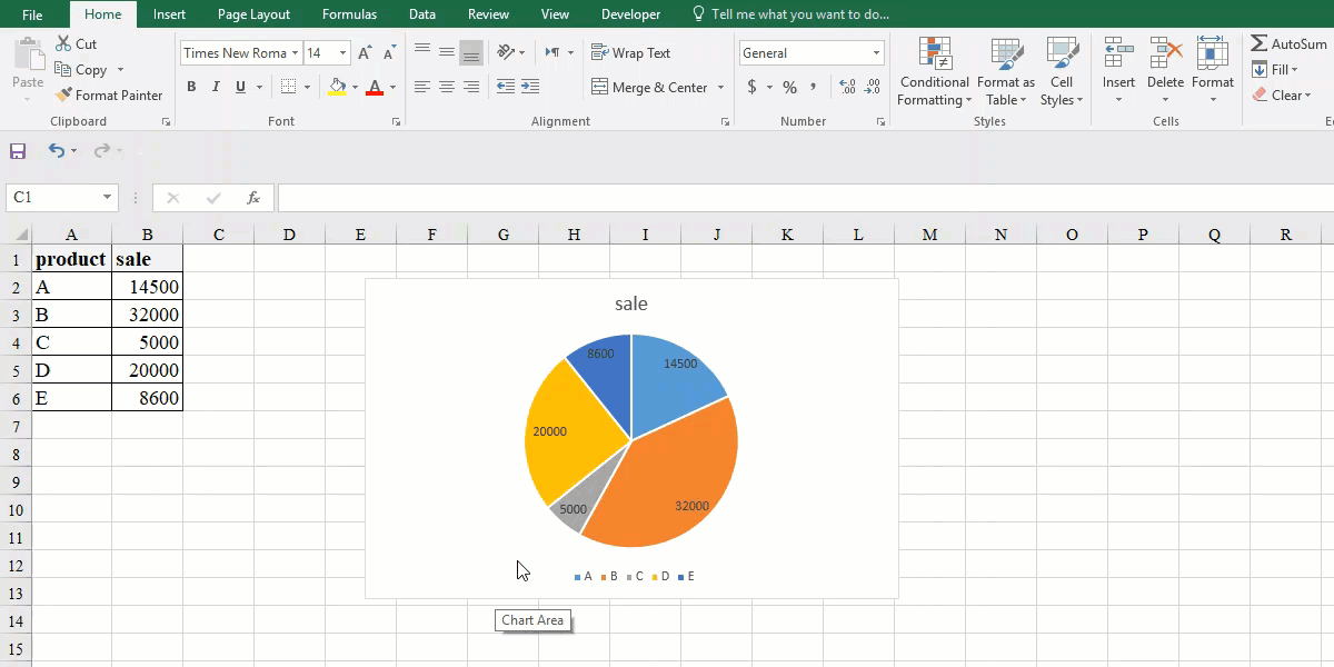
How to Make Pie Chart
To make a pie chart, follow these steps:
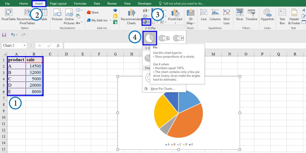
- Select the range of the data you want to visualize.
- Click on the Insert tab from the ribbon.
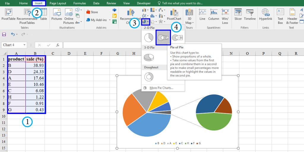
- From the chart group, click on Insert Pie or Doughnut Chart.
Choose “Pie” from 2-D Pie icons.
Note: The pie chart does not display the data points with zero value. Also, when you enter the negative values, it shows their absolute value in the chart.
Formatting Pie Chart
Excel makes graphs with the default formatting. You can customize the pie chart you have created as you like. Let’s see some of your options.
Formatting data Labels
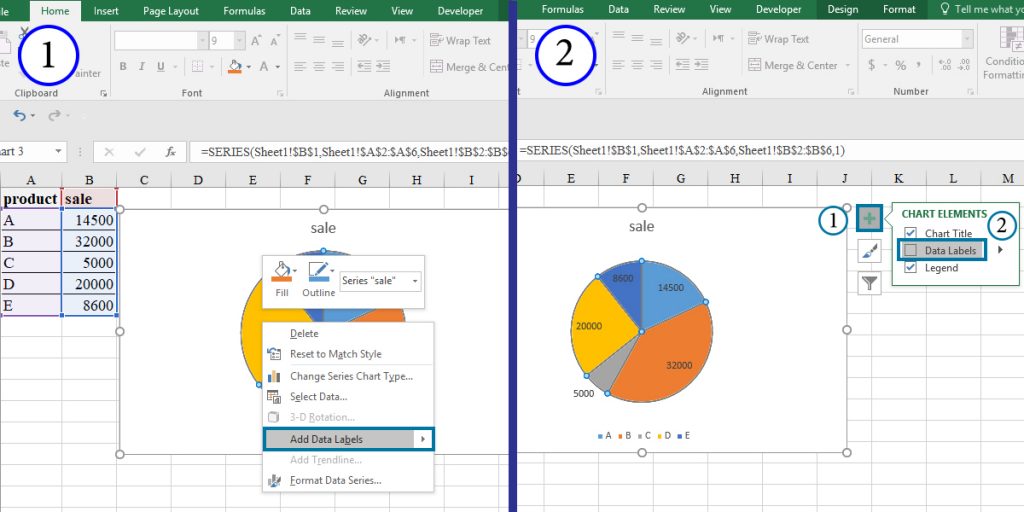
There are three easy ways to add data labels to the pie charts.
- The first method is the easiest. To add data labels using this technique, you should just right click on the chart and select the “Add Data Labels” option.
- The second method is shown below:
- Click on the chart.
- Click on the
 button on the top right of the chart and check the Data Labels checkbox.
- The Design tab is a quick tool for customizing data visualization. To use this method, follow these steps:
- Click on the chart and go to the Design tab.
- Click on Add Chart Elements.
- From the drop-down menu, click on Data Labels.
- From the resulting menu, you can choose how you would like the data labels to be shown.
Note: You can add data “Data Callout” which is a box containing the name of the data points and their value or percentage from this menu.
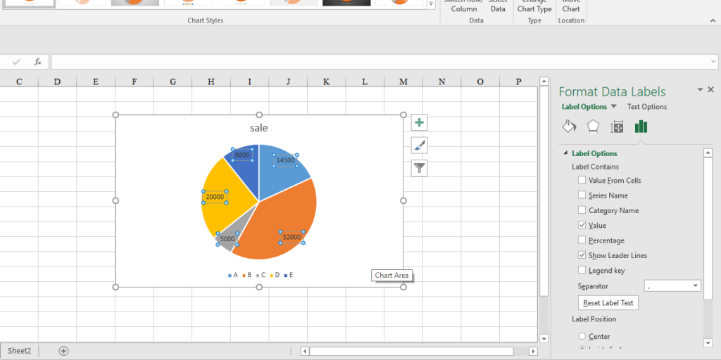
To format the Data Labels, double click on one of the labels on your chart. From the Format Data Label pane on the right side, you can make changes to the labels.
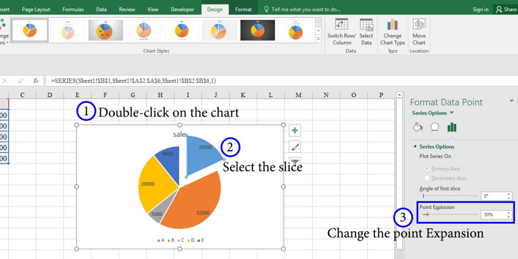
Highlight One Slice in the Pie Chart
Sometimes when visualizing data by pie charts, you intend to highlight one particular slice because of its importance. You can do this by giving it a different color or separating it from other slices.
To separate a slice in a pie chart, you can simply grab and drag it.
The other method is as below:
- Double click on the chart to see the Format Data Series pane.
- Click on the slice you want to separate.
Under the “Series Options” tab, change the Point Explosion value as you wish.
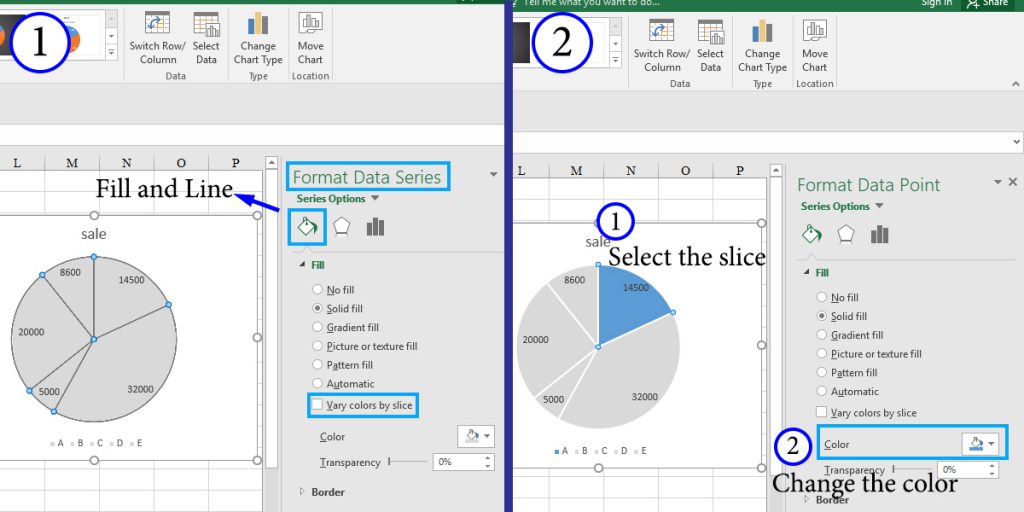
To highlight a slice by changing its color, you should first make all of the slices look alike, then change the specific slice’s color. To do so, follow these steps:
- Go to the “Fill and Line” setting from the Format Data Series pane.
- Uncheck the “Vary colors by slice” option under the “Fill” tab to make all of the slices the same color. You can set your desired color.
- Select the slice you want to highlight and set a different color for it.
Pie of Pie and Bar of Pie
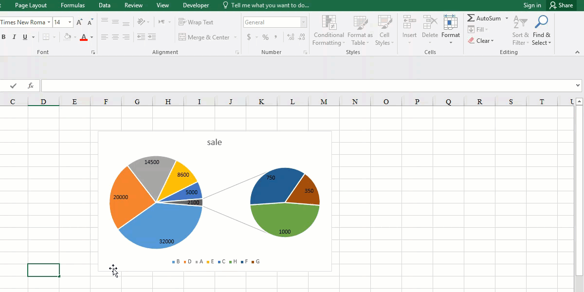
When you have several data points, The data points with lower percentages may not be quite clear, making it difficult to analyze the data. In this case, we can use a ‘pie of pie’ chart which emphasizes the smaller slices in a secondary chart.
How to make Pie of Pie
Suppose we have the following dataset, and we want to make a pie of pie chart.
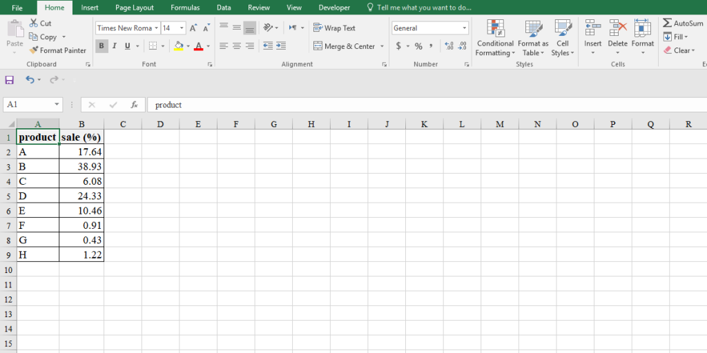
It’s important to note that, by default, Excel picks the last three points to separate from the main pie chart. So if they are not the lowest percentages, we have to sort the data first. After that, follow the procedure to create the pie chart, except in the last step, instead of the “pie” option, choose “pie of pie.”
As mentioned above, Excel takes the last three data points to separate from the main chart. You can set how you want to separate them.
To do so, double click on the pie chart to open the “Format Data Point” pane. Under the “Series Option” tab, click on the “Split Series By” box to open a drop-down menu.
Here, you can choose the criteria to split the slices. You will have the following options:
- “Position” is the default option. You can change the number of slices to split in the “Values in second pie” box.
- By choosing “Value,” you can separate the slices with a value less than a specified one.
Choose “Percentage value” to set a percentage to split the slices below it.
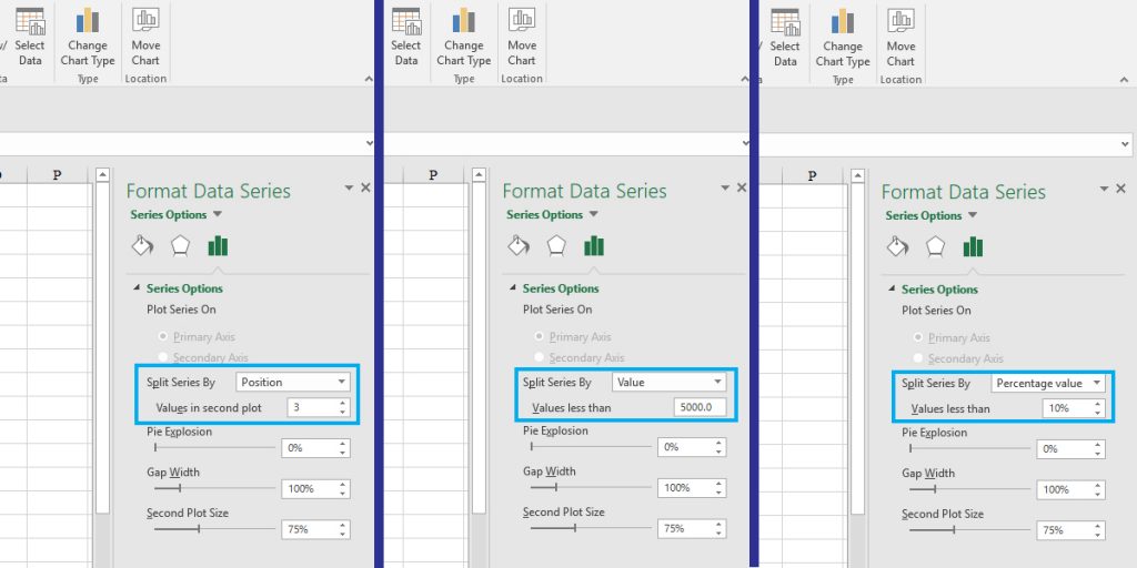
- If you want to change the position of the slices manually, select the “Custom” option. To move a slice from each pie to the other, click on it, then change its position from the “Point Belongs to” box.
As discussed in this tutorial, pie charts are a useful tool for visualizing data in Excel. But you should consider some parameters such as the number of data points.
You can connect with us and ask our experts for more inquiries and get further Excel Support Services.
Looking for visualizing your Excel reports? Please contact us through the Excel data analysis and visualization services page.
Our experts will be glad to help you, If this article didn’t answer your questions. ASK NOW
We believe this content can enhance our services. Yet, it’s awaiting comprehensive review. Your suggestions for improvement are invaluable. Kindly report any issue or suggestion using the “Report an issue” button below. We value your input.