How To Add Secondary Axis In Excel
There are different types of charts available on Excel which can help the user make different useful reports. Sometimes you will need to combine two types of Excel charts together to make a better report. That’s when you need to know how to add secondary axis in Excel.
When is a secondary axis required?
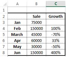
To explain more specifically, assume you have two different data column series, one is about monthly sales and the other is the percentage of growth you had in each month. Therefore, you have something like the following table:
To make a chart for this table, you will select the table and choose a “Chart” from the “Insert” menu. Normally, the “Clustered Column” is the default chart on Excel. However, in the most recent versions of Excel, it is possible to choose the “recommended chart” which might have the secondary axis as a default. But right now, we assume we have a simple clustered column chart. Which is like this:
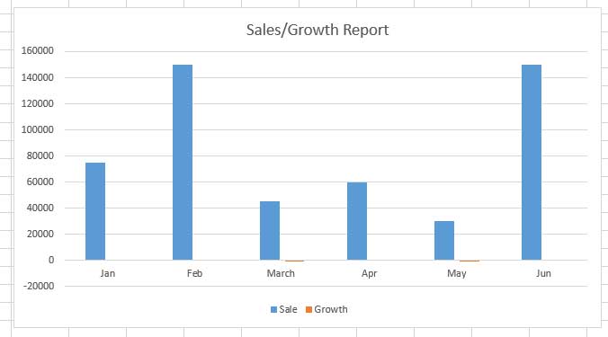
But that’s not the type of report you should have on such data. A horizontal linear chart is needed to show the percentage of growth each month. That’s when you need to add a secondary axis in Excel. Don’t worry, it’s so simple and can be done with a few steps.
Steps of adding a secondary axis in Excel chart
Step 1. Select your chart.
Step 2. Right-click on the chart and select “Change Chart Type”.
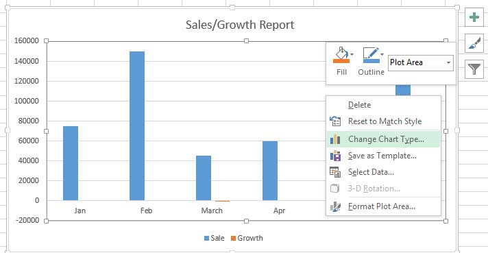
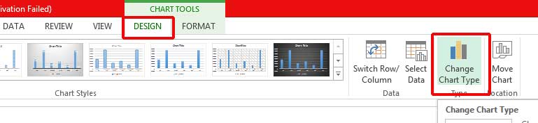
You can also select this option from the “Design” menu.
Step 3. Select “Combo” from the list and then check the checkbox of the data you want to add a secondary axis for. In this example, it is the data from the “growth” column which needs to be displayed with a line chart.
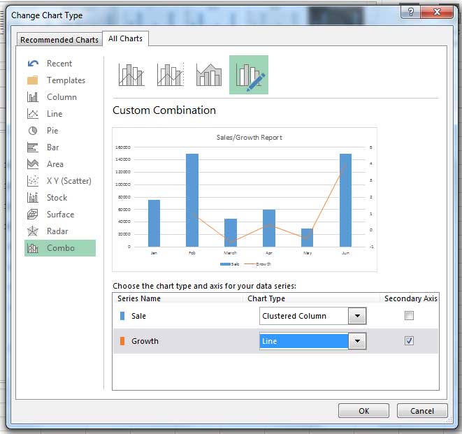
It is also possible to change the default chart type based on your preferences. You just need to click on the drop down menu in front of the Serie Name you want to change and choose from the list.
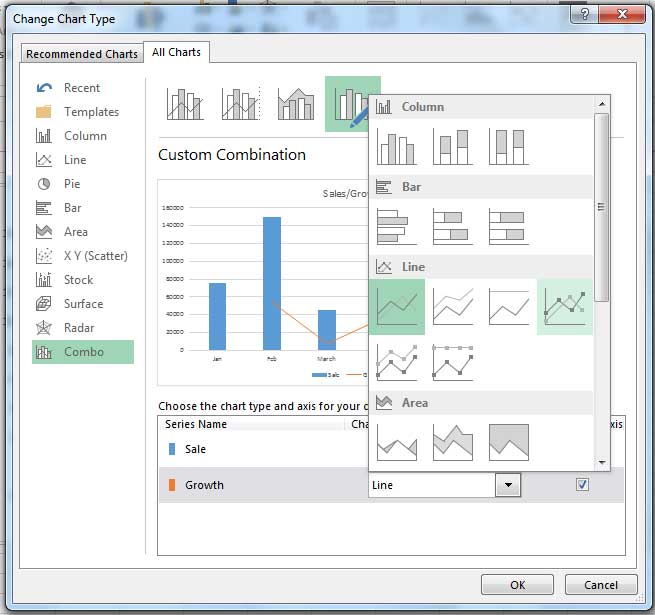
Even if there is another column which is needed to be displayed differently, you can add another secondary axis following the same steps.
Empower your business with our Excel Programming and VBA Macro Development Services, tailored to automate tasks and unlock the full potential of your data management capabilities.
How to change the appearance of a secondary axis in Excel?
You can change the appearance of the chart and its axis by customizing its colors or any other options it has. It is so simple. First, you should select the chart and click on the brush icon, which appears on the top-right corner of the chart. A dialogue box will appear. On the first tab, you can change the Chart Style, and the other helps you choose another color based on preset colors.
Even if you don’t like any of the predefined colors, you can apply your preferred color set too.
- Select the chart.
- Click on the Format tab in the Chart Tools menu.
- You can do all the necessary changes in the Current Selection tab. First, open the drop-down menu and select the area where you want to change its color.
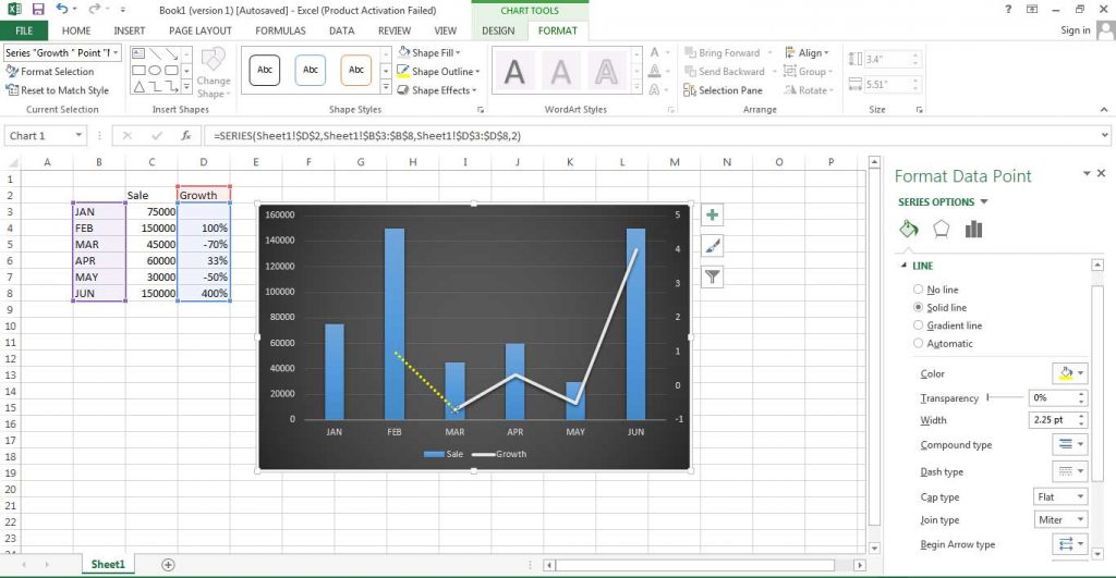
- If you want to change the color of the whole secondary axis, you should simply choose the Series’ name from the drop-down menu.
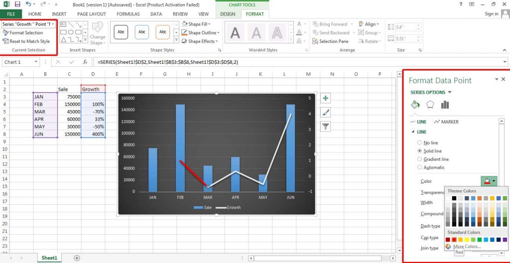
- In the Format Data Series window which will be opened, you can select the desired color.
- If you want to change the color of one line of the secondary axis, simply select the line on the chart.
- Change the color of the line from the Format Data Point window.
If you want to make a specific line thinner or thicker, first select the line on the chart. Then go to Format> Shape Styles> Shape Outline> Weight. In this menu, you can choose the thickness of the line.
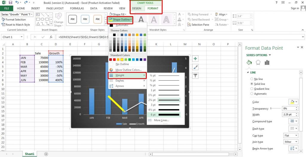
In the next option on this menu (Dashes) you can change the appearance of the line and make it appear as dotted format.
By changing the style and colors of the chart, you can have a customized chart which can better show your desired result.
Enhance your software capabilities with our customizable Add-In Solutions, seamlessly integrating new features to meet your business needs.
How to remove a secondary axis in Excel?
There is a remove function for everything we add in Excel. Removing the secondary axis is so simple. You just need to select the axis on the chart and then remove it by pressing the “Delete” button on the keyboard. Or right-click on the selected axis and then select “Delete” from the list.
Bottom Line
It might seem difficult, but after you learn how to add secondary axis in Excel, you will find out that Excel can be so easy to work with. By learning different aspects of this useful application, you can easily make perfect and flawless reports for your projects and work.
To learn more about working with axis, read the post about adding axis labels.
Our experts will be glad to help you, If this article didn’t answer your questions. ASK NOW
We believe this content can enhance our services. Yet, it’s awaiting comprehensive review. Your suggestions for improvement are invaluable. Kindly report any issue or suggestion using the “Report an issue” button below. We value your input.