How To Add Error Bars In Excel
Error bars in Excel is a graphical tool for showing the spread of the data. It’s generally used to show standard deviation and standard error, which is the degree to which the members of your dataset differ from the mean of the group.
If you’re working in an industry where these characteristics of data matter to you, then you’re likely to use the error bars feature in Excel. So let’s go through it.
In the following examples, we’re going to assume you have already graphed the data and created your chart. Excel allows you to add error bars to a variety of charts such as bar charts, line charts or scattergrams.
You can add these error bars to the chart:
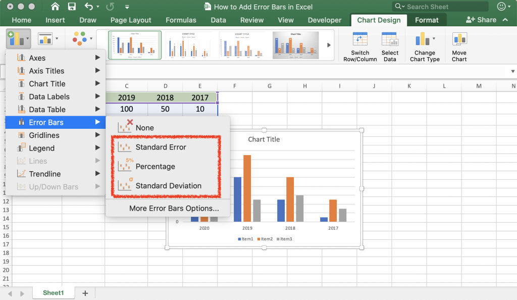
- Standard Error: shows the standard error for all the values in the dataset. Which is the likelihood of difference of sample mean to the population mean
- Percentage: Calculates a percentage error rate and the amount for the values provided
- Standard Deviation: Shows the standard deviation for all the values in the dataset.
Now let’s take a look at how to calculate error bars in Excel.
Unlock valuable insights with our Data Visualization and Data Analytics Services, transforming complex data into clear, actionable strategies for informed decision-making.
How to Add Standard Deviation Bars in Excel
- Click on the chart
- Click on the plus sign on the top-right corner
- Select the Error Bars box. It will list the choices of items that you can add to your chart.
- Click on Standard Deviation
How to Add Standard Error Bars in Excel
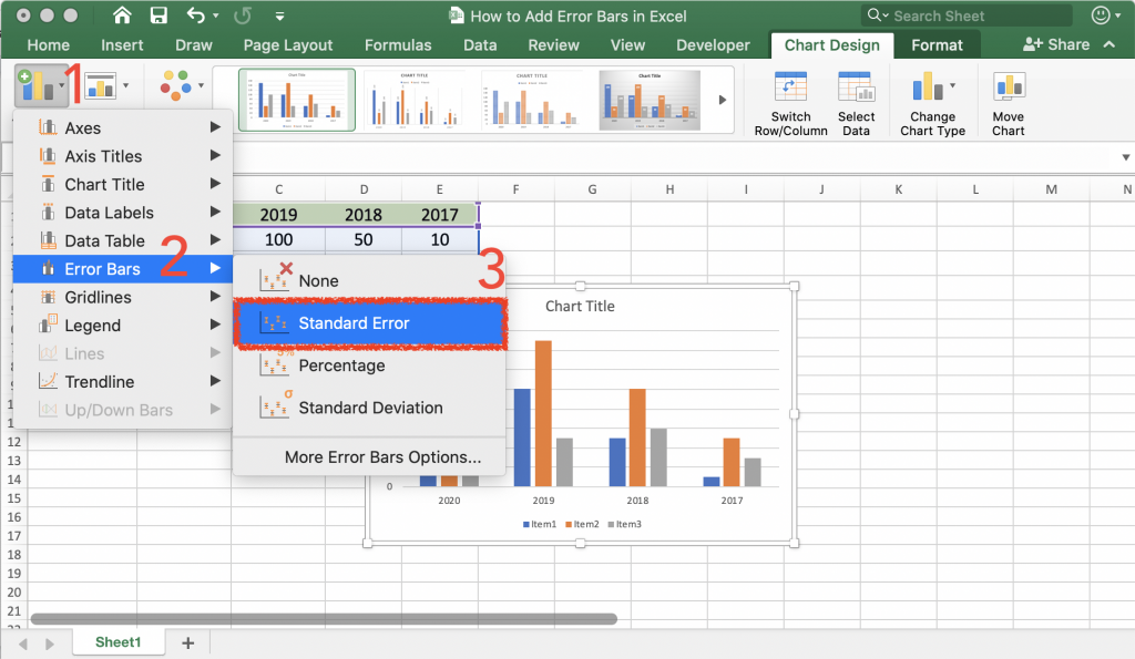
- Click on the chart
- Click on the plus sign on the top-right corner
- Select the Error Bars box and then press the arrow next to it
- Click on Standard Error
Using the More options choice from the menu, you can customize the error bar based on your needs.
How to Add Custom Error Bars in Excel
Most of the time, you’re probably going to use the default error bars provided by Excel, but sometimes you might have specific needs, that’s why you can create custom error bars. Follow these steps:
- Click on your chart
- Click on the plus sign on the top-right corner. (Chart Elements button)
- Click on the arrow on the Error Bars option and then select More Options
- Under the Error Amount section, select custom and then click Specify Value
- A small window called Custom Error Bars opens up. There are two fields, Positive Error Value and Negative Error Value.
- Enter the values in their respective fields and then click OK
If you don’t like the positive or negative values to be displayed, enter 0 in the fields. If you simply leave the fields empty, Excel will use the previous values, by default.
This action will add the custom values to each entry in the dataset. If you would like to add an individual error bar to each value, follow the next example.
How to Create Individual Error Bars in Excel
Start by creating a new sheet and enter all the error bar values, preferably in the same columns as the original values. Then create a graph, based on the custom error values.
In this example, we’re going to have 3 columns. We calculated the averages and created a graph based on the averages. Then, using the STDEV.P function, calculated the Standard Deviation of each column. Now we’re going to display the new values as error bars in the graph.
- Follow steps 1 through 3 in the previous example
- In the Custom Error Bars window, delete any value found in the Positive field, click on the field, then move your mouse cursor to the sheet and select a range.
- Follow the same steps for the Negative value. If you don’t wish to include it, enter 0 in the field
- Click OK
The individual error bars will be created.
Empower your business with our Excel Programming and VBA Macro Development Services, tailored to automate tasks and unlock the full potential of your data management capabilities.
How to Add Horizontal Bars
In most cases, the error bars are displayed vertically. For example, in the case of scattergrams and column charts.
In bar charts, however, the default display of error bars is horizontal. Like the example below:
In scattergrams, error bars are displayed for both X axis and Y axis values.
Follow these steps to add horizontal bars:
- Follow the steps to add error bars like the previous example
- Right-click on the vertical bars and click Delete
- The vertical bars will be removed. Double click on the chart to open the Format Error Bars pane
- Use the customize section to add horizontal bars according to your needs
How to Edit Error Bars in Excel
In order to edit the error bars for change in functionality or appearance, follow these steps:
- Double click on the error bars on the chart to open up the Format Error Bars panel
- In this section, you can change the direction, type and end style of the bars
- Navigate to the Options tab
- Here you can change the appearance of the bars such as colour, transparency, width, etc.
Our experts will be glad to help you, If this article didn’t answer your questions. ASK NOW
We believe this content can enhance our services. Yet, it’s awaiting comprehensive review. Your suggestions for improvement are invaluable. Kindly report any issue or suggestion using the “Report an issue” button below. We value your input.


[…] go to transcript In this video, You will find out how to add horizontal error bars in a scatter plot in excel. Read more to check other types of error bars and how to add them in Excel: https://bsuite365.com/blog/excel/how-to-add-error-bars-in-excel/ […]