How to Draw Gauge Charts in Excel
Charts are an essential part of Excel, and we can design various charts in Excel. However, we see some such as the gauge chart in other dashboard software that Excel doesn’t have in the charts section. Fortunately, we can create such charts with some creativity by combining the existing ones in Excel. One group of these charts is the Gauge charts that do not exist directly in Excel, but we can draw them by combining default doughnut charts and doing a series of calculations first. This comprehensive guide is designed to demystify the process, empowering you to effortlessly craft professional-grade Gauge Charts within Excel.
The 180-degree Gauge Chart in Excel
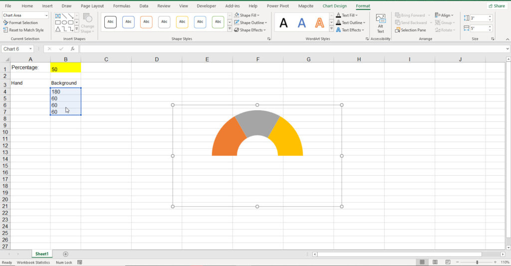
We can use this chart in Excel to show the percentage of a goal accomplished or how much a task has progressed, how much more of something we need to reach a specific level etc. For example, we want to see the hand move the same amount as a task is completed. If the task’s goal is 50% achieved, the writing also moves 50% forward. First, we need to create a table in Excel and enter some numbers and Formulas in it.
The gauge chart generally consists of two parts: the hand and the background.
Step 1: Enter the percentage manually (Cell B1).
Step 2: To create your data table, write Background and Hand in 2 separate columns. Under Background, enter 180, 60, 60, and 60 respectively under each other.
Step 3 Select the Background data(B4 to B7 cell in our example) and draw a Doughnut chart for them: Insert ???? Charts ???? Doughnut.
Step 4: Click the + button on the top right to uncheck all items or delete the title and legend charts directly.
Step 5: Rotate the chart 90 degrees so that the biggest slice (blue part) is at the bottom. And adjust Adjust the thickness of the chart.
- Right-click on the chart
- Select Format Data Series
- Change the “Angle of the first slice” to 90 degrees on the Format Data Point menu on the right.
- Reduce the “Doughnut hole size” till you’re happy with the appearance (45 in our example)
Step 6: Hide the biggest slice (180-degree section); in our example, it’s the blue part.
- Click on the blue part of the chart once and then click on it again to select only the blue part of the chart.
Note: Do not double-click; clicks should be done at intervals.
- From the format menu, click on Shape Fill, then select No Fill. Repeat this for Shape Outline.
- Select the whole chart and repeat the exact same thing.
After this, the chart will look like this:
Up to this point, we have drawn a Gauge chart background.
Follow the steps below to draw the hand:
Step 7: Draw the chart we need for the Hand
- Under the Hand cell, write the following numbers and formulas from top to bottom respectively: 180, =1.8*B1, 1, =360-A6-A5-A4.
- Select these cells (A4 to A7) and draw a Pie chart for them: Insert ???? Charts ???? Pie.
- Repeat Step 5 for this chart as well (Except for adjusting the thickness)
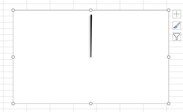
Step 8: Turn the pie chart into a hand:
- Select the chart
- From the format menu, click on Shape Fill, then select No Fill. Repeat this for Shape Outline.
- In cell A6, change the value from 1 to 10
Note: This is for convenience at this step; change it back to 1 later.
- Select the part of the chart that corresponds to cell A6
- From the Format menu, select Black color in the Shape Fill and the Shape Outline,
- For better appearances, select an effect from Shape Effects.
- Change the value of cell A6 to 1.
So far, our chart would look like this:
Step 9: Remove the outline and background of the hand chart frame.
- Select the chart frame, and
- From the Format menu, select No Fill in the Shape Fill and select “No Outline” from the Shape Outline.
Step 10: Check the hand size; if it is bigger or smaller than the doughnut chart, adjust them by dragging, enlarging, or reducing in the box.
Step 11: Merge the two charts of the hand and its background.
- Hold down the CTRL button and select the two charts by clicking on them.
- Select Align Center from Align in the Format menu (Shape Format menu in the new version) and then
- Select Align Middle.
- Click on Group in the Format menu and select Group form.
Now you have a 180-degree gauge in Excel, and by changing the percentage in cell B1, the hand moves to show the same proportion.
So far, we have been able to draw a 180-degree gauge diagram; as mentioned earlier, there are different types of gauge charts which we will explain in the following sections.
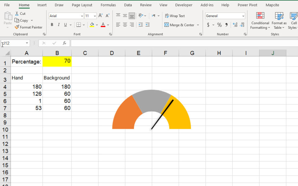
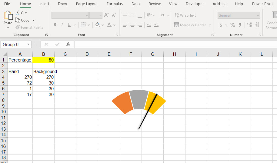
270-degree Gauge Chart
This chart is like a 180-degree gauge, except for the table of the hand and background and the rotation of the charts.
Repeat step 2 with the following numbers: 90, 90, 90, and 90.
At step 5, rotate the chart, but this time, instead of 90, enter 135. Repeat the same process for the hand chart
In step 7, use the following numbers: 90, =2.7*B1, 1, and =360-A6-A5-A4.
The rest of the steps are like the 180-degree gauge chart described above.
As a result, we will have You can see the 270-degree gauge chart in the following picture. The hand’s placement changes according to the percentage number.
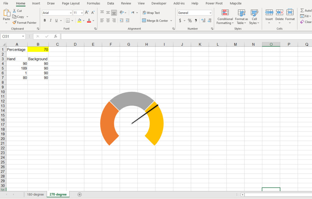
90-degree Gauge Chart
The method of drawing this chart is the same as the previous charts, but as you’d expect, we have to change the hand and background numbers in the table.
Repeat step 2 with the following numbers: 270, 30, 30, and 30.
The rotation angle of this chart is just like the 270-degree version. In step 5, select 135 degrees in the angle of the first slice section and repeat the same for the hand chart.
At step 7, we’ll have: 270, =0.9*B1, 1, and =360-A6-A5-A4.
The rest of the steps are like the 180-degree gauge charts described above.
The 90-degree gauge chart would look like this:
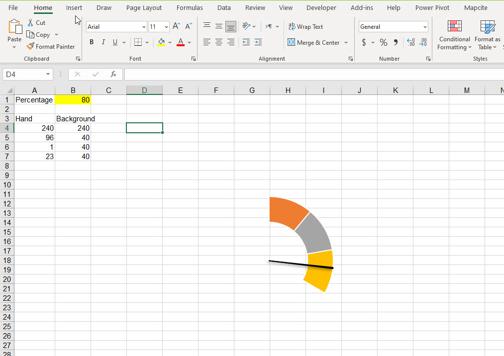
120-degree Gauge Chart
The method of drawing this chart is the same as the previous charts, but we have to change the hand and background numbers in the table to draw it.
For step 2 (the background cells) write the following numbers: 240, 40, 40, and 40.
And for step 7 we will have: 240, =1.2*B1, 1, and =360-A6-A5-A4.
And in the data series format section, we have to select 120 degrees in the angle of the first slice section for both charts.
The rest of the steps are like the other gauge charts described above.
As a result, we will have the 120-degree gauge chart as follows, in which the hand changes according to the percentage change.
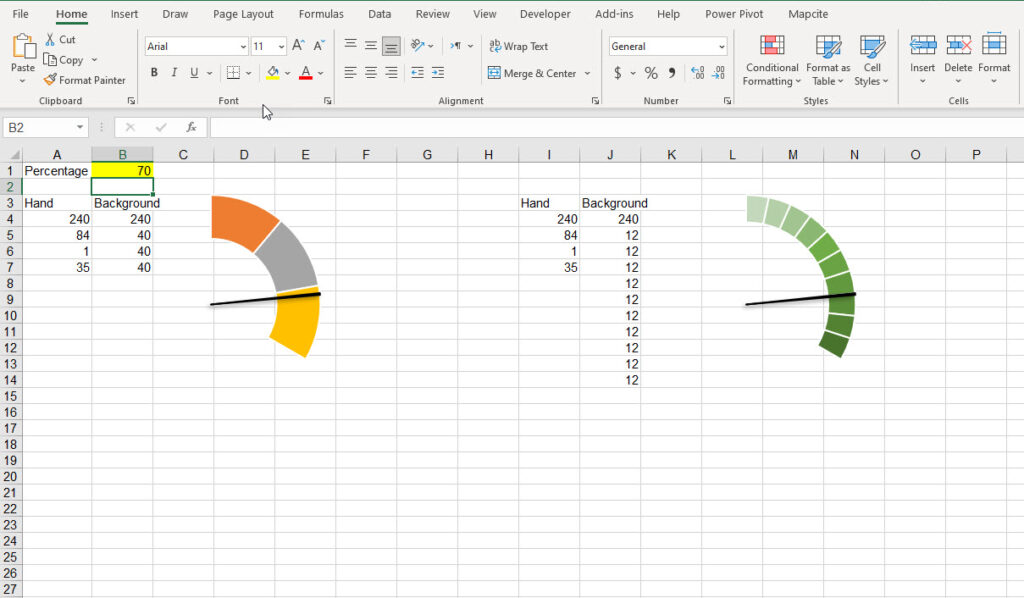
How to Divide the Background of a 120-degree Gauge Chart into 10 Sections
All the gauge charts we’ve shown you so far, including 120-degree gauge charts, can be drawn in another way; for example, instead of dividing the background into three parts, we can divide it into ten parts. This makes the chart more beautiful.
To do this, change the background table and write the following values respectively:240, 12, 12, 12, 12, 12, 12, 12, 12, 12, 12, 12, 12. Now, draw the doughnut diagram based on it.
As you can see, the first number (240) doesn’t change, but the following does, and the number of sections (and numbers) multiplied by this number gives us the degree of the chart:
With 3 sections, we have: 240 and 40 is repeated 3 times, so, 40*3=120
and now with 10 sections we have 240 , 12, 12, 12, 12, 12, 12, 12, 12, 12, 12, 12, 12 and 12*10=120.
As a result, the chart will look like this:
240-degree Gauge Chart with an Advanced Interface (Speedometer)
Now, we can use our experience in drawing gauge charts to create a great chart that looks like a speedometer. This chart is not difficult to draw; it’s done by repeating the previous steps with some changes. To draw this chart, combine the charts with Excel shapes and give it effects and colors.
Hope you’ve found this blog useful, and now you know enough about gauge charts to create one with your desired style.
A well-drawn chart can make your Excel reports look very professional and impressive. You can contact us to get a quote on our Excel Data Analysis and Visualization Services.
Conclusion
As you conclude your journey through this guide, you’ve unlocked the secrets to mastering Gauge Charts in Excel. Armed with newfound knowledge and techniques, you’re now equipped to transform raw data into captivating visualizations that command attention and convey insights with precision.
Remember, the true power of Gauge Charts lies not only in their ability to showcase data but also in their capacity to inspire action and drive decision-making. So, go forth with confidence, experiment with different designs, and unleash the full potential of Gauge Charts to elevate your data storytelling to new heights. With Excel as your canvas and this guide as your compass, the possibilities are limitless. Here’s to creating charts that not only inform but also inspire!
Our experts will be glad to help you, If this article didn’t answer your questions. ASK NOW
We believe this content can enhance our services. Yet, it’s awaiting comprehensive review. Your suggestions for improvement are invaluable. Kindly report any issue or suggestion using the “Report an issue” button below. We value your input.
About the Author: Hajir Hoseini
document.getElementById(“review-notice”).remove();
document.getElementsByTagName(“hide-notice”)[0].parentNode.remove();
}