How to Use Excel’s Trendline to Model and Predict Sales
Excel is a powerful tool in data analysis that helps us unravel the stories hidden within data. One of its key features, the line of best fit or more commonly trendline might sound technical at first, but it’s a valuable asset for anyone dealing with numbers. It helps us find the best mathematical representation of the relationship between two variables. This gives us a powerful means to understand our current data more concretely and predict future trends more realistically. To unveil the real potential of line-of-best-fit-in-Excel, let’s begin this article with a real-world problem statement.
Problem Statement – Model and Predict Sales
TiTi is a toy retail company that sells various kinds of toys in the local market. The sales manager needs to make projections about the impact of advertisement on the number of monthly units that the company will be able to sell of a particular toy in the coming year. In the past, she has been making such projections based on her experience. Now she wishes to be a little more scientific about the whole process.
The rest of this article is devoted to introducing the concept of trendline (line-of-best-fit) in Excel. This will help the sales manager deal with the situation more systematically rather than relying on her gut feeling. We will use Excel to fit the best line to the sales data, find a mathematical equation for the fitted line, and finally make predictions using the equation.
The reader of this article is supposed to have a working knowledge of Excel and must be familiar with basic algebra and the fundamentals of statistics.
Boost your productivity by getting a free consultation from Excel experts, and discover tailored solutions to optimize your data management and analysis.
The Data
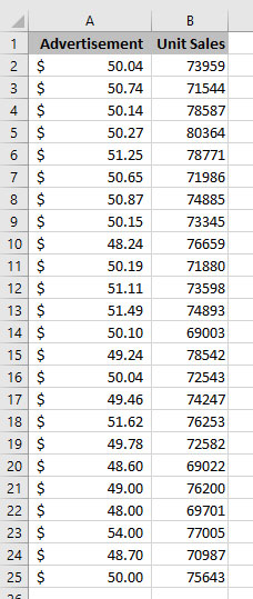
We have a relatively small dataset to use in this article. It is composed of 24 data points each comprising the amount spent on advertising a toy during one month along with units the toy sold in the next month. As mentioned earlier, we are trying to find a relationship between the amount spent on advertisement and the unit sales. To that end, we first need to plot the data and fit a line to it.
Add a Line of Best Fit (Trendline) in Excel
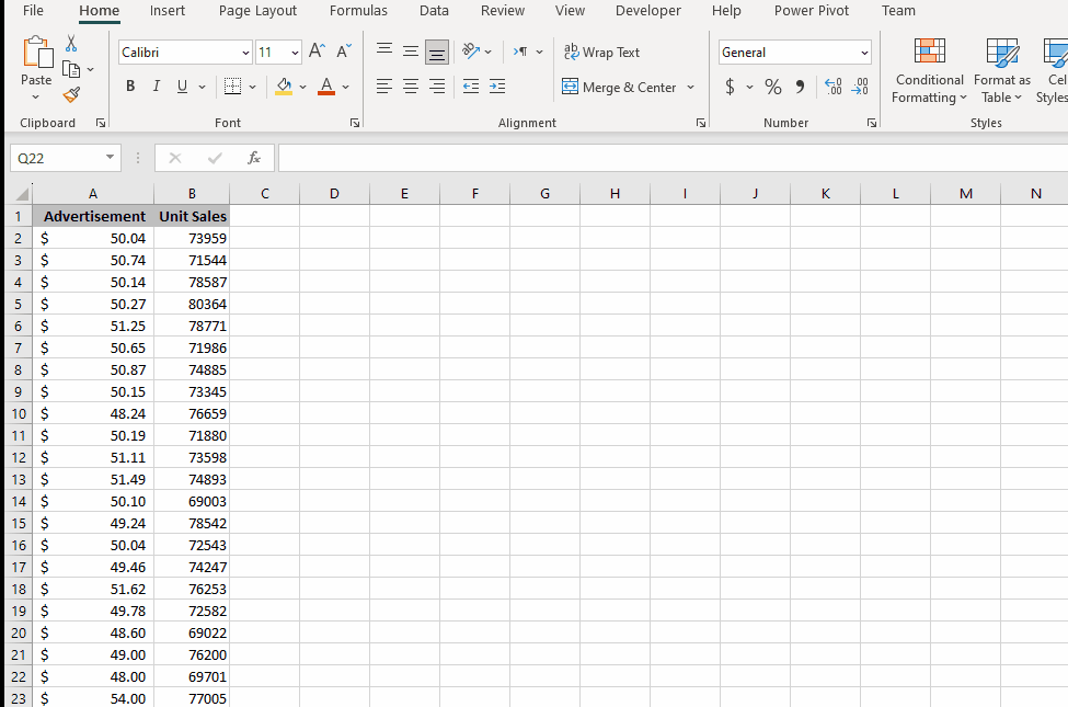
- Add Scatterplot
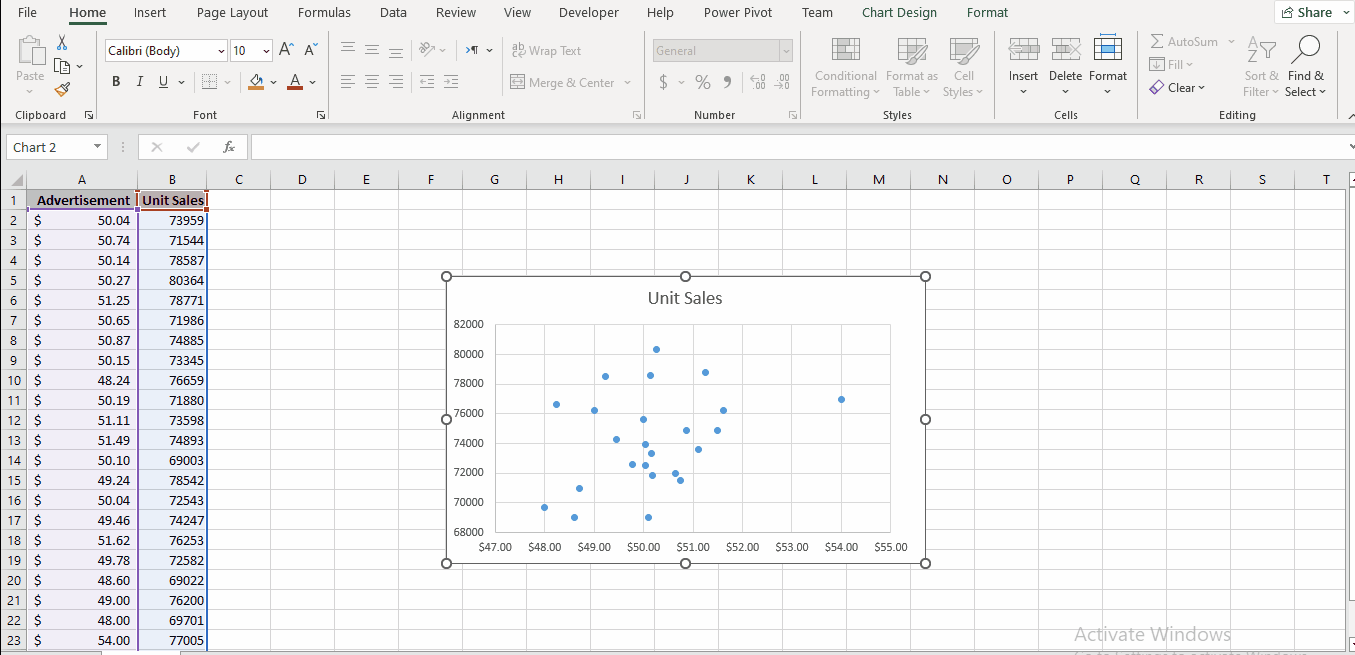
Click somewhere in your data, navigate to the Insert -> Charts, and select Scatter. A scatter plot is added to your sheet.
Important Note: While scatter plots are commonly used for trendlines, you can consider other chart types that suit your data. Choose a chart that presents the linear trend. A trendline can be added to various Excel charts, including XY scatter, bubble, stock, and unstacked 2-D bar, column, area, and line graphs.
- Add Trendline.
Regardless of the chart type you selected in the previous step, there are three options to add a trendline to the chart.
Option I
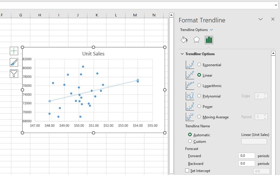
After adding the chart to your workbook, right-click any data points in the chart. From the context menu, opt for the Add Trendline feature. This will add a trendline to the chart and will open the Format Trendline pane.
Option II
Make sure that the chart is selected. This will activate the Chart Design ribbon. Go to Chart Design -> Add Chart Element -> Trendline -> More Trendline Options. This will add a trendline to the chart and will open the Format Trendline pane.
Option III
Make sure that the chart is selected. This will activate the Chart Elements icon on the upper right corner of the chart. Click the Chart Elements -> Hover over Trendline -> Click the arrow icon -> More Options. This will add a trendline to the chart and will open the Format Trendline pane.
Format Trendline Options
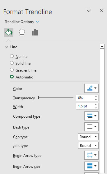
Once the trendline is added to the chart, we can customize it using the Format Trendline pane. The Format Trendline pane has three options; Fill & Line, Effects, and Trendline Options.
Fill & Line
- Within this tab, you have the option to customize the visual attributes of the line extensively. You can specifically customize the type of line, color, transparency, width, dash type, etc. of the trendline you have added to the chart.
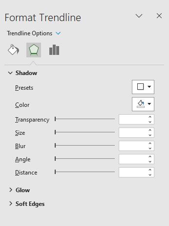
Effects
- This option enables you to distinguish the trendline effectively from the other elements in your chart. To be more specific, this option enables you to add Shadow, Glow, and Soft Edges to the trendline.
Trendline Options
This is the option we will work with in this article’s next sections. With this option, you can choose the most appropriate trendline, adjust its order, set its name, and make predictions.
Enhance your productivity and efficiency with our comprehensive Excel Automation Services, designed to simplify complex tasks and save you valuable time.
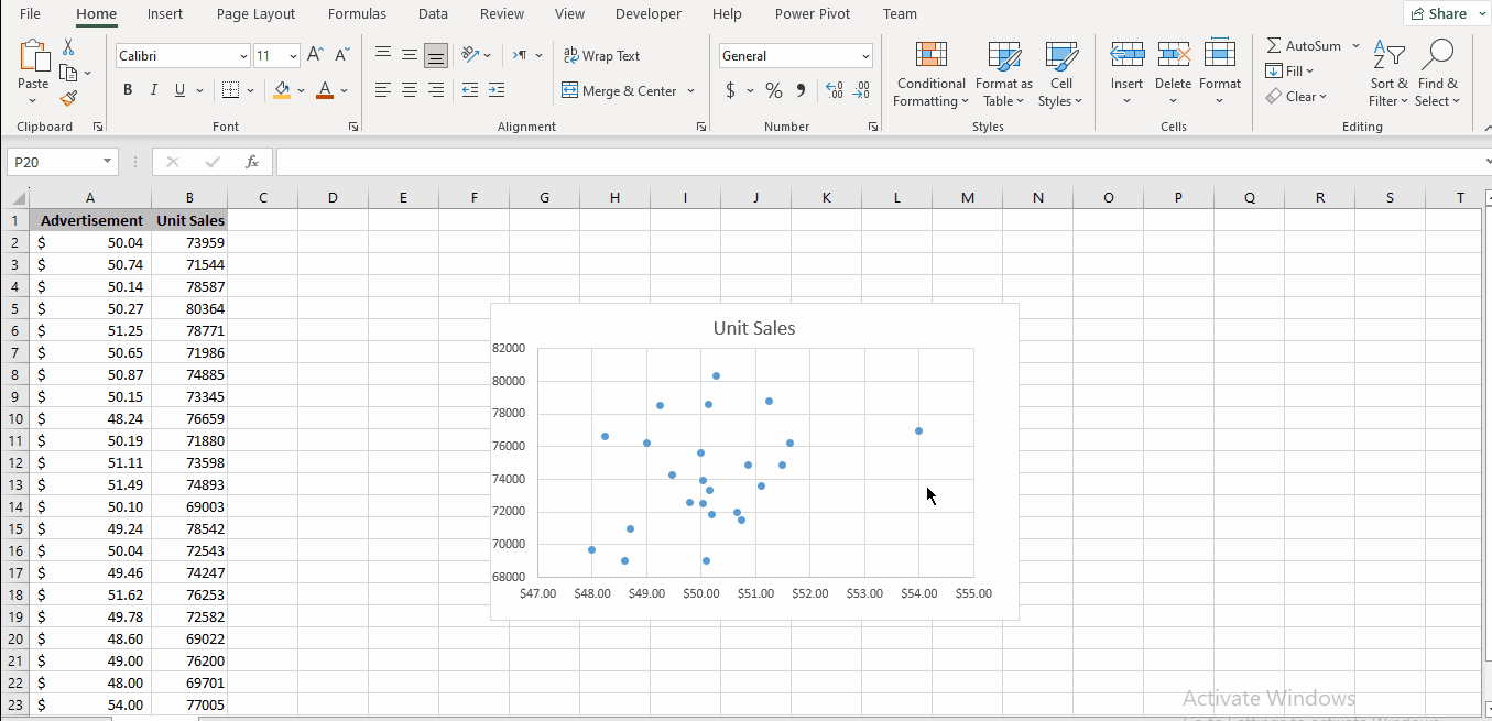
Line of Best Fit – Model Sales Data
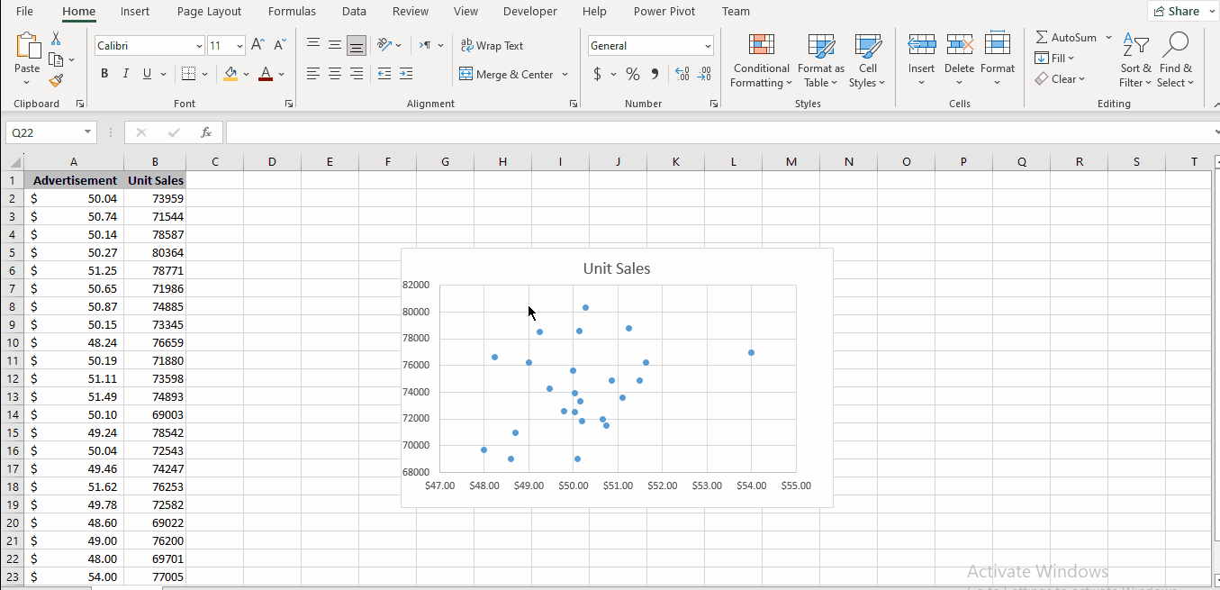
At this point, we have a dataset of 24 data points in an Excel worksheet and a scatterplot of the data with a trendline.
The trendline is by default linear, however, there are some other options we can choose from, two of which have a parameter to be set too. The critical question here is: How can we determine which line is better than the other lines? To answer this question, we need to define R-squared, more technically Coefficient of Determination.
R-squared (Coefficient of Determination)
According to Wikipedia, “In statistics, the coefficient of determination, denoted R2 or r2 and pronounced “R squared”, is the proportion of the variation in the dependent variable that is predictable from the independent variable(s)”. It is a number between 0 and 1.
R-squared is an objective benchmark for goodness of fit, the higher the R-squared, the better the fitted line is describing the variations of the dependent variable. This means that we should look for the line with the highest R-squared.
Model the Data
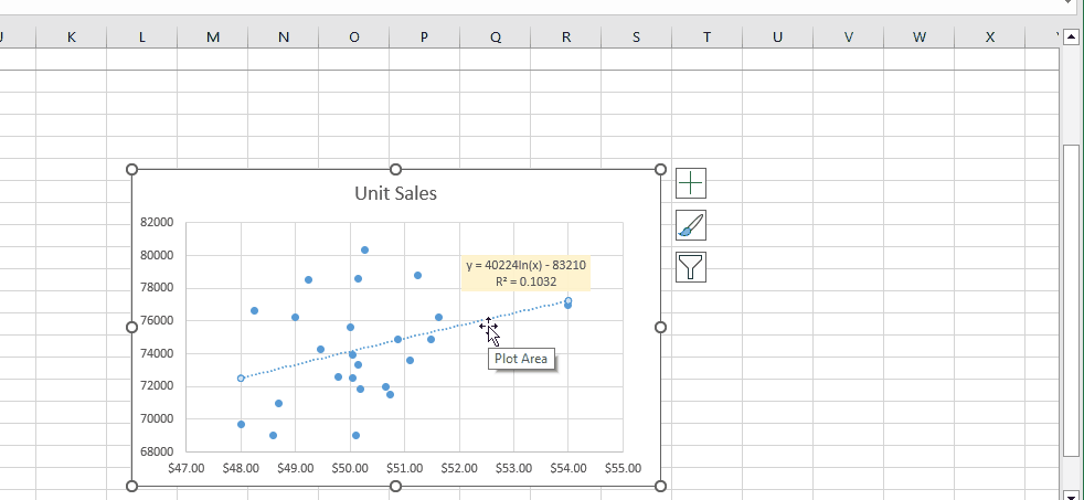
To add R-squared to the trendline: In the Formate Trendline pane, find the Display R-squared value on chart checkbox and check it. You can see the R-squared values appearing on the trendline. Play around with the different lines and also with the Set intercept option to see how R-squared changes.
Find the line with a reasonable R-squared that suits the dynamics of your data. It’s a trade-off. We opt for a Logarithmic line because it can describe the dynamics of our data, especially for higher amounts of advertisements, better than other choices.
Let’s move forward to find the mathematical equation of the fitted line and use it to predict sales in the next month.
Equation of the Trendline
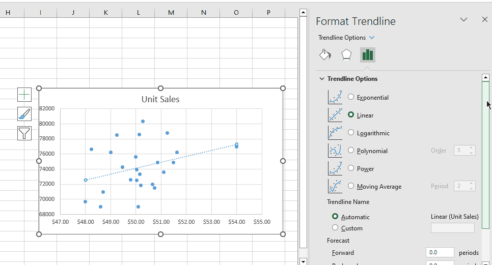
Up to this point, we have developed a model (a 6th-order polynomial) for our sales data. It’s time to get the equation of the polynomial.
At the bottom of the Format Trendline pane, find the Display equation on chart checkbox and check it. You can see that the 6th-order polynomial appears on the chart.
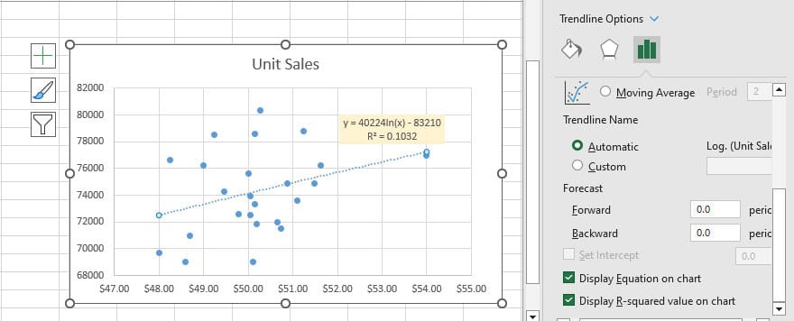
In the equation, x is the amount of advertisement and y is the unit sales. It’s now easy to predict sales given the amount of advertisements.
Predict Sales Using Trendline Equation
From the previous section, we know that the equation between y, the unit sales, and x, the amount of advertisement is as follows;
y = 40224 * ln(x) – 83210
With this formula, predicting unit sales given the amount of advertisements is very easy.
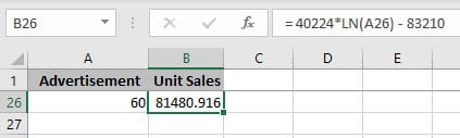
So for an advertisement of 60$, the unit sales will be 81480.
Transform your financial analysis with our comprehensive Excel Financial Modeling Services, providing accurate and insightful models to drive informed decision-making.
Predict Sales Using Extend Trendline
Extending the trendline is a straightforward way to project data trends into the future or past. This involves the following steps:
- Double-click the trendline to open the Format Trendline pane.
- Input the desired values in the Forward and Backward boxes under the Forecast section. For instance, you want to extend the trendline for 4 periods beyond the last data point. You can input this value to forecast the trend’s continuation.
As you can see in the screenshot above, the trendline extends forward and backward as I entered 4 in the Forward and Backward fields. This gives us the means to predict sales for advertisement amounts beyond what we have in the initial dataset.
Conclusion
To sum it up, the line of best fit in Excel is a powerful way to make sense of data. Whether you’re predicting future trends, understanding connections between variables, or just seeing the bigger picture, this tool has you covered. If you’re also interested in optimizing commission plans for your team, be sure to check out our comparison of Excel Tiered Commission vs Flat Commission.
So, remember, the line of best fit and Excel go hand in hand. They’re your dynamic duo for turning data into insights, guiding you towards smarter decisions and a deeper understanding of the stories within your data.
FAQ
Suppose you’re tracking students’ study hours and exam scores in Excel. To add a trendline:
Enter Data: List study hours and exam scores in columns.
Create Scatter Plot: Select data and insert a scatter plot.
Add Trendline: Click data points, press “Chart Elements,” and check “Trendline.”
Choose Type: Right-click trendline, choose “Format Trendline,” and pick linear.
Show Equation: Check “Display Equation” and “R-squared” for insights.
This offers a quick visual of the correlation between study hours and scores, aided by the trendline’s equation and R-squared value. Remember to interpret results in your data’s context.
Select the data you want to analyze.
Click on the Insert tab.
In the Charts group, click on the Scatter icon.
Select the first scatter chart option.
The chart will be inserted into your spreadsheet.
Right-click on the line of best fit and select Format Trendline.
In the Format Trendline dialog box, select the Linear option from the Trendline Type drop-down list.
Click on the Close button.
Our experts will be glad to help you, If this article didn’t answer your questions. ASK NOW
We believe this content can enhance our services. Yet, it’s awaiting comprehensive review. Your suggestions for improvement are invaluable. Kindly report any issue or suggestion using the “Report an issue” button below. We value your input.
About the Author: Roya.Pa
document.getElementById(“review-notice”).remove();
document.getElementsByTagName(“hide-notice”)[0].parentNode.remove();
}