How to Use Pivot Tables in Excel?
- What Is an Excel Pivot Table?
- Why Are Pivot Tables Important?
- What Are the Applications of Pivot Tables?
- Creating Pivot Tables in Excel: A Step-by-Step Guide
- How to Generate Pivot Tables in Google Sheets
- Approaches to Handling a Pivot Table
- What Are Pivot Charts and What Are They Good for?
- Distinctions Between Pivot Charts and Conventional Charts
- Using an External Data Source to Create a Pivot Table or Pivot Chart
- Using Another Pivot Table as a Data Source
- Changing the Source Data of an Existing Pivot Table
- The Key Components of Pivot Tables in Excel
- Analyzing Data Using the Pivot Table
- Rows, Columns, Values, and Filters: Which One to Use?
- Types of Pivot Tables
- Conclusion
- FAQs
Excel is one of the most widely used tools in the business world, and for good reason. It’s powerful, versatile, and can easily handle vast amounts of data. Pivot Tables in Excel are one of its most powerful features.
Whether you are a beginner to Excel spreadsheets or a professional, if you’re not familiar with Pivot Tables, you’re missing out on one of Excel’s most powerful tools for data analysis. Pivot Tables allow you to summarize and analyze large amounts of data quickly and easily, making it easier to spot trends, patterns, and other insights. In this blog post, we’ll take a closer look at Pivot Tables in Excel and show you how to use them to make sense of your data.
Whether you’re a seasoned Excel user or just getting started, this guide will help you get the most out of this powerful tool. So, let’s dive in and explore the world of Pivot Tables!
What Is an Excel Pivot Table?
Pivot Tables in Excel are a powerful tool that allows you to summarize and analyze large amounts of data quickly and easily. It provides a way to organize and present data in a way that is easy to understand and allows you to gain insights into your data that would otherwise be difficult to see.
Essentially, a pivot table is a tool that enables you to rotate or turn your data. It simplifies a large data set by arranging and summarizing information based on certain criteria, resulting in a condensed and easy-to-understand overview. In Excel, pivot tables use one or more fields from the data set as row and column headers and then generate summary statistics for each intersection of rows and columns.
One of the great things about Pivot Tables is that they are dynamic. This means that you can easily change the layout and design of your Pivot Table, and your calculations and summaries will update automatically. This makes exploring different scenarios and analyzing your data from different perspectives easy.
They are a powerful tool for analyzing and summarizing large amounts of data in Excel. Pivot Tables in Excel allow you to pivot your data by grouping and summarizing it based on specific criteria, making it easier to spot trends, patterns, and other insights. By following the steps outlined below, you can create your own Pivot Tables and start gaining insights into your data today.
Pivot tables are a cornerstone of data analysis and reporting. If you’re looking to boost your employability, they’re also one of the top advanced Excel skills employers look for.
Unlock valuable insights with our Data Visualization and Data Analysis Services, transforming complex data into clear, actionable strategies for informed decision-making.
Why Are Pivot Tables Important?
Well, Pivot Tables in Excel are important because they provide a powerful way to analyze and summarize large amounts of data quickly and easily. Pivot tables are necessary for efficiently analyzing and summarizing vast volumes of data.
They provide valuable insights, save time, and are highly customizable to meet specific needs. Whether you’re a beginner or an advanced Excel user, Pivot Tables are an important tool to have in your data analysis toolkit. Here are some reasons why Pivot Tables are so important:
- Easy to Use
Pivot Tables in Excel are easy to use, even for those who are not familiar with advanced Excel features. Once you have your data set up, creating a Pivot Table is just a matter of a few clicks. This makes it accessible to a wide range of users, from beginners to experts.
- Time-Saving
More than a million companies use Office 365 users worldwide. This is why time-saving becomes important. Pivot Tables in Excel save time by automating the process of data analysis. Instead of manually sorting and filtering data, a Pivot Table can quickly organize the data and provide meaningful insights in just a few seconds. This frees up valuable time for other important tasks.
- Providing Insights
Furthermore, they provide insights into your data that would otherwise be difficult to see. By summarizing and grouping your data based on specific criteria, Pivot Tables can reveal patterns, trends, and other insights that may have been hidden in the raw data.
- Dynamic
Pivot Tables in Excel are dynamic, which means that they can be easily modified to reflect changes in the data. For example, if you add new data to your data set, the Pivot Table can be refreshed to update the analysis automatically.
- Customizable
Pivot tables offer a great deal of flexibility in terms of customization, enabling you to adapt the analysis to meet your precise requirements. This implies that you can decide which fields to incorporate, how to group and summarize the data, and how to present the pivot table in a visually appealing and easily understandable way.
- Useful for Reporting
Pivot Tables are useful for reporting because they provide a concise summary of your data that is easy to read and understand. This is particularly useful when presenting data to stakeholders or when making important business decisions.
What Are the Applications of Pivot Tables?
Pivot Tables in Excel are used for a variety of purposes, including data analysis, reporting, and decision-making. Whether you’re working with financial data, customer data, or employee data, Pivot Tables provide a way to organize and summarize your data in a way that is easy to understand and use. Here are some of the most common uses of Pivot Tables:
- Data Analysis
Pivot Tables in Excel are commonly used for data analysis, particularly when dealing with large amounts of data. They allow you to easily summarize and organize your data into meaningful categories, making identifying patterns, trends, and other insights easier.
- Business Intelligence
Secondly, Pivot Tables in Excel are a popular tool for business intelligence, providing insights into sales data, customer data, and other key metrics. By summarizing and visualizing data, Pivot Tables help businesses make data-driven decisions and identify opportunities for growth.
- Financial Analysis
Moreover, Pivot Tables in Excel are useful for financial analysis, providing a quick and easy way to calculate financial ratios, analyze trends, and identify patterns in financial data. This is particularly useful for budgeting, forecasting, and financial reporting.
- Marketing Analysis
Pivot Tables are frequently used for marketing analysis, allowing marketers to analyze customer data, track campaign performance, and identify opportunities for optimization. Pivot Tables can provide valuable insights into customer behavior and preferences by summarizing and grouping data.
- Human Resources
Pivot Tables are also useful for human resources, providing a way to analyze employee data, track performance metrics, and identify trends in recruitment and retention. By summarizing and grouping data, Pivot Tables can help HR managers make data-driven decisions and improve employee satisfaction.
- Project Management
Finally, Pivot Tables in Excel are often used for project management. They provide a way to track project progress, analyze resource utilization, and identify bottlenecks in the project timeline. By summarizing and grouping data, Pivot Tables can help project managers make informed decisions and optimize project performance.
Boost your productivity by getting a free consultation from Excel experts, and discover tailored solutions to optimize your data management and analysis.
Creating Pivot Tables in Excel: A Step-by-Step Guide
To create Pivot Tables in Excel, you first need to have a data set that is organized into rows and columns. This can be in the form of a table or a range of cells. Once you have your data, you can create a Pivot Table by following these steps:
Step 1: Select the data range.
The first step in creating Pivot Tables in Excel is to select the range of cells that contains your data. This can be done by clicking and dragging your mouse over the cells. You can also use the keyboard shortcut Ctrl+A to select the entire range.
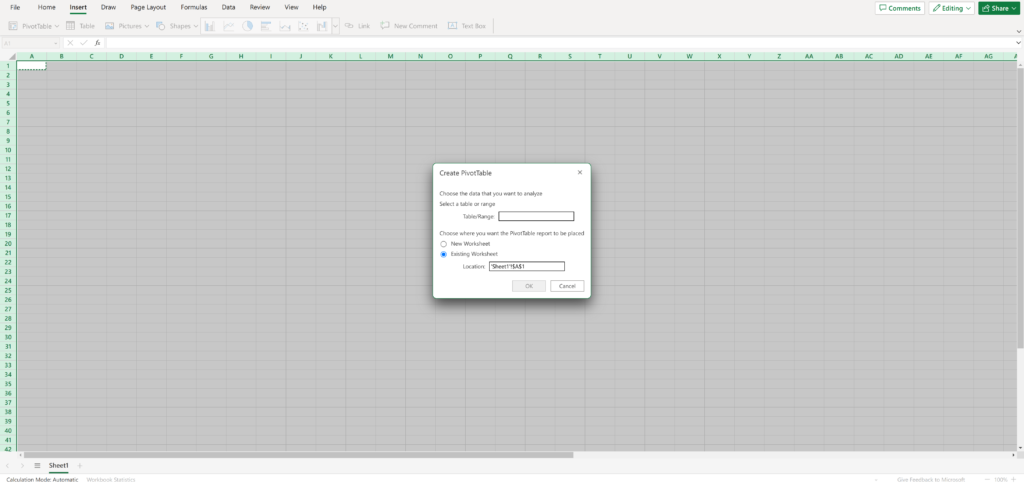
Step 2: Open the PivotTable dialog box.
With your data range selected, you can now open the PivotTable dialog box by going to the “Insert” tab on the Excel ribbon and selecting “PivotTable” from the menu.
Step 3: Choose the Data Range.
In the PivotTable dialog box, you’ll need to choose the range of cells that you want to use for your Pivot Tables in Excel. If your data range is already chosen, this option should already be marked.
Step 4: Choose where to place the Pivot Table.
Next, you’ll need to choose where to place the Pivot Table. You can either choose to place it in a new worksheet or in an existing worksheet. Once you’ve made your selection, click “OK”.
Step 5: Design your Pivot Table.
With your Pivot Table created, you can now start designing it by adding fields to the rows, columns, and values areas. To accomplish this task, effortlessly drag and drop the desired field names from the “field list” onto the corresponding areas within the pivot tables in Excel.
Step 6: Analyze your data.
You can start analyzing your data once you set up your Pivot Tables in Excel. This can be done by filtering, sorting, and grouping your data in different ways. You can also use the Pivot Table to calculate summary statistics such as totals, averages, and percentages.
How to Generate Pivot Tables in Google Sheets
Creating Pivot Tables in Google Sheets is similar to creating Pivot Tables in Excel. By using Pivot Tables in Google Sheets, you can quickly analyze and summarize large amounts of data and gain valuable insights into your business or organization. Here are the steps to create a Pivot Table in Google Sheets:
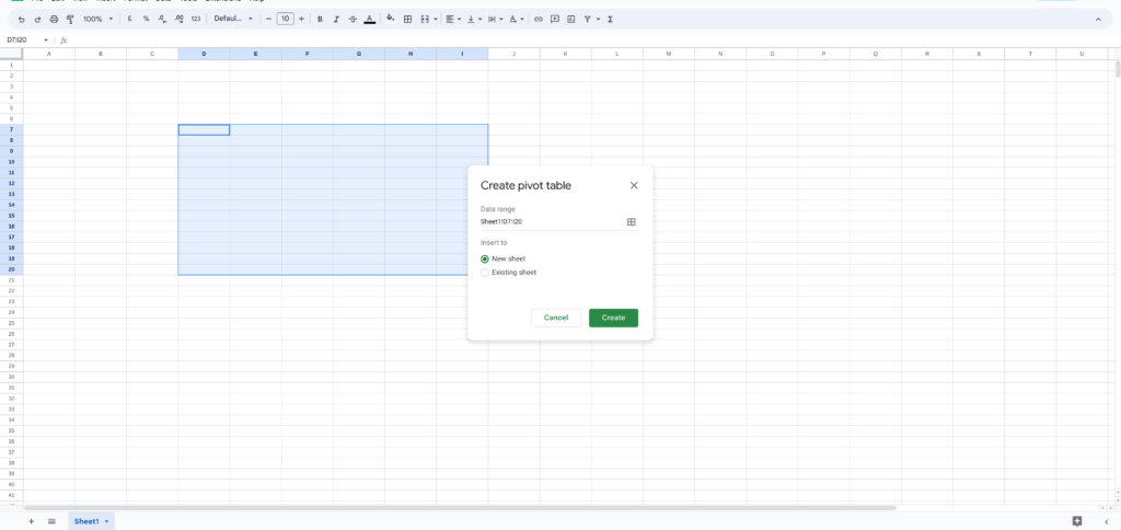
- Select the Data.
Select the data you want to include in the Pivot Tables in Excel by clicking and dragging your cursor over the cells. Make sure to include the column headers.
- Create the Pivot Table.
Click on the “Insert” menu and select “Pivot Table” from the dropdown. In the “Create Pivot Table” dialog box, ensure the “Range” field is set to the data range you selected. Choose the location where you want to place the Pivot Table and click “Create”.
- Add Rows and Columns.
Drag and drop the fields you want to include in the Pivot Table into the “Rows” and “Columns” boxes. You can also drag fields into the “Values” box to perform calculations on the data.
- Apply Filters.
You can apply filters to the Pivot Tables in Excel to focus on specific data. Click on the dropdown arrow next to a field in the “Rows” or “Columns” box and select “Filter by condition”. Choose the condition you want to use and click “OK”.
- Format the Pivot Table.
You can format the Pivot Tables in Excel by changing the font size, color, and alignment. You can also add borders, shading, and other formatting options to make the Pivot Table more visually appealing and easier to read.
- Refresh Data.
If the data in your spreadsheet changes, you can update the Pivot Table by clicking on it and selecting “Refresh” from the dropdown menu. This will update the Pivot Table with the latest data.
Enhance your software capabilities with our customizable Add-In Solutions, seamlessly integrating new features to meet your business needs.
Approaches to Handling a Pivot Table
Working with Pivot Tables in Excel involves several important steps to make the most of the data analysis tool. To work with a pivot table, various significant procedures need to be followed, including creating a Pivot Table, formatting it, filtering and sorting data, grouping data, and calculating fields. By mastering these skills, you can use Pivot Tables in Excel to analyze and summarize large amounts of data quickly and easily. Here are some ways to work with a Pivot Table:
- Creating a Pivot Table
The first step in working with a Pivot Table is to create one. This involves selecting the data set that you want to analyze and choosing the Pivot Table option in Excel. You can then select the fields that you want to include in the Pivot Table and choose the aggregation method for each field.
- Formatting a Pivot Table
Once you have created Pivot Tables in Excel, you can format them to make them more visually appealing and easier to read. This can involve changing the font size and color, adding borders and shading, and adjusting the alignment of the data.
- Filtering Data
One of the most powerful features of a Pivot Table is the ability to filter data. This allows you to focus on specific subsets of data that are most relevant to your analysis. You can filter data by selecting specific values in a field, setting up custom filters based on specific criteria, or creating a slicer.
- Sorting Data
You can also sort data in Pivot Tables in Excel to make it easier to analyze. This can involve sorting data by ascending or descending order, numeric value, or date. You can also sort data by multiple fields to get a more detailed analysis.
- Grouping Data
Grouping data is another way to work with Pivot Tables in Excel. This involves grouping data by specific fields, such as date, region, or product category. By grouping data, you can create a more concise and meaningful summary of your data.
- Calculating Fields
In addition to summarizing data using aggregation functions such as sum, count, and average, you can also calculate custom fields in Pivot Tables in Excel. This can involve adding calculated fields that combine multiple fields or applying formulas to specific fields.
What Are Pivot Charts and What Are They Good for?
Pivot charts are visual representations of Pivot Tables in Excel that allow you to visualize and analyze data in a more dynamic and interactive way. Here are some crucial facts to note about pivot charts:
- Interactivity
One of the main benefits of pivot charts is their interactivity. You can use features like drill down, expand/collapse, and filtering to interact with the data and explore different aspects of the analysis. This allows you to identify data trends, patterns, and outliers quickly.
- Formatting
Like Pivot Tables in Excel, pivot charts can be formatted to make them more visually appealing and easier to read. You can change the chart type, add titles and labels, adjust the colors and fonts, and add data labels and legends.
- Updating Data
Pivot charts are dynamic, which means that they can be updated automatically as new data is added or existing data is modified. This allows you to keep your analysis up-to-date without having to update the chart manually.
- Sharing and Collaboration
Pivot charts can be shared with others and used for collaboration purposes. You can save the chart as an image or PDF, embed it in a report or presentation, or share it with others via email or a shared folder.
- Chart Types
You can choose from several types of pivot charts, including column charts, bar charts, line charts, scatter charts, and pie charts. The type of chart you choose will depend on the type of data you are analyzing and the insights you want to gain from the analysis.
Pivot charts are a powerful tool that allows you to analyze data in a more dynamic and interactive way. By creating pivot charts, you can quickly identify trends and patterns in the data, update the analysis as new data becomes available, and share the insights with others.
Distinctions Between Pivot Charts and Conventional Charts
Pivot charts and standard charts have some similarities but also some key differences between them. Here are some of the main differences:
- Data Source
Pivot charts are based on Pivot Tables in Excel, which are used to summarize and analyze data. Standard charts are based on a data range or a table.
- Interactivity
Pivot charts are more interactive than standard charts. They allow you to drill down into the data, expand/collapse rows and columns, and filter the data dynamically. Standard charts don’t have these features.
- Flexibility
Pivot charts are more flexible than standard charts. You can change the structure of the Pivot Tables in Excel, and the chart will update automatically. With standard charts, you need to update the data range manually.
- Aggregation
Pivot charts are better at aggregating and summarizing data than standard charts. They can automatically perform calculations like sum, count, average, and percentage. With standard charts, you need to calculate these values separately.
- Customization
Standard charts are more customizable than pivot charts. You have more control over the chart’s layout, colors, and styles. Pivot charts are limited to the chart types supported by the Excel Pivot Tables.
- Complexity
Pivot charts can be more complex than standard charts. They can contain multiple layers of data and calculations, which can make them difficult to read and understand. Standard charts are simpler and easier to interpret.
Pivot charts and standard charts have different strengths and weaknesses. Pivot charts are more interactive, flexible, and efficient at summarizing data but can be more complex to work with. Standard charts are more customizable and easier to understand but don’t have the same level of functionality as pivot charts. The choice between pivot charts and standard charts depends on the specific requirements of your data analysis project.
Using an External Data Source to Create a Pivot Table or Pivot Chart
In addition to using worksheet data, you can also use an external data source to create Pivot Charts or Pivot Tables in Excel. Here are the steps to create a Pivot Table or pivot chart from an external data source:
- Connect to the External Data Source
Click on the “Data” tab on the ribbon and select “From Other Sources” from the “Get External Data” section. Choose the type of data source you want to connect to, including a SQL Server database, an Access database, or a web page. Enter the connection details, such as the server name, database name, and authentication method.
- Import the Data
Select the tables or queries you want to use as the Pivot Table or pivot chart data source. You can also specify any filters or sorting options you want to apply. Click “Finish” to import the data into Excel.
- Create the Pivot Table or Pivot Chart
Follow the same steps as creating a Pivot Table or pivot chart from worksheet data, but select the external data source as the data range. You can choose to create a new worksheet or use an existing one.
- Add Rows and Columns
Drag and drop the fields you want to include in the Pivot Table or pivot chart into the “Rows” and “Columns” boxes. You can also drag fields into the “Values” box to perform calculations on the data.
- Apply Filters
Apply filters to the Pivot Table or pivot chart to focus on specific data. Click on the dropdown arrow next to a field in the “Rows” or “Columns” box and select “Filter by selection” or “Filter by values”. Choose the selection or values you want to use and click “OK”.
- Format the Pivot Table or Pivot Chart
Format the Pivot Table or pivot chart by changing the chart type, font size, color, and alignment. You can also add borders, shading, and other formatting options to make the Pivot Table or pivot chart more visually appealing and easier to read.
- Refresh Data
If the data in the external data source changes, you can update the Pivot Table or pivot chart by clicking on it and selecting “Refresh” from the dropdown menu. This will update the Pivot Table or pivot chart with the latest data.
Using an external data source to create a Pivot Table or pivot chart in Excel allows you to access data from different sources, such as databases, web pages, or other applications. By following these simple steps, you can quickly and easily analyze and summarize large amounts of data and gain valuable insights into your business or organization.
Using Another Pivot Table as a Data Source
You can use one Pivot Table as a data source for another Pivot Table. This can be useful when you have multiple Pivot Tables in Excel that need to reference the same data or when you want to consolidate data from multiple Pivot Tables into a single Pivot Table. Here’s how to use another Pivot Table as a data source:
- Create the First Pivot Table
Create the first Pivot Table using the data you want to analyze. Add rows, columns, and values as needed, and apply any necessary filters or formatting.
- Copy the Pivot Table
Right-click on the Pivot Table and select “Copy”. Alternatively, you can select the entire Pivot Table and press “Ctrl+C” on your keyboard.
- Create the Second Pivot Table
Create a new Pivot Table in a different worksheet or workbook. Select “Use an external data source” and choose “Microsoft Excel List or Database” as the data source.
- Paste the Pivot Table
Click on the location where you want to paste the Pivot Table and select “Paste Special” from the “Edit” menu. Choose “Paste Link” and then select “Microsoft Excel PivotTable Object” from the list. Click “OK” to paste the Pivot Table.
- Adjust the Pivot Table Fields
Adjust the fields in the second Pivot Table as needed to reference the first Pivot Table. You can add, remove, or rearrange fields as needed to create the desired analysis. The second Pivot Table will automatically update as you make changes to the first Pivot Table.
- Refresh the Pivot Table
If the data in the first Pivot Table changes, you can update the second Pivot Table by right-clicking on it and selecting “Refresh”. This will update the second Pivot Table with the latest data from the first Pivot Table.
Using another Pivot Table as a data source can save time and reduce errors when working with multiple Pivot Tables in Excel. By following these simple steps, you can easily create a new Pivot Table that references the data from an existing Pivot Table and quickly analyze and summarize large amounts of data.
Changing the Source Data of an Existing Pivot Table
You can change the source data of an existing Pivot Table in Excel if you want to use a different range of data or if the data in the original range has been updated. Here’s how to change the source data of an existing Pivot Table:
- Select the Pivot Table
To change the source data for a specific pivot table in Excel, simply click inside the table to select it.
- Open the PivotTable Options
Click on the “Options” tab in the ribbon menu and select “Change Data Source” from the “Data” group.
- Select the New Source Data
In the “Change PivotTable Data Source” dialog box, select the new range of data that you want to use as the source data for the Pivot Table in Excel. If the new range of data is on the same worksheet, you can simply drag your mouse over the new range to select it. If the new range of data is in a different worksheet or workbook, click on the “Browse” button and select the file and sheet that contains the new data.
- Verify the New Source Data
Verify that the new source data is correct by checking the preview area in the “Change PivotTable Data Source” dialog box. This will show you how the Pivot Table will look with the new data.
- Click OK
Once you have verified the new source data, click the “OK” button to apply the changes and update the Pivot Table.
After changing the source data, you may need to update the fields and filters in the Pivot Tables in Excel to reflect the new data. You can do this by dragging and dropping fields, applying filters, or changing the summary functions as needed.
Changing the source data of an existing Pivot Table in Excel is a straightforward process that allows you to use different data or update the data in an existing Pivot Table. By following these simple steps, you can quickly change the source data of your Pivot Table and continue analyzing and summarizing your data.
The Key Components of Pivot Tables in Excel
An Excel PivotTable is a powerful tool for data analysis, allowing users to quickly and easily summarize large datasets and extract valuable insights. Understanding the nuts and bolts of an Excel PivotTable can help you get the most out of this tool and make your data analysis tasks more efficient.
Here are some key components that make up an Excel PivotTable:
- Data source: The first step in creating a Pivot Table in Excel is to select a data source. This can be a range of cells in an Excel worksheet, an external data source, or another PivotTable. The source contains the raw data you want to summarize and analyze.
- PivotTable Fields: PivotTable Fields are the individual data fields in Pivot Tables in Excel that you want to include in your PivotTable. These fields can be dragged and dropped into the PivotTable area to create rows, columns, values, and filters.
- PivotTable Areas: PivotTable Areas are the different sections of a PivotTable that allow you to organize and analyze your data. The four primary PivotTable Areas are Rows, Columns, Values, and Filters.
- Row Labels: Row Labels are used to group data by rows in the Pivot Tables in Excel. They can be used to break down the data into categories such as dates, regions, or product lines.
- Column Labels: Column Labels are used to group data by columns in the PivotTable. They can be used to break down the data into categories such as months, quarters, or years.
- Values are the data fields you want to summarize in your PivotTable. These can be numerical values such as sales, profits, or quantities.
- Filters: Filters are used to narrow down the data in your Pivot Tables in Excel based on specific criteria. You can use filters to exclude or include data based on certain values or conditions.
- Pivot Cache: Pivot Cache is a temporary database that stores a copy of your source data, which is used to populate your PivotTable. Pivot Cache allows you to manipulate and analyze large data sets without actually modifying the original data.
By understanding these key components, you can create PivotTables customized to your specific data analysis needs and extract valuable insights from your data quickly and efficiently.
Analyzing Data Using the Pivot Table
Analyzing data using pivot tables in Excel is an incredibly effective and powerful method for data analysis. Pivot Tables allow you to conveniently analyze large amounts of data and gain valuable insights that may be difficult or time-consuming to obtain using other methods.
Here are some ways in which Pivot Tables can help you analyze your data:
- Summarize data: Pivot Tables in Excel allow you to summarize your data by creating totals, averages, or other calculations. This can help you identify your data’s patterns, trends, or anomalies.
- Group data: They allow you to group data by categories such as dates, regions, or product lines. This can help you identify trends or patterns that may not be apparent when looking at the data in its raw form.
- Filter data: They also enable you to filter your data based on specific criteria such as date ranges, product categories, or sales regions. This can help you focus on the most relevant data and eliminate noise from your analysis.
- Create charts: Moreover, Pivot Tables in Excel let you create charts and graphs based on your data, making it easier to visualize trends and patterns. This can help you communicate your findings to others in a clear and concise manner.
- Drill down: Pivot Tables allow you to drill down into your data to explore it more detail. You can double-click on any data point to see the underlying data and even create a new Pivot Table based on that subset of data.
By using Pivot Tables in Excel to analyze your data, you can gain valuable insights that can help you make informed decisions and take action based on your findings. Pivot Tables can help you streamline your data analysis process and make it more efficient, allowing you to spend more time interpreting and using your data.
Rows, Columns, Values, and Filters: Which One to Use?
When creating Pivot Tables in Excel, you will typically have four fields to work with: Rows, Columns, Values, and Filters. Each of these fields serves a specific purpose and can be used to analyze and visualize your data in different ways.
- Rows: The Rows field in Pivot Tables in Excel is used to group your data by specific categories or variables. For example, if you were analyzing sales data, you might use the Rows field to group your data by product category, region, or salesperson. This allows you to see how your data is distributed across different categories and identify any patterns or trends.
- Columns: The Columns field is similar to the Rows field but is used to group your data horizontally rather than vertically in Pivot Tables in Excel. This can be useful for creating more complex analyses that require multiple levels of grouping or for comparing data across different categories.
- Values: The Values field is used to specify the type of calculation you want to perform on your data. This might include things like sums, averages, counts, or percentages. By specifying a value for the Values field, you can quickly calculate and compare different metrics across your data.
- Filters: The Filters field allows you to filter your data in Pivot Tables in Excel based on specific criteria. For example, you might use the Filters field to show only data from a specific time period or only data from a specific region or product category. This can help you focus on the most relevant data and eliminate noise from your analysis.
When deciding which field to use for a particular analysis in Pivot Tables in Excel, it is important to consider the specific question you are trying to answer and the type of data you are working with. For example, if you are trying to compare sales across different regions, you might use the Rows field to group your data by region and the Values field to calculate total sales. If you are trying to identify trends over time, you might use the Columns field to group your data by year and the Rows field to group it by month.
Ultimately, the key to using Rows, Columns, Values, and Filters effectively in Pivot Tables in Excel is to experiment with different combinations and see what works best for your specific analysis. By taking the time to understand the purpose of each field and how they work together, you can create powerful Pivot Tables that help you gain insights and make informed decisions based on your data.
Types of Pivot Tables
There are several types of Pivot Tables in Excel that you can create, each with its own set of features and capabilities. Here are some of the most common types of Pivot Tables:
- Tabular Pivot Tables: A tabular Pivot Table is Excel’s most basic type of Pivot Tables. It displays your data in a simple tabular format, with the Rows and Columns fields creating the structure of the table and the Values field providing the data for each cell. Tabular Pivot Tables are best suited for simple analysis and essential data exploration.
- Compact Pivot Tables: A compact Pivot Table in Excel is similar to a tabular Pivot Table but with a more compact layout that eliminates empty cells and makes it easier to read and analyze your data. Compact Pivot Tables are ideal for larger datasets where you need to condense your data to fit on a single screen.
- Outline Pivot Tables: An outline Pivot Table is a more visually appealing version of a tabular Pivot Table. It uses indentation and shading to create a hierarchy of data, making it easier to read and understand complex data relationships.
- Pivot Charts: Pivot Charts are not technically Pivot Tables but are closely related and often used in conjunction with Pivot Tables. A Pivot Chart allows you to visualize your data in a graphical format and filter, drill down, and analyze your data in real time. Pivot Charts are ideal for creating visualizations that highlight trends and patterns in your data.
- Data Model Pivot Tables: Data model Pivot Tables in Excel are a more advanced type of Pivot Table that allows you to analyze multiple data sources at once. With a data model Pivot Table, you can combine data from multiple tables or databases and create more complex calculations and analysis. Data model Pivot Tables are ideal for larger organizations that need to analyze data from multiple sources or for more complex analysis that require more advanced data modeling capabilities.
- Power Pivot Tables: Power Pivot Tables are similar to data model PivotTables, but with even more advanced capabilities. Power Pivot Tables allows you to analyze larger datasets, create more complex calculations, and perform more advanced data modeling and analysis. Power Pivot Tables are ideal for businesses that need to analyze large amounts of data or for more advanced data analysis and modeling applications.
Excel offers a variety of Pivot Table types that can help you analyze your data in different ways. By understanding the capabilities of each type of Pivot Table, you can choose the right tool for your specific analysis and create more powerful and insightful reports.
Conclusion
In conclusion, Pivot Tables in Excel are an incredibly powerful tool for analyzing and summarizing large amounts of data. With Pivot Tables, you can create reports, analyze data trends, and uncover insights that might be difficult to see in a raw data format.
We have discussed the basics of Pivot Tables in Excel, including how to create them, work with them, and use them to analyze your data. We have also covered some of the more advanced features of Pivot Tables, such as Pivot Charts, the Pivot Cache, and the various types of Pivot Tables available in Excel.
Overall, Pivot Tables offer a flexible and intuitive way to analyze your data, and they are an essential tool for anyone working with large datasets or complex data analysis. By using Pivot Tables effectively, you can save time, reduce errors, and gain a deeper understanding of your data, which can help you make more informed decisions and achieve better business outcomes.
If you require aid with Microsoft Excel tasks such as development, Macro/VBA programming, customization, data analysis, data visualization, or troubleshooting, we have a team of Excel experts who can help you. You can contact us whether you prefer remote or in-person assistance.
FAQs
To create a Pivot Table in Excel, follow these steps:
Select the data range that you want to use for the Pivot Table. Click on the “Insert” tab on the ribbon. Click on the “PivotTable” button in the “Tables” group. In the “Create PivotTable” dialog box, select the range of data you want to use for the Pivot Table. Choose where you want to place the Pivot Table (either a new worksheet or an existing one). Drag and drop fields into the “Rows”, “Columns”, and “Values” areas to create the Pivot Table.
A Pivot Table is a powerful feature in Microsoft Excel that allows you to summarize and analyze large amounts of data efficiently. It is a table that displays a summary of the data, with rows and columns arranged to allow you to analyze and compare the data in different ways.
The PivotTable feature is located on the “Insert” tab of the Excel ribbon in the “Tables” group.
The main use of a Pivot Table in Excel is to summarize and analyze large amounts of data quickly and easily. It allows you to group data by different categories, such as date, product, or region, and display the summarized data in a way that makes it easy to analyze and draw conclusions from.
To use a Pivot Table in Excel, you need to create a Pivot Table (as described in question 1), and then drag and drop fields into the “Rows”, “Columns”, and “Values” areas to create the table. You can then use the filters, sorting, and grouping options to analyze and compare the data.
To edit a Pivot Table in Excel, simply right-click on the table and choose “PivotTable Options”. You can then make changes to the fields, layout, and other options.
To change the source data of an existing PivotTable in Excel, follow these steps:
Click anywhere inside the PivotTable to activate the PivotTable Tools. Click the “Change Data Source” button in the “Data” group on the “Options” tab. In the “Change PivotTable Data Source” dialog box, enter the new range of data that you want to use for the PivotTable. Click “OK” to update the PivotTable with the new data range.
Our experts will be glad to help you, If this article didn’t answer your questions. ASK NOW
We believe this content can enhance our services. Yet, it’s awaiting comprehensive review. Your suggestions for improvement are invaluable. Kindly report any issue or suggestion using the “Report an issue” button below. We value your input.