Mastering Automated Reports in Excel
Excel has always been a convenient and functional tool for businesses. Many companies intend to use Excel for their financial reports as it can easily calculate data and provide desirable results. The most important feature of this powerful tool is the ability to return automated reports with the help of other programming languages. If you need to prepare automated reports in Excel for your business, follow this post to learn everything you need.
Benefits of Automated Reports
Automated Reports in Excel offer a broad range of advantages, saving valuable time on repetitive reporting tasks. By leveraging Excel reporting tools, businesses can not only reduce human errors but also significantly enhance the accuracy of their data. The resulting consistency and reliability in reporting contribute to informed decision-making processes. By automating Excel reports, the information will be at hand within a shorter time, helping you make decisions more quickly. This can be beneficial when working in a fast-paced environment where decisions need to be made quickly.
Enhance your productivity and efficiency with our comprehensive Excel Automation Services, designed to simplify complex tasks and save you valuable time.
Setting the Foundation: Data Preparation
In the process of creating automated reports in Excel, rigorous data preparation can be considered the cornerstone of success. Let’s walk through the essential steps to ensure your data is not just organized but ready for seamless automation.
A. Ensuring data is well-organized for automated reporting
Before starting the automation process, it’s important to organize your data systematically. The key is to structure your datasets in a way that facilitates easy retrieval and analysis.
- Group similar information together.
- Arrange columns logically.
- Ensure consistent formatting throughout your datasets.
B. Utilizing Excel tables for dynamic data range
One of Excel’s powerful features for data organization is the use of tables. Excel tables provide a dynamic data range and will automatically expand or contract as your data grows or shrinks. By converting your data into tables, you’re ensuring that your automated reports in Excel remain flexible and accurate, regardless of fluctuations in data volume.
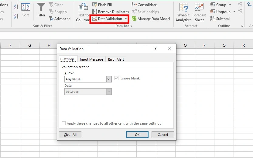
C. Data validation and cleaning for reliable reports
The reliability of your automated reports in Excel depends on the quality of the data they contain, making data validation and cleaning indispensable steps in the data preparation process. By setting data validation rules, you can control the type and range of data entered, minimizing errors and ensuring consistency. You can access Data Validation by navigating to the Data tab> Data Tools> Data Validation. Additionally, cleaning your data is a must. It involves identifying and modifying inaccuracies, removing duplicates, and addressing missing or inconsistent entries.
Excel Formulas for Data Calculation
Excel’s robust set of formulas emerges as a valuable tool, enabling you to conduct automated calculations with precision and efficiency. Leveraging these formulas, incorporating logical functions, and efficiently handling complex calculations contribute to your success in the process of creating automated reports in Excel.
A. Leveraging Excel formulas for automated calculations
Excel offers a rich collection of formulas that can be harnessed to automate calculations seamlessly. Functions such as SUM, AVERAGE, and COUNT facilitate basic calculations, while more advanced functions like VLOOKUP and HLOOKUP allow for dynamic data retrieval. By integrating these formulas into your automated reporting processes, you not only save time but also ensure accuracy in your calculations, fostering confidence in the reliability of your reports.
B. Incorporating logical functions for dynamic data analysis
Logical functions such as IF, AND, and OR, play a pivotal role in efficient reporting in Excel by introducing dynamic data analysis capabilities. These functions allow you to introduce conditional logic into your calculations, enabling your reports to respond dynamically to changes in the data. For instance, using the IF function lets you set up conditions, instructing Excel to perform specific calculations based on whether certain criteria are met.
C. Handling complex calculations efficiently
When performing automated data analysis, not all calculations are straightforward, and Excel provides tools to handle these complex calculations efficiently. Features like array formulas and mathematical functions for statistical analysis empower you to tackle intricate computations. By mastering these advanced capabilities, you can confidently manage complex calculations within the framework of automated reporting, ensuring that even the most intricate analytical requirements are met with efficiency and accuracy.
Unlock valuable insights with our Data Visualization and Data Analysis Services, transforming complex data into clear, actionable strategies for informed decision-making.
Introduction to PivotTables for Reporting
PivotTables stand as a cornerstone when creating automated reports in Excel, offering a dynamic and powerful means to transform large datasets into meaningful insights. These tables allow you to extract valuable insights from extensive datasets by organizing and presenting data in a structured, easy-to-understand format. They can transform raw data into actionable information, making them indispensable for reporting purposes.
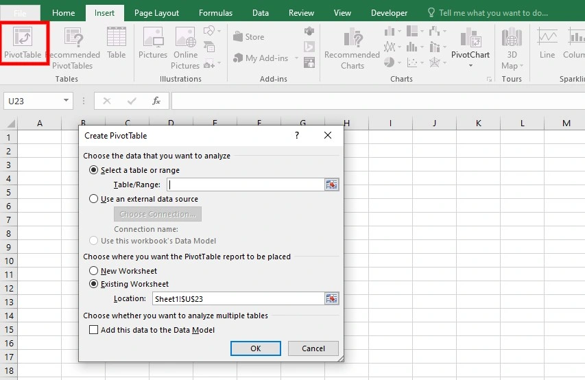
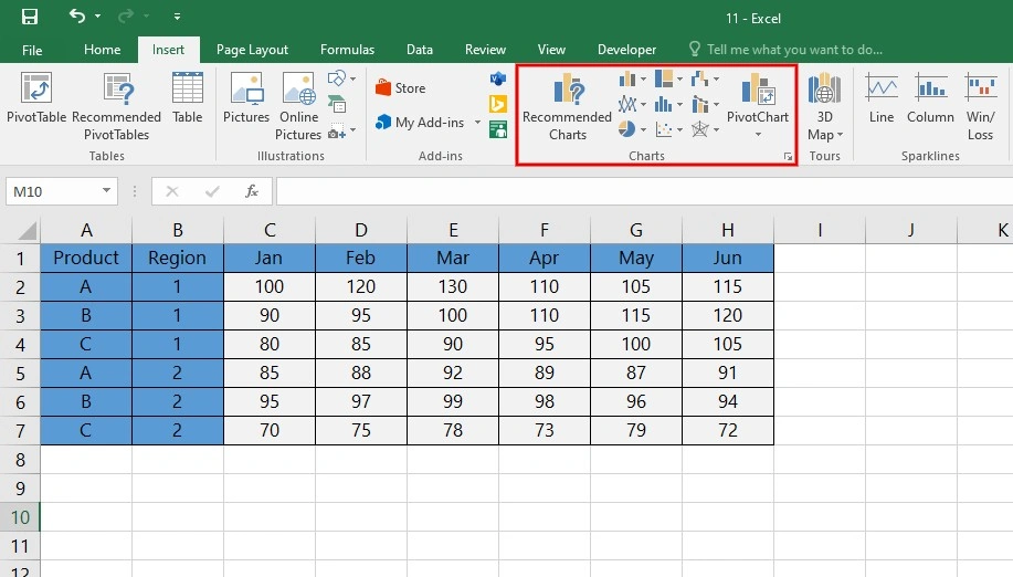
A. Creating PivotTables to summarize and analyze data
Creating a PivotTable is a straightforward process that begins with selecting the dataset you want to analyze. To do this, navigate to the “Insert” tab, click on “PivotTable,” and then choose the range of cells containing your data. Excel will automatically generate a basic PivotTable, which you can then customize to suit your reporting needs.
Once the PivotTable is created, you can drag and drop fields into the “Rows” and “Values” areas, allowing for the aggregation and summarization of data. For instance, you can summarize sales data by product category or analyze customer feedback scores by region. The ability to quickly reorganize and analyze data makes PivotTables an invaluable tool for real-time reporting.
B. Customizing PivotTables for specific reporting needs
Excel empowers you to tailor PivotTables to specific reporting requirements, offering a range of customization options. These include:
- Formatting: Customize the appearance of your PivotTable by adjusting fonts, colors, and styles to align with your reporting goals.
- Filtering: Use filters to focus on specific data. This feature is particularly useful when dealing with large datasets, allowing you to focus on the most relevant information.
- Grouping and Sorting: Arrange data hierarchically by grouping rows or columns. This is especially beneficial when dealing with time-based data, enabling you to view information with flexibility.
- Calculated Fields and Items: Optimize your PivotTable by creating calculated fields or items, allowing for immediate calculations within the table itself.
Power Query for Data Transformation
Power Query is an Excel add-in designed to streamline and automate the process of importing, transforming, and cleaning data. With Power Query, you can effortlessly connect to various data sources, transform raw data into a usable format, and create a structured foundation for automated reports in Excel.
You can access Power Query through the “Data” tab in Excel. Once activated, Power Query opens a new window, allowing you to navigate through a series of steps to import, shape, and transform data. The ability to record and replicate these steps ensures consistency and repeatability in the data transformation process.
A. Connecting to external data sources for real-time updates
One of Power Query’s standout features is its capacity to seamlessly connect to various external data sources, facilitating real-time updates for your reports. You can use the “Get Data” option in Power Query to choose your data source. This opens a dialog where you can select from a range of options, such as databases, online services, or even web scraping.
B. Cleaning and shaping data with Power Query
The true power of Power Query is its ability to clean and shape data with precision. Once data is imported, Power Query provides a range of transformation tools to structure it according to your reporting needs. This includes removing duplicates, filtering rows, pivoting columns, and merging tables, among other operations. You can preview the impact of each transformation step, ensuring that the final dataset aligns with your reporting requirements. You can also create reusable queries, enabling consistent data transformation across multiple datasets or reporting periods.
Enhance your software capabilities with our customizable Add-In Solutions, seamlessly integrating new features to meet your business needs.
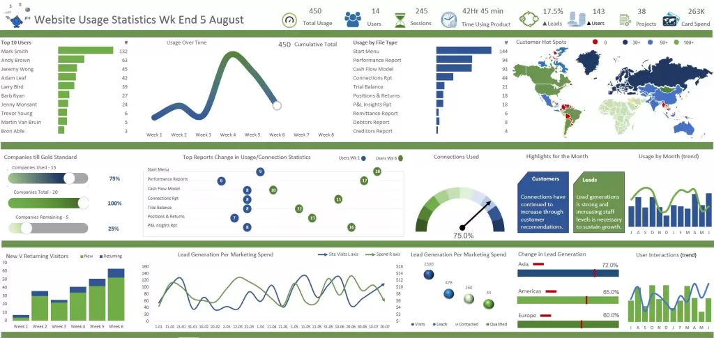
Building Automated Dashboards
In the process of creating an Excel dashboard, the integration of automated reports is a pivotal step. Leveraging the power of Excel, you can seamlessly embed these reports into a centralized and interactive dashboard. Begin by opening a new worksheet as your canvas where you’ll integrate key insights.
A. Integrating Automated Reports into Interactive Dashboards
Follow these steps to integrate reports into the dashboards:
1. Copy and Paste Reports
- Copy the relevant sections from your automated reports in Excel.
- Paste these sections onto the dashboard worksheet.
2. Link Data Dynamically
- Ensure real-time updates by linking the data from your reports to the dashboard.
- Use Excel formulas like VLOOKUP or INDEX-MATCH to establish dynamic connections.
3. Create a Cohesive Layout
- Organize the pasted reports logically within different sections on the dashboard.
- Consider allocating space for summary metrics, detailed charts, and any other essential elements.
B. Using Excel Features like Slicers for Dynamic Filtering
To enhance the interactivity of your dashboard, Slicers provide you with an intuitive way to filter data, offering a dynamic and responsive user experience.
1. Insert Slicers
- Navigate to the “Insert” tab and select “Slicer.”
- Choose the fields you want to use as filters, such as date ranges, product categories, or geographic regions.
2. Connect Slicers to Reports
- Right-click on a slicer, go to “Report Connections,” and link it to the relevant tables or charts on your dashboard.
- This ensures that adjusting a slicer instantly updates the connected elements.
3. Enable User-Friendly Filtering
- You can now interactively filter data by clicking on slicer options.
- This feature provides a seamless way to drill down into specific aspects of the data without complex manual adjustments.
C. Designing Visually Appealing and User-Friendly Dashboards
The visual appeal and user-friendliness of your Excel dashboard are crucial for effective communication. Add design principles to ensure that your dashboard not only conveys information but is also engaging and accessible.
1. Add Visual Elements
- Insert charts, graphs, and visual representations that align with the nature of your data.
- Use the “Insert” tab to include images, logos, or shapes that enhance the overall visual appeal.
2. Apply Conditional Formatting
- Employ conditional formatting to highlight key insights or trends.
- This feature draws attention to critical data points and makes the dashboard more user-friendly.
3. Consider Color and Style
- Maintain a consistent color scheme and style throughout the dashboard.
- Choose colors that complement each other and use contrasting shades for emphasis.
4. Include Navigation and Instructions
- Add navigation buttons if your dashboard has multiple sections.
- Include instructions or tooltip text to guide users on how to interact with different elements.
5. Test for User-Friendliness
- Test the dashboard’s user-friendliness by having someone unfamiliar with the data navigate through it.
- Gather feedback to identify areas for refinement and improvement.
Advanced Charting for Data Visualization
Advanced charting techniques elevate your ability to communicate insights effectively. Using automated charts in Excel, incorporating them into the reports, and customizing chart elements for clarity and emphasis are key to having informative reports.
A. How to Utilize Advanced Chart Types for Impactful Data Visualization
Follow these steps to utilize advanced charts when preparing dashboards to visualize automated reports in Excel:
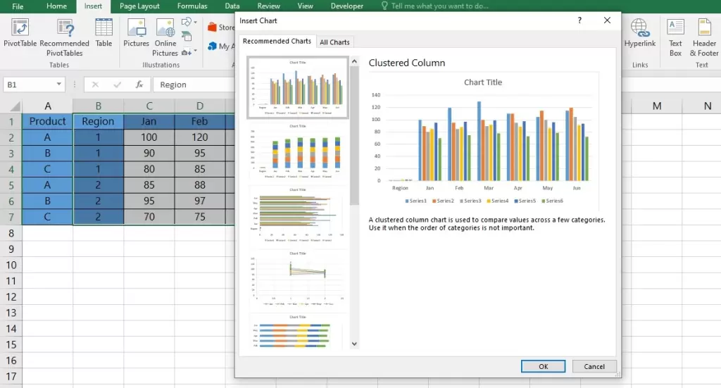
1. Explore Chart Options
- Navigate to the “Insert” tab in Excel and explore various chart types available.
- Beyond basic bar and line charts, consider advanced options like radar charts, bubble charts, or waterfall charts.
2. Choose the Right Chart for Your Data
- Select a chart type that aligns with the nature of your data and the story you want to tell.
- For hierarchical data, consider sunburst or treemap charts. For trends over time, use line or area charts.
3. Utilize 3D and Surface Charts
- Experiment with 3D charts for multidimensional data representation.
- Surface charts are excellent for showcasing relationships between three sets of data.
B. How to Incorporate Charts into Automated Reports for Better Insights
Let’s explore how you can add different charts to your automated reports in Excel.
1. Embed Charts in Automated Reports
- Copy charts from your Excel sheets containing automated reports.
- Paste these charts into the relevant sections of your automated reports or dashboards.
2. Ensure Dynamic Updates
- If your reports are linked to dynamic data sources, ensure that the embedded charts update automatically.
- Leverage Excel’s formula-driven capabilities to link charts to changing datasets.
3. Create a Visual Narrative
- Arrange charts in a logical order to tell a coherent data story.
- Consider the flow of information and strategically place charts to guide the reader through key insights.
C. How to Customize Chart Elements for Clarity and Emphasis
If you seek more clarity in your dashboard, you need to customize the charts based on your requirements:
1. Modify Chart Titles and Labels
- Ensure clarity by providing concise and descriptive titles for each chart.
- Adjust axis labels and data labels for precision and readability.
2. Choose Appropriate Colors
- Select a color scheme that is easy on the eyes and conveys meaning.
- Use contrasting colors to emphasize specific data points or trends.
3. Highlight Key Data Points
- Utilize features like data point markers, trendlines, or error bars to highlight important data points.
- This draws attention to critical elements within the chart.
4. Adjust Chart Layout
- Optimize the layout to avoid clutter and enhance visual appeal.
- Consider whether a clustered or stacked layout better suits your data presentation needs.
5. Explore Annotation and Text Boxes
- Annotate charts with text boxes to provide additional context.
- Use arrows or lines to draw attention to specific areas of the chart.
Automation with Excel Macros for Reports
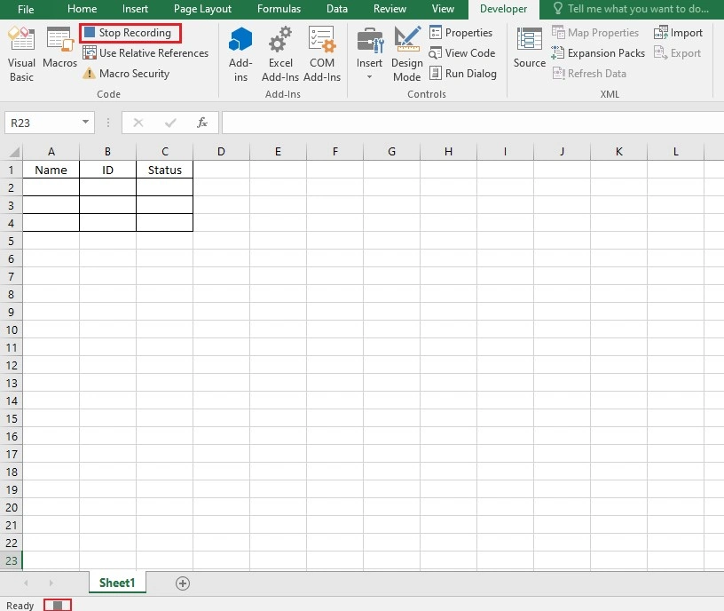
Recording macros is a common method for automating repetitive tasks and you can take advantage of them when creating automated reports in Excel. When you create a macro, you are recording all the individual actions done by the mouse clicks and keystrokes on a spreadsheet. Once a macro is created, you can save it under a specific name and run it whenever required to perform certain tasks.
To record a new Macro, navigate to the Developer tab, Code section, and click on “Record Macro”. In the Record Macro box, assign a proper name to your Macro and a shortcut key. Whenever you click the defined shortcut key, the macro is run. When you click OK, the Macro starts recording your clicks and all the changes you make.
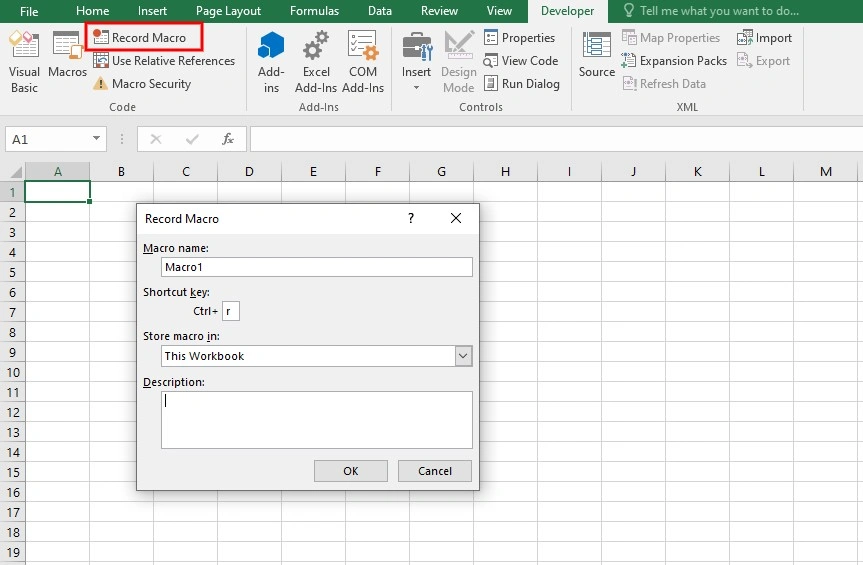
After you are done with the changes, click “Stop Recording”. Now, to perform the recorded Macro, click on the Macros, select the desired Macro, click “Run”, and the Macro will perform all the recorded tasks.
For more advanced data visualization and dashboarding, explore how you can use Power BI analysis in Excel to take your insights even further.
Scheduled Refreshes and Updates
Efficient reporting in Excel relies on the timely availability of accurate and up-to-date information. Setting up scheduled refresh in Excel for real-time information, ensuring data accuracy through automated updates, and managing connections and external data sources can help you to reach this goal.
A. How to Set Up Scheduled Data Refreshes for Real-time Information
Follow these steps to set up scheduled data refreshes:
1. Connection to External Data
- Ensure that your Excel workbook is connected to external data sources, such as databases, online services, or APIs.
2. Power Query or Data Connection Properties
- If you are using Power Query for reports, navigate to the Query Editor and access the “Query Properties.”
- For traditional data connections, right-click on the imported data, go to “Connection Properties,” and locate the “Refresh” options.
3. Define Refresh Frequency
- Specify how often you want the data to refresh. Options typically include daily, weekly, or more frequent intervals.
- Choose a time when the refresh is least likely to disrupt users or other automated processes.
4. Save and Close
- Save your workbook after configuring the refresh settings.
- Close the workbook, and the scheduled refresh will occur automatically based on the defined frequency.
B. How to Ensure Data Accuracy Through Automated Updates
Follow these steps to ensure data accuracy through the automated updates:
1. Data Validation Rules
- Implement data validation rules within your Excel sheets to ensure that only accurate and relevant data is accepted.
- This step is crucial before setting up automated updates to prevent errors.
2. Error Handling in Power Query
- Incorporate error handling mechanisms to manage potential issues during data refreshes.
- Configure the handling of errors to ensure that the refresh process doesn’t fail completely if minor issues arise.
3. Test Refresh Scenarios
- Before deploying automated updates, thoroughly test the refresh scenarios.
- Consider edge cases, such as data source unavailability, and ensure that your system can handle these situations.
4. Utilize Data Validation Checks
- Implement data validation checks to ensure that the updated data aligns with expected formats and ranges.
- This step acts as a final layer of validation to maintain accuracy.
C. How to Manage Connections and External Data Sources
If you are concerned about data connections, follow these steps to manage connections and external data sources:
1. Review and Document Connections
- Regularly review and document all connections in your Excel workbook.
- Include details such as connection type, data source location, and any necessary information.
2. Connection Manager (for Power Query)
- Use the Connection Manager in Power Query to centralize and manage data source connections.
- This allows for easier modification of connection properties and credentials.
3. Update Credentials
- If credentials for external data sources change, update them promptly to avoid disruptions in scheduled refreshes.
- Ensure that whoever manages the data sources communicates any credential changes in the shortest time.
4. Data Source Versioning
- Consider implementing version control for external data sources.
- This ensures that changes to the data structure are managed systematically, reducing the risk of unexpected issues during refreshes.
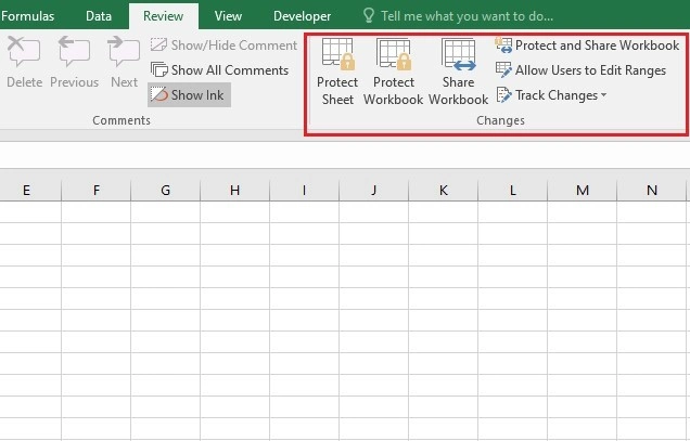
Security and Access Control
Maintaining the security and integrity of automated reports in Excel is paramount to help you with data-driven decision-makings. Implementation of security measures, controlling access to sensitive information, and using data encryption and password protection contribute to succeeding in this process.
A. Implementing Security Measures for Automated Reports in Excel
Follow these steps to implement security measures for your reports:
1. User Authentication
- Enforce robust user authentication for individuals accessing automated reports. This may include multi-factor authentication to add an extra layer of security.
2. Role-Based Access Control (RBAC)
- Use role-based access control to assign specific permissions to users based on their responsibilities.
- Restrict access to critical functions and sensitive data to authorized personnel only.
3. Audit Trails
- Establish audit trails to monitor user activities within automated reports in Excel.
- Log actions such as data modifications, report access, and any significant changes.
4. Regular Security Audits
- To address potential risks promptly, conduct regular security audits within your company.
- Stay informed about the latest security best practices and updates.
B. Controlling Access to Sensitive Information in Excel
It’s essential to control users’ access to sensitive data in business reports, avoiding unauthorized modification or data corruption. Follow these steps to do so:
1. Worksheet Protection
- Use Excel’s worksheet protection feature to restrict access to specific sheets or ranges.
- Set passwords for protected sheets to control who can view or modify sensitive information.
2. Cell-Level Security
- For particularly sensitive cells or data points, consider using Excel’s cell-level security features.
- Apply data validation rules or conditional formatting to enforce specific access conditions.
3. Shared Workbooks with Tracked Changes
- Use shared workbooks with tracked changes to monitor and control modifications to sensitive data.
- Track changes allow for transparent visibility into who made what modifications and when.
C. Data Encryption and Password Protection
Password protection can add an extra layer of security to your data, preserving your automated reports in Excel.
1. Workbook Encryption
- Encrypt the entire workbook to safeguard the data within it.
- Excel provides options for password-protecting workbooks during the save process.
2. External Data Source Encryption
- If your automated reports rely on external data sources, ensure that these sources use encryption protocols (e.g HTTPS for web connections).
- This helps secure data during transmission between Excel and external systems.
3. Password Protection for VBA Codes
- If your automated reports in Excel involve VBA (Visual Basic for Applications) codes, password-protect the VBA modules.
- This adds an additional layer of security, preventing unauthorized access to a specific code.
4. Secure Data Transmission
- When sharing automated reports or data, use secure channels for transmission.
- Platforms like secure file-sharing services or encrypted emails help protect sensitive information during transit.
Case Studies
These case studies demonstrate the tangible benefits that businesses can derive from implementing automated reports in Excel. From streamlining retail operations to enhancing financial forecasting precision, the impact on decision-making and efficiency is substantial, offering a competitive edge in today’s data-driven business landscape.
Retail Analytics Transformation
A global retail chain faced challenges in consolidating sales data from diverse locations.
- Solution: Implemented automated reports in Excel with Power Query, integrating data from individual stores in real-time.
- Outcome: Achieved a centralized view of sales performance, enabling proactive decision-making and optimizing inventory management.
Financial Forecasting Precision
A financial institution struggled with time-consuming manual financial reporting and forecasting.
- Solution: Implemented automated reporting with Excel formulas and PivotTables.
- Outcome: Reduced reporting time by 50%, enabling finance teams to focus on strategic analysis and improving forecasting accuracy.
Supply Chain Optimization
A manufacturing company was dealing with challenges regarding supply chain metrics tracking.
- Solution: Automated reports enabled a manufacturing company to track and analyze supply chain metrics in real-time.
- Outcome: Informed decisions regarding inventory levels, supplier performance, and production scheduling, leading to a 20% reduction in operational costs.
Best Practices for Automated Reporting
By adhering to these best practices, you can optimize your automated reporting processes, address challenges proactively, and ensure the long-term efficiency and reliability of your reporting workflows.
A. Tips for Optimizing Automated Reporting Processes
- Keep data sources up-to-date and review them regularly to ensure accurate reporting.
- Implement robust data validation rules to catch errors early in the reporting process.
- Use named ranges for dynamic data to enhance formula reliability and readability.
- Document automated reporting workflows and complex formulas for better collaboration and future reference.
B. Addressing Common Challenges and Troubleshooting
- Set up alerts for scheduled refresh failures and promptly address any issues with data sources or connections.
- Incorporate error-handling mechanisms in formulas and scripts to manage unexpected data issues.
- Ensure compatibility when sharing automated reports in Excel, especially if different team members are using different versions of the software.
- Periodically test automated workflows to catch potential issues before they impact critical reporting processes.
C. Recommendations for Maintaining Efficient Automated Reports
- Archive previous versions of automated reports in Excel and maintain version control to track changes over time.
- Keep workbook size manageable by removing unnecessary data, sheets, or formatting.
- Provide training and documentation for end users to ensure they understand how to interact with automated reports effectively.
- Keep Excel and any relevant add-ins up-to-date to leverage the latest features.
If you’re looking to take automation even further, check out our guide on how to use Python in Excel for advanced data analysis and reporting.
Conclusion
Mastering automated reports in Excel is a strategic imperative for modern businesses seeking efficiency, accuracy, and agility in their decision-making processes. The journey from data preparation to advanced charting and dashboard creation empowers your business to harness the full potential of your data. As we encourage you to explore and implement these techniques, they not only bring convenience within performing your tasks but are also foundational to staying competitive and adaptive in an ever-evolving business landscape.
FAQs
Automated reports in Excel can include a wide range of data types, including numerical values, text, dates, and more.
Yes, Excel allows extensive customization of the format and layout of automated reports. You can adjust fonts, and colors, add images, and design layouts to suit specific reporting needs.
The frequency of scheduled refreshes for automated reports in Excel can be set according to specific needs, including daily, weekly, or more frequent intervals.
Excel Macros are used to automate repetitive tasks in reporting. They can be recorded and executed to perform actions with a single click.
Yes, automated reports in Excel can be integrated with various data sources such as external databases, web services, and other sources using Power Query.
Automated reporting minimizes human errors associated with manual data entry and calculation. By automating these processes, accuracy is enhanced, and reports reflect reliable information.
Yes, security is crucial. Implement measures such as user authentication, role-based access control, encryption, and regular security audits to protect sensitive information within automated reports.
Yes, automated reports in Excel can be shared with team members. Reports can be shared through Excel files, secure file-sharing platforms, or other collaboration tools.
Our experts will be glad to help you, If this article didn’t answer your questions. ASK NOW
We believe this content can enhance our services. Yet, it’s awaiting comprehensive review. Your suggestions for improvement are invaluable. Kindly report any issue or suggestion using the “Report an issue” button below. We value your input.