Boost HR Decision-Making with Excel Dashboards
To enhance employee retention and improve HR decision-making, leveraging data is essential. However, simply having raw data isn’t sufficient. It’s crucial to derive clear and concise insights that can prompt action. In these scenarios, Excel can be a valuable tool.
While there are many advanced HR software solutions available, Excel remains a powerful and accessible option for optimizing HR operations. It can be utilized to visualize candidate pipelines during the recruitment process, gain clarity on performance through straightforward metrics, and even increase employee engagement by tracking key indicators.
This article will explore how HR professionals can construct effective dashboards in Excel to visualize and manage employee data efficiently.
Understanding Dashboards in Excel: Empowering HR with Data
By creating dynamic dashboards in Excel, HR teams can transform complex data into actionable information. Explore the Best HR Dashboards in Excel to see how top-performing dashboards turn raw data into meaningful insights. However, handling employee data comes with security risks. Learn more about protecting employee data in Excel with HR best practices.
What is an Excel Dashboard?
An Excel dashboard is a dynamic visual representation of data that combines charts, tables, key performance indicators (KPIs), and summaries to provide actionable insights. It enables HR professionals to monitor critical metrics, identify trends, and make informed decisions quickly.
These dashboards often incorporate interactive elements like slicers, filters, and drill-down capabilities, allowing users to explore data from different perspectives and delve deeper into specific areas of interest.
In summary, you can think of it as a control panel for your HR data that offers a clear and concise overview of key information.
Why Dashboards Are Essential for HR Professionals?
In today’s data-driven world, HR professionals need more than just raw data; they need actionable insights to drive strategic decision-making. HR dashboards provide this powerful solution. Here’s why they are essential:
1. Centralizing Key HR Metrics for Quick Insights
HR dashboards combine key metrics from various sources into one centralized location, providing instant access to a comprehensive workforce overview. This eliminates the need to sift through multiple spreadsheets or reports. So, the HR team can quickly identify trends, patterns, and potential issues.
2. Enabling Effective Data Tracking and Analysis
Dashboards streamline the analysis of employee data by presenting it in an easy-to-understand visual format. This empowers HR professionals to identify correlations, spot trends, and make data-driven decisions regarding talent acquisition, performance management, employee development, and retention strategies.
3. Enhancing Communication with Stakeholders Through Visual Reporting
Visual reporting through dashboards significantly improves communication with stakeholders (management, other departments, and even employees). By presenting data in charts, graphs, and other visual formats, dashboards make complex information more accessible and engaging, fostering better understanding, collaboration, trust, and transparency.
Common HR Metrics (KPIs) to Track
Effective HR dashboards typically track a range of key metrics, often referred to as Key Performance Indicators (KPIs), to provide a holistic view of the workforce.
Here are some common and valuable HR metrics to track:
- Employee Retention Rates: It measures the percentage of employees who remain with the company over a specific period.
- Performance Scores and KPIs: Measures employee performance against pre-defined goals and objectives.
- Attendance and Leave Management: Tracks attendance and leave data to monitor employee absenteeism, identify potential patterns, ensure compliance with company policies, and provide insights into employee well-being and potential workload issues.
- Recruitment and Hiring Statistics: Tracks the efficiency and effectiveness of the recruitment process, including time-to-hire, cost-per-hire, and source of hire, to optimize the hiring process and attract top talent.
- Training and Development Progress: Tracks training completion rates, training hours, and skills gained to ensure compliance, monitor employee development, and measure the effectiveness of training programs.
Key Components of an Effective HR Dashboard
A well-designed HR dashboard is more than just a collection of charts and graphs in Excel; it’s a strategic tool that transforms raw data into actionable insights. To achieve this, a dashboard should incorporate the following key components:
A. Clear Data Visualization
Data visualization is essential for making complex information easily digestible. Effective dashboards use visual elements to tell a story and highlight key trends.
Use of Charts, Graphs, and Heat Maps
Employ appropriate chart types to represent different types of data:
- Bar/Column Charts: These charts are Ideal for comparing values across categories (e.g., employee count by department, average performance rating by team).
- Line Charts: Best for visualizing trends over time (e.g., turnover rate over the past year, hiring trends over several months).
- Pie Charts: These are useful for showing the proportions of a whole (e.g., employee demographics by age group, distribution of training completion status). Use sparingly, as they can be difficult to interpret with many categories.
- Heat Maps: Effective for displaying data with varying intensity, allowing for quick identification of high and low values (e.g., performance ratings across different departments and time periods).
Visualizing Trends
Clearly display trends and patterns in your data to identify areas of improvement or potential issues. For example, a line chart showing a steady increase in turnover rate over several months indicates a potential retention problem that needs attention.
Note: Use consistent colors, fonts, and labeling throughout the dashboard to maintain a professional and cohesive look. This enhances readability and makes the dashboard easier to navigate.
B. Key Metrics
Track metrics aligned with organizational goals, including:
- Workforce Demographics: Headcount, gender, age, tenure, and location distributions.
- Turnover Rates: Overall, voluntary, and by department or tenure.
- Performance and Productivity: Ratings, goals achieved, and training completion.
- Recruitment Metrics: Time-to-hire, cost-per-hire, and source of hire.
C. Interactivity
Interactivity allows users to explore the data and gain deeper insights.
- Filters and Slicers: Use filters and slicers to enable users to drill down into specific data segments. For example, a slicer for “Department” allows users to filter the dashboard to show data for a specific department.
- Dropdowns: Use dropdown menus to allow users to easily switch between different views or data sets. For example, a dropdown could allow users to switch between different timeframes (e.g., monthly, quarterly, yearly).
- Tooltips: Implement tooltips that appear when hovering over data points, providing additional information without cluttering the dashboard.
How to Build an HR Dashboard in Excel: A Step-by-Step Guide
Building an effective HR dashboard in Excel involves a structured approach. Here is a step-by-step process for creating a basic dashboard.
A. Data Collection and Organization
Before building your dashboard, you must gather and organize your data. This is crucial for accurate and reliable insights.
- Gathering Data: Collect employee data from relevant sources, including:
- HR Information Systems (HRIS) exports: CSV, Excel files, or database extracts.
- Spreadsheets: Existing spreadsheets track specific HR functions (e.g., recruitment, training, performance reviews).
- Employee Surveys and Feedback Forms: Data from online survey tools or manually collected feedback.
- Organizing Data in Excel:
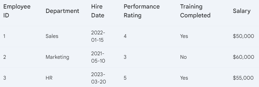
- Create a Dedicated “Data” Sheet: Create a new worksheet named “Data” to store your raw data. This separation is essential for preventing accidental data modifications and keeping your dashboard clean.
- Use a Tabular Format (Structured Data): Organize your data in a tabular format (rows and columns) with clear and concise column headers in the first row. Each column should represent a specific data point (e.g., “Employee ID,” “Name,” “Department,” “Hire Date,” “Performance Rating,” “Training Completed,” “Salary”).
- Ensure Data Consistency and Quality:
- Consistent Data Formats: Use consistent date formats (e.g., YYYY-MM-DD), number formats (e.g., currency, percentage), and text formats.
- Handle Missing Data: Avoid blank cells. Use 0 for numerical data or “N/A” (Not Applicable) or other appropriate indicators for text data.
- Validate Data Types: Ensure data types are correct (e.g., numbers for numerical data, text for text data, dates for dates). This is crucial for accurate calculations and chart creation.
B. Setting Up the Dashboard: Visualizing Your Data
- Create a “Dashboard” Sheet: Create a new worksheet named “Dashboard” where your visualizations will reside.
- Plan Your Dashboard Layout: Consider how you want to present your data. A common approach is to place key metrics (KPIs) at the top and supporting charts below.
- Choose the Right Chart Types: Select appropriate chart types to effectively visualize your data:
- Employee Count by Department: Bar or column chart.
- Turnover Rate Over Time: Line chart.
- Performance Rating Distribution: Histogram or column chart. Avoid pie charts for this if there are many rating categories.
- Salary Distribution: Histogram or box plot. For visualizing data distributions—such as performance ratings or salary bands—a histogram can be a highly effective chart type. Learn how to make a histogram in Excel using two simple methods.
- Create Your Charts:
- Select the data you want to visualize on the “Data” sheet (or a PivotTable if you’re using one).
- Go to the “Insert” tab and choose the desired chart type.
- Move the chart to your “Dashboard” sheet.
- Add Clear Titles, Labels, and Formatting: Give each chart a descriptive title, label the axes clearly, and use consistent formatting (colors, fonts).
- Use PivotTables for Data Summarization: For large datasets, PivotTables are essential for summarizing data before creating charts.
C. Advanced Excel Features for HR Dashboards (Optional Enhancements)
These features can enhance your dashboards but are not strictly necessary for a basic dashboard:
- Power Query (Get & Transform Data): Power Query is used to import and clean data from various sources (databases, web pages, text files). This is highly useful for automating data updates and handling messy data.
- Conditional Formatting: Use conditional formatting to highlight key metrics or trends visually. For example, use color scales to highlight high and low-performance ratings or icon sets to indicate performance trends.
- Power Pivot: Use Power Pivot to manage and analyze extremely large datasets that exceed Excel’s row limits. This is useful for more complex analysis and creating relationships between multiple data tables.
Best Practices for Creating HR Dashboards
Creating effective HR dashboards requires more than just knowing how to use Excel. Following these best practices will ensure your dashboards are informative, user-friendly, and drive meaningful insights:
Keep It Simple (Less is More)
A dashboard should present information in a clear, concise, and easily digestible manner. It’s about maximizing impact with minimal clutter. In practice, this means:
- Focus on Key Metrics: Highlight essential KPIs aligned with HR and business objectives.
- Prioritize Clarity: Use simple, intuitive visuals over complex charts.
- Utilize White Space: Avoid clutter; use spacing to improve readability.
Make Dashboards Interactive (Empower Exploration)
Dashboards shouldn’t just be static displays of information; they should allow users to actively engage with the data, explore different perspectives, and uncover deeper insights.
- Implement Filters and Slicers: Allow users to drill down into specific data segments, such as department-specific details.
- Enable Drill-Down Functionality: Use PivotTables to let users explore underlying data.
- Provide Tooltips: Add hover-over context for detailed insights without overcrowding the dashboard.
Update Data Regularly (Maintain Relevance)
Employee information, performance metrics, and recruitment data are dynamic and need to be kept current to ensure the dashboard provides accurate and actionable insights.
- Automate Updates: Connect dashboards to live data sources to maintain accuracy.
- Schedule Updates: For manual systems, set regular update intervals.
- Indicate Update Timelines: Clearly display when data was last refreshed.
Design for Your Audience (User-Centric Approach)
Your HR dashboard should be tailored to the specific needs and understanding of the people who will be using it.
- Understand Stakeholders: Tailor dashboards to meet the specific needs of users, such as HR managers or executives.
- Use Clear Labels: Avoid jargon and keep titles concise.
- Iterate with Feedback: Test designs with users and refine them based on their input.
Maintain Data Integrity (Accuracy is Key)
The data used in your dashboards must be accurate, consistent, and reliable. Garbage in, garbage out—if your data is flawed, your dashboard will be misleading and potentially harmful.
- Validate Data: Check accuracy and completeness before using it.
- Document Sources: Clearly outline data origins and calculations for transparency.
Benefits of Using Excel for HR Dashboards
Leveraging Excel dashboards for HR data offers significant advantages that can transform HR operations and drive organizational success:
Time-Saving: Streamlining HR Processes and Freeing Up Time for Strategic Initiatives
- Automated Reporting and Visualization: Automation reduces manual tasks, freeing up time for strategic initiatives like workforce planning and employee engagement.
- Quick Access to Key Metrics: Dashboards consolidate data, enabling faster decision-making without navigating multiple spreadsheets. For example, turnover rates can be reviewed instantly.
Improved Decision-Making: Data-Driven Strategies for Better Outcomes
- Real-Time Insights: Dashboards provide up-to-date data for proactive HR management, such as addressing absenteeism trends promptly.
- Trend Analysis: Visualizing trends in areas like recruitment or performance helps HR address potential issues early, such as rising turnover in specific departments.
Increased Collaboration: Enhanced Communication and Shared Understanding
- Transparent Reporting: Sharing dashboards fosters transparency and makes complex data accessible to stakeholders, like providing hiring managers with recruitment progress.
- Shared Insights: Dashboards promote collaboration between HR and department heads by offering a unified view of key metrics, aiding discussions on performance or development needs.
Conclusion on Using Excel for HR Dashboards
HR professionals are increasingly turning to data to gain insights into their workforce. From monitoring employee performance to analyzing recruitment trends, data plays a pivotal role. Creating effective HR dashboards in Excel empowers HR professionals to make data-driven decisions.
By utilizing Excel’s features, HR can improve reporting, streamline processes, and foster positive organizational change. If you need assistance, consider Excel consulting services for customized dashboard development.
As outlined above, building an HR dashboard involves several key steps. If you find the technical aspects challenging or want to speed up the process while ensuring a professional and impactful outcome, Bsuite365 offers expert Excel consulting and dashboard development services.
We can assist you with everything from data organization and cleaning to advanced visualization and automation. Contact us today to discuss your project!
Our experts will be glad to help you, If this article didn’t answer your questions. ASK NOW
We believe this content can enhance our services. Yet, it’s awaiting comprehensive review. Your suggestions for improvement are invaluable. Kindly report any issue or suggestion using the “Report an issue” button below. We value your input.
About the Author: Fariba Me
document.getElementById(“review-notice”).remove();
document.getElementsByTagName(“hide-notice”)[0].parentNode.remove();
}