Descriptive Statistics in Excel for Better Decision-Making
- Understanding Excel Descriptive Statistics
- Excel Functions for Descriptive Statistics
- Visualizing Descriptive Statistics
- Creating Charts and Graphs in Excel
- Interpreting Excel Descriptive Statistics Results
- Using Descriptive Statistics to Make Informed Decisions
- Descriptive Statistics Real-World Applications
- Advanced Tips and Tricks
- Shortcuts, Excel Add-ins, or Third-party Tools
- Troubleshooting Common Issues
- Conclusion
- FAQs
Understanding data is critical to making informed decisions and grasping the world around us. Descriptive statistics in Excel, the art of transforming data into meaningful insights, is a crucial skill. This guide is for anyone interested in making sense of data. Whether you’re a professional looking to improve decision-making, a student diving into statistics, or simply curious about numbers, we’re here to simplify complex concepts.
Understanding Excel Descriptive Statistics
Descriptive statistics in Excel is a critical aspect of statistics that simplifies and summarizes data to make it more accessible and understandable for researchers, analysts, and decision-makers. Its primary functions include condensing complex datasets, facilitating data exploration, and enhancing data interpretation through summary measures and visual representations.
It aids in data comparison, understanding data central tendencies and variability, and assists in data cleaning by identifying errors or outliers. In essence, descriptive statistics in Excel provides a foundational framework for the initial stages of data analysis, helping individuals to quickly grasp the main characteristics of a dataset and make informed decisions based on their observations and insights.
Types of Data and Their Relevance in Statistical Analysis
Understanding data types is essential in statistical analysis, guiding the choice of suitable statistical methods and measures. Each data type has distinct attributes that impact the interpretation of the result.
- Nominal Data: Represents categories without inherent order. It’s used for frequency counts and proportions.
- Ordinal Data: Involves ordered categories with unequal intervals. The analysis includes median and percentiles, not mean or standard deviation.
- Interval Data: refers to numeric data with consistent and meaningful intervals, often used for various calculations and analysis. Excel provides functions like SUM, AVERAGE, and charting tools to work with this type of data.
- Ratio Data: is numeric data measured on a scale with consistent intervals and a meaningful true zero point, allowing for a wide range of mathematical operations and analyses.
Empower your business with our Excel Programming and VBA Macro Development Services, tailored to automate tasks and unlock the full potential of your data management capabilities.
Excel Functions for Descriptive Statistics
Here are step-by-step instructions on how to use Excel functions for calculating mean, median, mode, range, variance, and standard deviation:
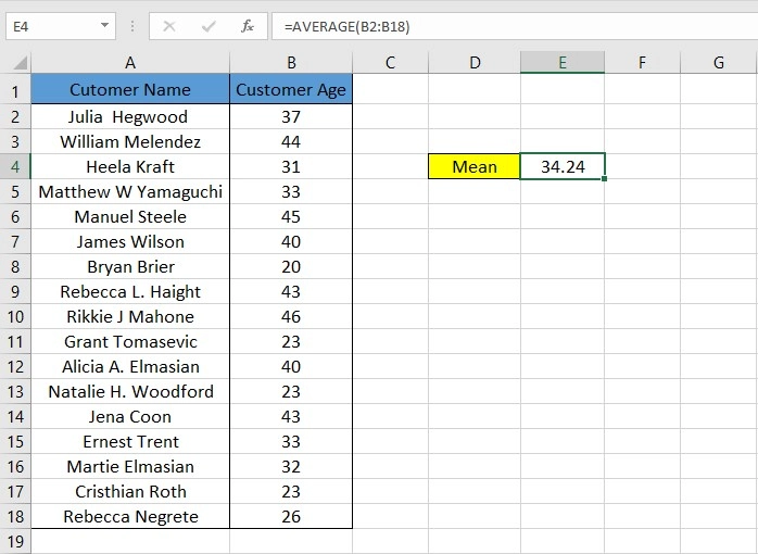
- Mean (Average)
Also called the average, it’s found by summing all data values and dividing by the count. This measure is sensitive to outliers. To calculate the Mean in Excel,
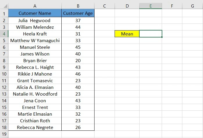
- Open your Excel workbook and select the cell where you want the Mean to appear. Here, we have a dataset containing customers’ names and ages:
2. Enter the following formula: `=AVERAGE(range),` where “range” represents the cells containing the data you want to calculate the mean for (e.g., `=AVERAGE(B2:B18)`).
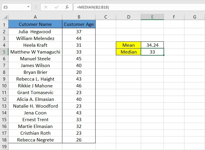
- Median
The median is the middle value in ordered data, or the average of two middle values for even datasets. It is less affected by outliers. To calculate the Median in Excel,
1. Select the cell where you want the Median to appear.
2. Enter the following formula: `=MEDIAN(range)`, where “range” refers to the cells containing the data you want to calculate the median for (e.g., `=MEDIAN(B2:B18)`).
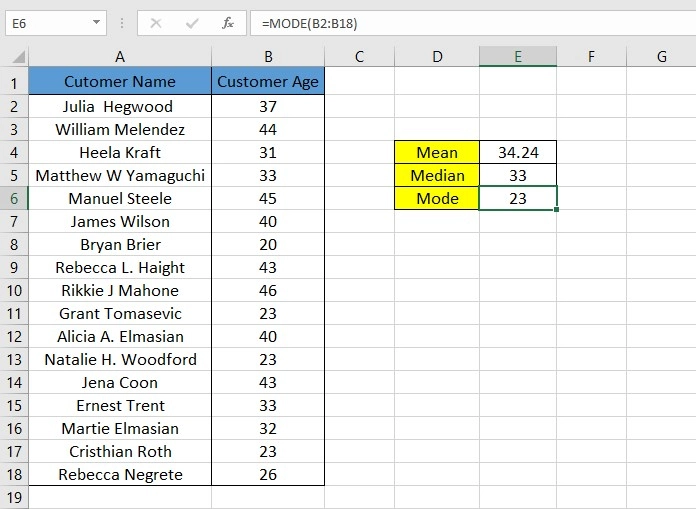
- Mode
Mode is the most frequently occurring value, useful for identifying common values in categorical data. To calculate Mode in Excel,
1. Choose the cell where you want the Mode to be displayed.
2. Enter the following formula: `=MODE(range),` where “range” represents the cells containing the data you want to find the mode for (e.g., `=MODE(B2:B18)`).
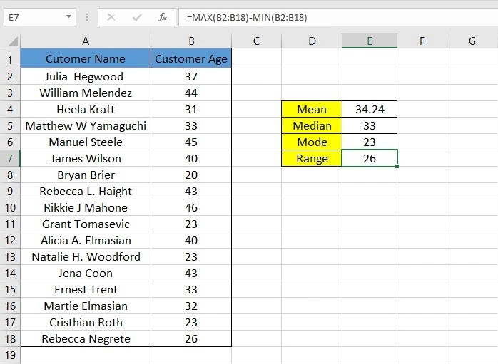
- Range
The range is calculated by subtracting the minimum from the maximum value and is affected by outliers. To calculate the Range in Excel,
1. Select the cell where you want the Range to be shown.
2. Enter the following formula: `=MAX(range) – MIN(range),` where “range” includes the cells with the data you want to find the range for (e.g., `=MAX(B2:B18) – MIN(B2:B18)`).
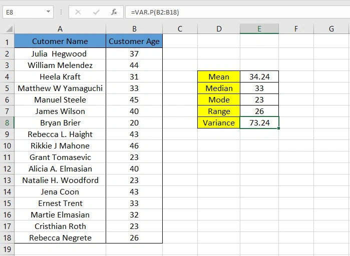
- Variance
Measuring how data points deviate from the mean, the Variance is calculated as the average of squared differences from the mean. To calculate Variance in Excel,
1. Choose the cell where you want the Variance to appear.
2. Enter the following formula: `=VAR.P(range)`, where “range” contains the cells with the data you want to calculate the variance for (e.g., `=VAR.P(B2:B18)`).
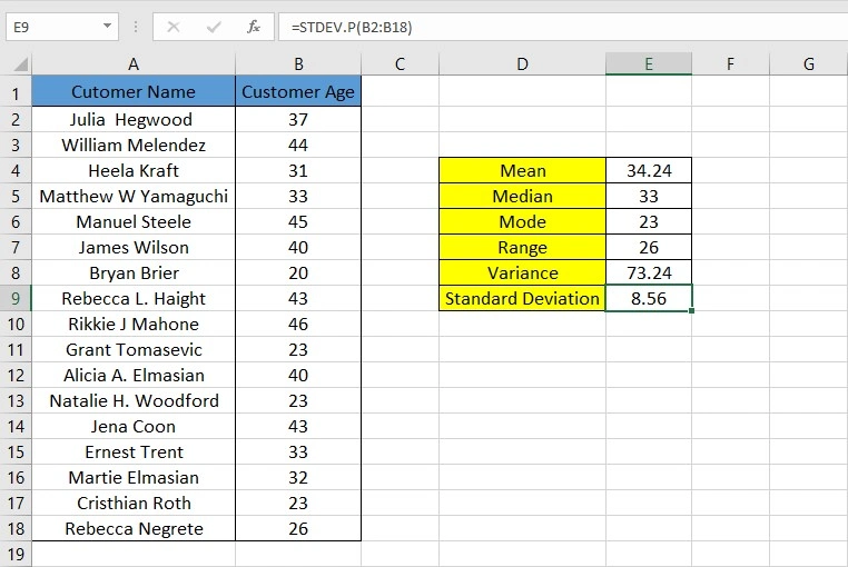
- Standard Deviation
The square root of the Variance provides a more interpretable measure of data spread which is the Standard Deviation. Smaller values of Standard Deviation indicate that data points are closer to the Mean. To calculate Standard Deviation in Excel,
1. Select the cell where you want the Standard Deviation to be displayed.
2. Enter the following formula: `=STDEV.P(range)`, where “range” includes the cells containing the data for which you want to calculate the standard deviation (e.g., `=STDEV.P(B2:B18)`).
Unlock valuable insights with our Data Visualization and Data Analytics Services, transforming complex data into clear, actionable strategies for informed decision-making.
Potential Pitfalls or Common Errors to Avoid
Using Excel functions for calculating Mean, Median, Mode, Range, Variance, and Standard Deviation is generally straightforward, but there are some common pitfalls and errors to be aware of:
- Incomplete Data
Ensure your data range includes all the values you want to analyze. Leaving out data points can significantly impact your results. Double-check that your data is complete before applying any functions.
- Mixed Data Types
Excel functions may not work correctly if your data contains mixed types (e.g., numbers and text) in the same range. Ensure that your data is consistent in terms of data types.
- Ignoring Outliers
Outliers (extreme values) can skew results, especially for Mean and Standard Deviation. Failing to identify and handle outliers can cause misleading conclusions. Consider removing outliers or using more robust statistical measures if appropriate.
- Using the Wrong Function
Selecting the wrong Excel function for your data type can lead to incorrect results. For instance, using the MEDIAN function for non-numeric data. Choose the appropriate function based on the nature of your data (e.g., AVERAGE for numeric, MODE for categorical).
- Using Sample Variance or Standard Deviation
Excel offers both sample and population Variance/Standard Deviation functions. Ensure you use the correct one based on your data:
- Sample functions (e.g., VAR.S and STDEV.S) are used when your data represents a sample from a larger population.
- Population functions (e.g., VAR.P and STDEV.P) are used when your data represents the entire population.
Understand whether your data represents a sample or a population, and choose the appropriate function accordingly.
Visualizing Descriptive Statistics
In this section, we delve into the pivotal role of data visualization in comprehending descriptive statistics in Excel.
Importance of Data Visualization in Understanding Descriptive Statistics
Data visualization plays a crucial role in understanding descriptive statistics in Excel for several reasons:
- Enhances Data Interpretation: Visual representations like charts and graphs make it easier to interpret and grasp the main characteristics of a dataset. Descriptive statistics alone may not convey the complete picture, but visualization provides a clear and intuitive view.
- Reveals Patterns and Trends: Visualization can uncover patterns, trends, outliers, and data distributions that may not be immediately apparent in raw numbers. They help in identifying relationships and anomalies within the data.
- Facilitates Communication: Visualizations are effective tools for communicating data insights to others, whether in reports, presentations, or discussions. They make it easier for non-experts to understand the data.
- Simplifies Benchmarking: Visualizations allow for easy comparison of multiple datasets or the benchmarking of one dataset against another, which is essential in research and decision-making processes.
For a deeper understanding of how to approach time series data and enhance your data visualization skills, check out our Time Series Analysis and Excel Visualization guide.
Creating Charts and Graphs in Excel
Here’s how to create three common types of charts and graphs in Excel:
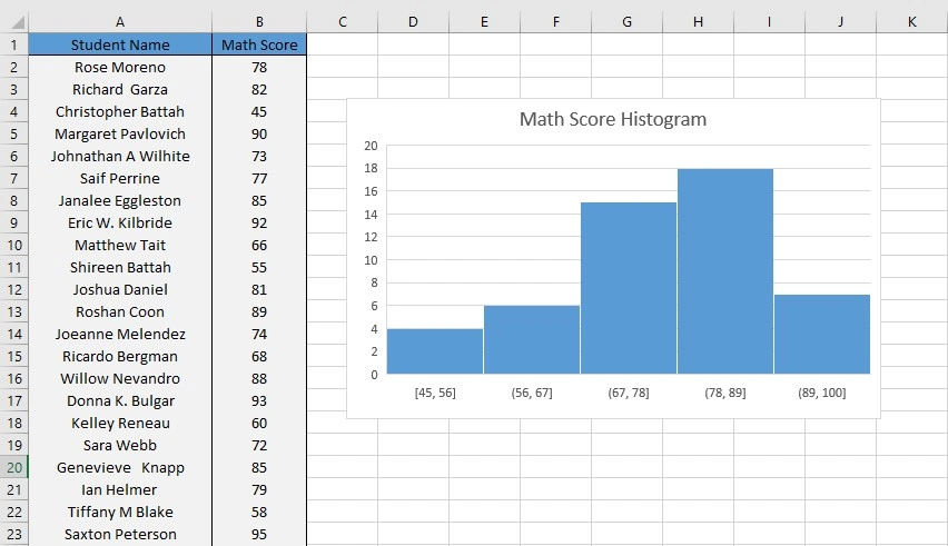
- Histogram
Histograms are an appropriate visualization tool for continuous numerical data where the range of data values is divided into intervals, known as bins. Imagine you have a dataset containing the test scores of 50 students, and you want to create a histogram out of it. To do so:
- Select the data you want to create a histogram for.
- Go to the “Data” tab and click on “Data Analysis” (If you don’t see it, you may need to enable the Analysis ToolPak add-in).
- Choose “Histogram” from the list of analysis tools.
- In the dialog box that appears, specify the input range (the data you selected), the bin range (the range of values for each bar in the histogram), and the location for the output. Also, make sure that the Chart Output checkbox is selected.
- Click “OK,” and Excel will generate a histogram in Excel.
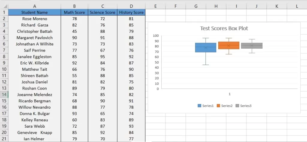
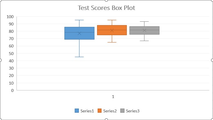
2. Box Plot (Box and Whisker Plot)
Box plots, also known as box-and-whisker plots, are ideal for visualizing the distribution of a dataset across its quartiles. Box plots provide a five-number summary of a dataset: minimum, first quartile (Q1), median (second quartile, Q2), third quartile (Q3), and maximum. This summary gives a quick overview of the central tendency and spread of the data.
Let’s say you have the test scores for 30 students in three different subjects. To create a Box Plot out of this data:
- Select the data you want to create a Box Plot for.
- Go to the “Insert” tab and click on “Box & Whisker Plot” from the charts group.
- Excel will create a box plot for the selected data.
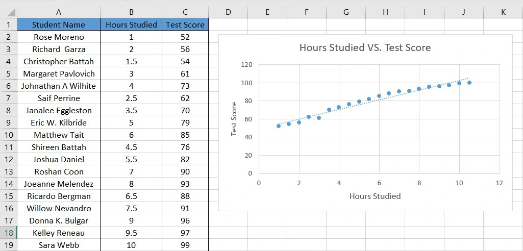
3. Scatter Plot
Scatter plots are used to show the relationship between two sets of data, often to identify any correlation or trend patterns. If you’re interested in learning how to create a scatter plot, check out our detailed guide on How To Make A Scatter Plot In Excel.
Suppose you have a data table containing Hours Studied vs. Test Scores of 20 students. To create a Scatter Plot out of this data:
- Select the data you want to create a scatter plot for. This typically involves having two columns of data, one for the x-axis and one for the y-axis.
- Go to the “Insert” tab, and select “Scatter” from the charts group.
- Choose the type of scatter plot you want (e.g., markers only, markers with straight lines, etc.).
- Excel will generate the scatter plot.
Choosing The Right Visualization For Different Types of Data
Selecting the right visualization element for your data in Excel is essential for conveying information effectively. The choice depends on the type of data and the message you want to convey. Here’s guidance on choosing the right visualization for different data types:
- Categorical Data: Use bar charts, pie charts, or stacked bar charts to visualize categorical data.
- Time Series Data: Line charts or area charts are suitable for showing trends over time.
- Comparison of Data: Use scatter plots for comparing two numerical variables and box plots for comparing data distributions.
- Geographical Data: Maps and bubble maps are appropriate for geographical data.
- Hierarchical Data: Treemaps or sunburst charts work well for visualizing hierarchical data.
- Distribution Data: Histograms and probability density function (PDF) plots are ideal for displaying data distributions.
- Comparison of Data Sets: Side-by-side bar charts and grouped bar charts are useful for comparing datasets.
- Proportions and Percentages: 100% stacked bar charts and donut charts are suitable for visualizing proportions and percentages.
Interpreting Excel Descriptive Statistics Results
Interpreting the results of descriptive statistics in Excel is a crucial step in understanding a dataset and drawing meaningful conclusions from it. Let’s discuss how to interpret these results, their implications, and their practical significance:
How to Interpret The Results of Descriptive Statistics
Interpreting descriptive statistics results is a crucial step in understanding data. Descriptive statistics, as exemplified by Excel’s tools, provide a meaningful summary of data. At the core of this interpretation are measures of central tendency, like the Mean, Median, and Mode, and measures of variability, including the Range, Standard Deviation, and Variance.
Interpreting Central Tendency
When interpreting the central tendency of a dataset, it is important to consider the type and the distribution of data.
- For normally distributed data, the Mean, Median, and Mode will be approximately equal. This means that you can use any of these measures of central tendency to get a good understanding of the typical value in the dataset.
- For skewed data, the Median is a more accurate measure of central tendency than the Mean. This is because the Median is not affected by outliers, while the Mean can be skewed by them.
- For categorical data, the Mode is the most accurate measure of central tendency. This is because the Mode represents the most frequent category in the dataset.
Interpreting Variability
When interpreting the variability of a dataset, it is important to consider the type of data and the range of possible values.
- For normally distributed data, the Standard Deviation is a good measure of variability. This is because the Standard Deviation tells you how much of the data is within one Standard Deviation of the Mean, two Standard Deviations of the Mean, and so on.
- For skewed data, the Range is a more informative measure of variability than the Standard Deviation. This is because the Range tells you the full range of values in the dataset, while the Standard Deviation can be skewed by outliers.
- For categorical data, the Range is the most informative measure of variability. This is because the Range tells you the number of different categories in the dataset.
Transform your financial analysis with our comprehensive Excel Financial Modeling Services, providing accurate and insightful models to drive informed decision-making.
Using Descriptive Statistics to Make Informed Decisions
Descriptive statistics offers several avenues for making well-informed decisions and drawing meaningful conclusions. Here are some practical ways to leverage descriptive statistics for these purposes:
- Comparing Data From Different Groups
Descriptive statistics in Excel enables you to compare the central tendencies and variabilities of data from distinct groups. For instance, you can contrast the average heights of men and women or the average test scores of students from different schools. This comparison provides insights into the differences and similarities between these groups, aiding in informed decision-making.
- Identifying Outliers
Excel Descriptive statistics is valuable for identifying outliers within the dataset—data points that significantly deviate from the majority. Detecting and dealing with outliers is crucial because they can skew your analysis. Removing outliers can enhance the accuracy of your conclusions and decisions.
- Forming Hypotheses
Descriptive statistics can be instrumental in hypothesis generation. For example, if you observe a substantial difference in the average height between men and women, you might formulate the hypothesis that men are generally taller than women. Subsequently, inferential statistics can be used to rigorously test this hypothesis, adding a layer of statistical confidence to your conclusions.
Descriptive Statistics Real-World Applications
Here are some scenarios that exemplify the practical importance of descriptive statistics:
- Marketing Insights
A marketing manager employs descriptive statistics to gain insights into the characteristics of their target customer base. For instance, they may utilize the average age, income, and education level of their customers to design marketing campaigns tailored to their specific preferences and requirements.
- Quality Control Monitoring
A quality assurance engineer utilizes descriptive statistics to monitor the quality of products over time. For example, they might rely on the standard deviation of product defects to pinpoint areas where the manufacturing process is either improving or deteriorating, enabling timely interventions.
- Medical Research Comparisons
In medical research, descriptive statistics come into play when comparing the effectiveness of different treatments. For instance, a medical researcher might employ the mean survival rate of patients in various treatment groups to determine which treatment exhibits the highest efficacy.
Advanced Tips and Tricks
Here are some more advanced tips and tricks for descriptive statistics in Excel.
Handling Large Datasets or Complex Calculations
When working with extensive datasets or intricate computations in Excel, it is crucial to employ efficient methods to avert performance issues. Here are some recommendations:
- Data Tables: Save time and effort by using data tables for calculations across a range of values, avoiding the need for manual formula input, especially with large datasets.
- Named Ranges: Improve formula readability and performance by assigning meaningful labels to cell ranges with defined names, making formulas easier to manage.
- Array Formulas: Speed up calculations by using array formulas to process multiple values simultaneously, which is particularly useful for handling extensive datasets.
- Excel Add-ins and Tools: Simplify descriptive statistics in Excel tasks by exploring various Excel add-ins and third-party tools. Some tools can automatically generate histograms, box plots, and other visualizations, streamlining the analytical process.
Shortcuts, Excel Add-ins, or Third-party Tools
Here are some shortcuts, Excel add-ins, and external tools that can simplify descriptive statistics tasks:
Keyboard Shortcuts
- Ctrl + Shift + Enter: This shortcut is used to create an array formula, which can be handy for performing complex calculations on multiple data points.
- Alt + F1: It opens the Formula Palette, providing quick access to commonly used formulas.
- F9: This key triggers the recalculation of all formulas in the worksheet.
Excel Add-ins
- Analysis ToolPak: Excel’s Analysis ToolPak offers a range of statistical functions, including those for descriptive statistics.
- StatPlus for Excel: StatPlus for Excel is a robust add-in that extends Excel’s capabilities with a wide array of statistical functions, including advanced descriptive statistics.
Third-Party Tools
- SPSS: SPSS is a dedicated statistical software package that facilitates a broad spectrum of descriptive and inferential statistical analyses.
- R: R is a free and open-source statistical programming language that empowers users to perform a comprehensive array of statistical analyses, including descriptive statistics.
Troubleshooting Common Issues
Here are some tips to troubleshoot common issues encountered in descriptive statistics tasks in Excel:
- Data Format: Ensure that your data is correctly formatted. For instance, when using the AVERAGE function, make sure that all data points are in numeric format.
- Formula Errors: If you obtain unexpected results, meticulously review your formulas for any errors or inconsistencies.
- Function Selection: Given the variety of statistical functions in Excel, make certain that you’re employing the appropriate one for your specific requirements.
- Add-ins and Third-Party Tools: If issues persist, consider using Excel add-ins or external tools. They often offer a more user-friendly and error-resistant approach compared to Excel’s built-in statistical functions.
While Excel’s built-in Descriptive Statistics tool provides a great summary of common metrics like mean, median, mode, and standard deviation, it doesn’t directly show you how many unique or distinct values are in your dataset. If you’re analyzing categorical or survey data, knowing how many unique entries exist can be just as important. Learn how to count unique and distinct values in Excel to enhance your statistical analysis.
Conclusion
Understanding descriptive statistics in Excel is your gateway to unraveling the power of data analysis. From grasping the fundamentals of data types, central tendencies, and variabilities to data preparation, Excel functions, visualization, interpretation, and mastering advanced techniques, this journey equips you with the expertise to transform raw data into actionable insights. Real-world applications illustrate the broad impact of these skills in diverse fields, from marketing to healthcare. Whether you’re a professional or a beginner, these skills are a catalyst for informed decisions, data-driven discoveries, and a deeper understanding of your world.
FAQs
Fundamental descriptive statistics measures in Excel include Central Tendency measures and Variability measures:
Central Tendency measures include Mean, Median, and Mode, calculated by Excel functions like AVERAGE, MEDIAN, and MODE.
Variability measures include Range, Standard Deviation, and Variance, calculated by Excel functions like STDEV.S, STDEV.P, VAR.S, and VAR.P.
– Choosing the wrong measure that doesn’t match your data and objectives
– Ignoring data distribution, as the mean might not be suitable for skewed data
– Neglecting outliers, as they can distort results significantly
– Misinterpreting results can lead to false conclusions about what descriptive statistics convey about your data
Descriptive statistics in Excel help businesses understand customer behavior, improve product quality, analyze financial performance, and evaluate marketing campaign effectiveness, enabling informed decision-making and strategic planning.
To ensure accurate and efficient data analysis, partnering with Professional Excel Consulting Services can help you implement advanced statistical techniques, automate calculations, and optimize your workflow for better decision-making.
Our experts will be glad to help you, If this article didn’t answer your questions. ASK NOW
We believe this content can enhance our services. Yet, it’s awaiting comprehensive review. Your suggestions for improvement are invaluable. Kindly report any issue or suggestion using the “Report an issue” button below. We value your input.