Mastering Excel Data Analysis: Tips and Common Challenges
Excel data analysis tools are fundamental processes across various fields, serving as the cornerstone for informed decision-making and problem-solving. From business and finance to science and research, the ability to extract meaningful insights from data is paramount. In this context, Microsoft Excel emerges as a versatile and indispensable tool, empowering individuals and organizations alike to explore, analyze, and visualize data efficiently. In this guide, we will delve into the significance of data analysis tools and techniques in Excel, Excel’s role as a pivotal data analysis tool, and how it can be harnessed to navigate the complexities of data in the modern world.
Common Data Analysis Challenges
Excel data analysis tools play a pivotal role in addressing and mitigating common data analysis challenges. They assist in managing data volume and complexity, enhancing data quality, and improving the efficiency of analysis. These tools are instrumental in revealing hidden insights within data, facilitating effective communication of findings, and ensuring data security. Moreover, they offer opportunities for skill development and are designed to scale alongside growing data needs. In summary, data analysis tools empower users to overcome hurdles, making data analysis more accessible and impactful across various domains.
Efficient data management is crucial to Excel data analysis tools due to the vast daily data influx across various channels. To derive meaningful insights, businesses must embrace analytics tools for real-time data collection, management, and analysis.
- Collecting Meaningful Data: The high data volume poses a challenge, with manual sorting and analysis being time-consuming. Utilizing data analysis techniques in Excel streamlines this process, enhancing productivity through real-time reporting and employee training.
- Selecting the Right Data Analysis in Excel 365: Choosing the perfect tool for data analytics is essential. Factors such as budget, scalability, and integration capabilities should be considered. Expert consultation or training for non-experts can aid in tool selection.
- Data Visualization: Manual data visualization is impractical and time-consuming. Free data analysis tool in Excel simplify this task, ensuring accuracy and relevance in decision-making.
- Data from Multiple Sources: Manually consolidating data from various sources is time-intensive. Reliable software can gather and analyze data comprehensively, reducing the risk of errors.
- Low-Quality Data: Manual data entry is prone to inaccuracies. Automating data collection minimizes errors and enhances data integrity.
- Data Analysis Skills Challenges: A shortage of skilled professionals hinders insightful data interpretation. Training programs or user-friendly software can bridge this gap.
- Scaling Challenges: As data volumes grow, scalability becomes vital. Ensure your analytics tool can support efficient data analysis as your business expands.
- Data Security: Increasing data storage elevates security concerns. Mitigate risks through access control, data encryption, and cybersecurity measures.
- Budget Limitations: Data analysis can be cost-intensive. Careful budgeting, ROI calculations, and strategic solutions are essential to acquire the necessary tools and expertise.
For a comprehensive overview of creating charts and graphs in Excel, be sure to check out our ‘A Basic Guide To Charts And Graphs In Excel‘ article.
Excel’s Built-In Data Analysis Tools
Excel provides a range of built-in data analysis tools that are fundamental for performing basic data analysis tasks. Here, we’ll discuss Excel’s native features for data analysis and how they can be applied to solve common data analysis problems:
- Functions (e.g., SUM, AVERAGE)
- SUM: The SUM function allows you to add up a range of numbers. It is commonly used to calculate the total of a set of values, such as sales figures, expenses, or scores.
- AVERAGE: The AVERAGE function computes the arithmetic mean of a range of numbers. It’s used to find the average value of data points, like average test scores or monthly temperature readings.
- Filters
- AutoFilter: Excel’s AutoFilter feature enables you to filter data in a column based on specific criteria. This is useful for quickly identifying and analyzing data that meets certain conditions. For example, you can filter a list of sales transactions to view only those that occurred in a particular month.
- Advanced Filter: Advanced Filter provides more complex filtering options for data analysis tools and techniques in Excel, allowing you to create custom filter criteria using logical operators. It’s helpful for more intricate data analysis tasks, such as extracting unique values or filtering based on multiple conditions.
Unlock valuable insights with our Data Visualization and Data Analytics Services, transforming complex data into clear, actionable strategies for informed decision-making.
How These Tools Can Be Applied
- Summarizing Data
- Use the SUM function to calculate the total sales, expenses, or any other numeric data in a dataset.
- Utilize the AVERAGE function to find the average price, rating, or any other numeric metric in your data.
- Filtering and Sorting Data
- Apply AutoFilter to quickly isolate data that meets specific criteria. For instance, filter a list of products to see only those with a price range or filter a list of employees to view only those in a particular department.
- Use Advanced Filters to perform more complex filtering, such as extracting records that meet multiple conditions or creating custom filtering criteria.
- Data Validation
- Use Excel’s data validation feature to restrict the type of data that can be entered in a cell. For instance, you can ensure that only valid dates, specific values, or numbers within a certain range are input.
- PivotTables
- PivotTables are advanced data analysis tools in Excel. They allow you to summarize and analyze large datasets by creating dynamic tables that can be customized to show various aspects of your data. For example, you can use a PivotTable to analyze sales data by product, region, and time period.
- Excel provides various chart types to visualize data, such as bar charts, line graphs, and pie charts. These visualizations can help you understand trends and patterns in your data more easily.
If you’re interested in creating gauge charts in Excel, don’t miss our step-by-step tutorial on ‘How To Draw Gauge Charts In Excel‘ for expert guidance.
Advanced Excel Data Analysis Tools
Advanced Excel data analysis tools are features and functions within Microsoft Excel that allow you to perform complex data analysis tasks, manipulate data, and gain insights from your datasets. Here are some of the advanced data analysis tools and techniques in Excel:
PivotTables; a tool for data analysis in Excel 365
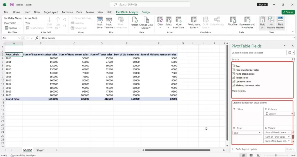
PivotTables is one of the most powerful Excel data analysis tools. They allow you to summarize and analyze your data in a variety of ways, making it easy to identify trends and patterns.
To create a PivotTable, simply select the range of data you want to analyze, click the Insert tab, and select the PivotTable button. You will then be prompted to select the location where you want to create the PivotTable.
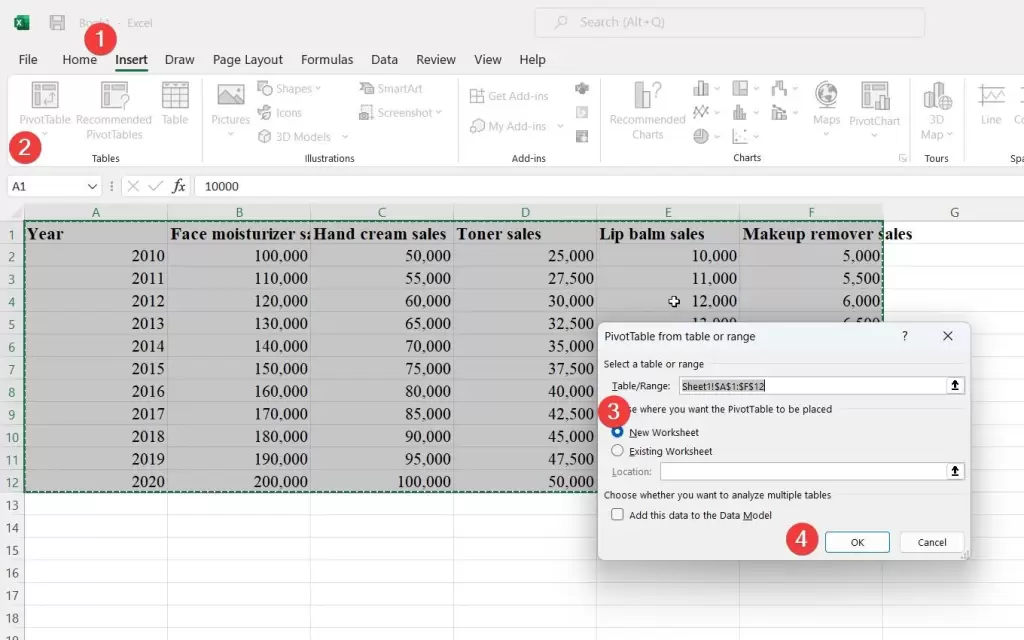
Once you have created a PivotTable, you can start dragging and dropping fields from the PivotTable Fields pane to the Rows, Columns, Values, and Filters areas of the PivotTable.
PivotCharts
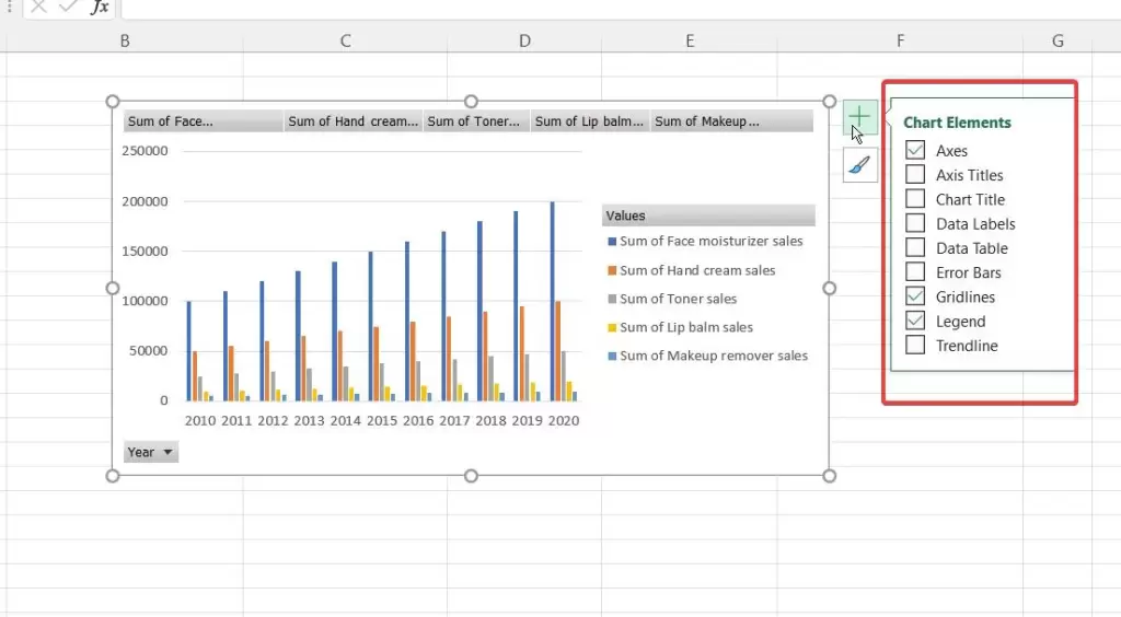
PivotCharts are a great way to visualize your PivotTable data. To create a PivotChart using Excel data analysis tools, simply select a PivotTable and then click the Insert tab and select the PivotChart button. You will then be prompted to select the type of chart you want to create.
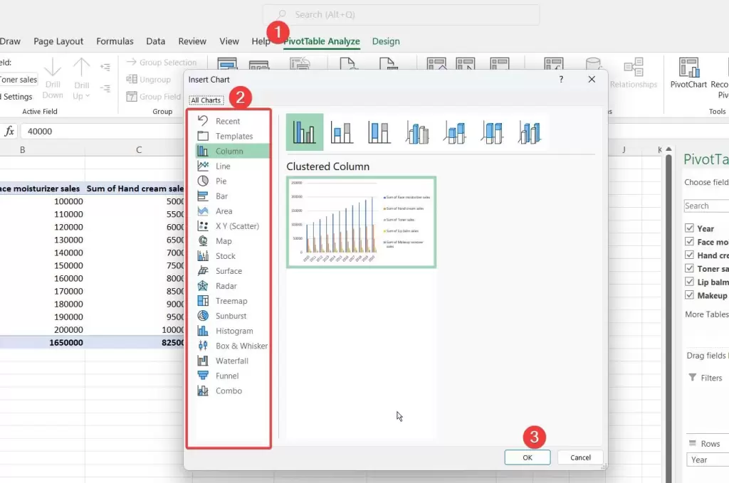
Once you have created a PivotChart, you can start customizing it to your liking. You can change the chart type, the colors, the fonts, and the labels. You can also add trendlines, data labels, and other elements to your chart.
Power Query
Power Query is a powerful tool for transforming and cleaning data. It allows you to import data from a variety of sources, including Excel spreadsheets, text files, and databases. You can then use Power Query to clean, transform, and merge your data before loading it into an Excel spreadsheet.
Boost your productivity by getting a free consultation from Excel experts, and discover tailored solutions to optimize your data management and analysis.
Solver
Solver finds optimal solutions for problems, including linear programming, mixed-integer programming, and non-linear programming. Define variables, the objective function, and constraints before using Solver. It’s powerful but complex; consider reading the documentation or watching tutorials if you’re new to it.
Data Analysis ToolPak
This free data analysis tool in Excel offers statistical and mathematical functions for complex tasks like regression analysis, ANOVA, and t-tests.
To activate it, go to File > Options > Add-Ins. You can utilize its functions by navigating to Data > Data Analysis.
Visualizing Data in Excel
Visualizing Data in Excel is the process of using Microsoft Excel to create charts and visual representations from raw data. When working with complex data sets, visual clarity is crucial. One effective way to enhance your charts is by using a secondary axis in Excel to better display different data series. These visualizations, including bar charts, pie charts, and scatter plots, simplify complex data, aid in identifying trends, and improve data communication.
Excel’s charting capabilities are essential for data analysis, reporting, and decision-making across various domains.
Excel charts and how to create various types of charts
Excel offers robust charting capabilities that enable users to create various types of charts to represent and analyze data effectively. When presenting your data visually, charts can be incredibly insightful. To make them even clearer, adding axis labels in Excel is a simple yet effective step. These charts include:
- Column Charts: Ideal for comparing data across categories, such as sales figures for different months.
Column charts are excellent for comparing data across different categories or displaying data in columns.
To create a column chart in Excel, first select the data you wish to visualize. Next, navigate to the Insert tab and then click on the Column chart type.
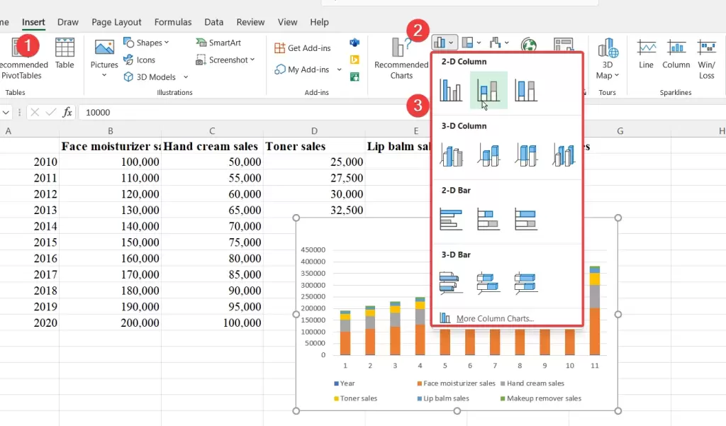
You’ll have various column chart subtypes to choose from, such as clustered columns for side-by-side comparisons or stacked columns for illustrating the composition of categories. Excel’s flexibility in column chart options allows you to present your data in the most effective way for your analysis and reporting needs.
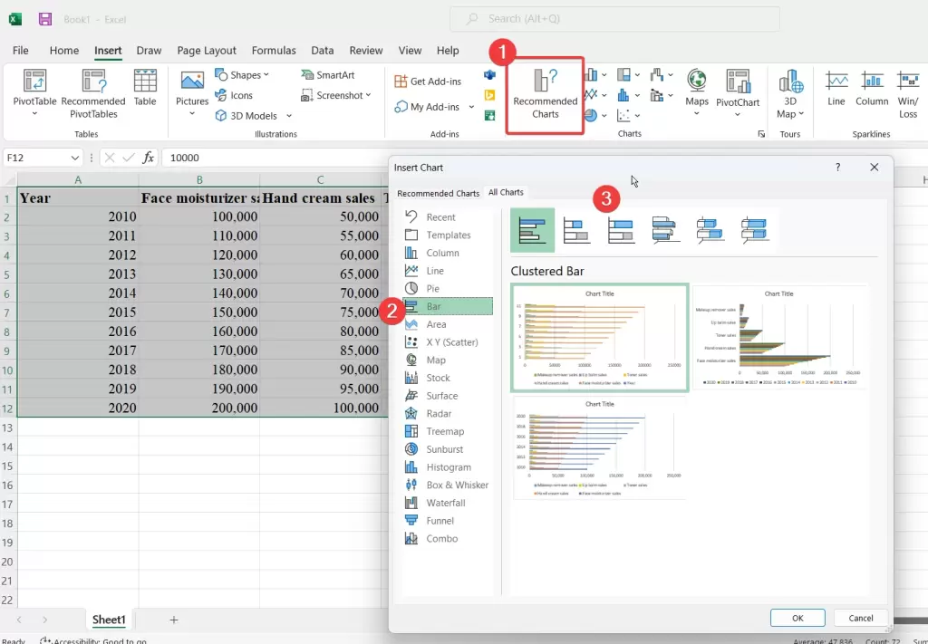
- Bar Charts: Like column charts but with horizontal bars, suitable for comparisons across categories.
A bar chart is ideal for comparing data across categories. To create one, start by selecting the data you wish to chart and then navigate to the Insert tab.

Click on the Bar chart type, and choose the specific sub-type that suits your data, such as clustered bar charts for comparing multiple data series side by side or stacked bar charts for showcasing the composition of each category.
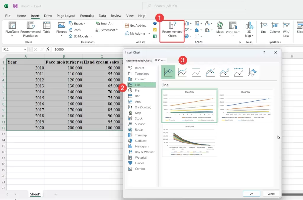
- Line Charts: Display trends over time, making them useful for tracking data changes, such as stock prices.
Line charts are perfect for tracking trends over time or showing continuous data. To create a line chart, select your data, then access the Insert tab.
Click on the Line chart type, and select the specific style that best represents your data, whether it’s a basic line chart or a more advanced stacked line chart.
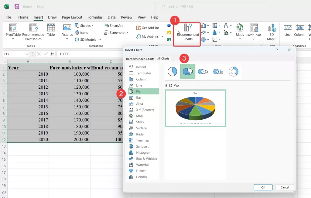
- Pie Charts: Show parts of a whole, useful for displaying percentages, like the composition of a budget.
Pie charts are great for displaying the composition of parts within a whole. To create a pie chart, select your data, then go to the Insert tab.
Click on the Pie chart type, and choose either a standard pie chart or a 3D pie chart for added visual impact. Excel will automatically calculate the percentages for each category based on your data.
- Area Charts: Similar to line charts but with the area under the line filled, making them suitable for visualizing cumulative data.
Area charts, like line charts, are suitable for visualizing data trends over time. They’re particularly effective at illustrating cumulative data. To create an area chart, choose your data, head to the Insert tab, and click on the Area chart type.
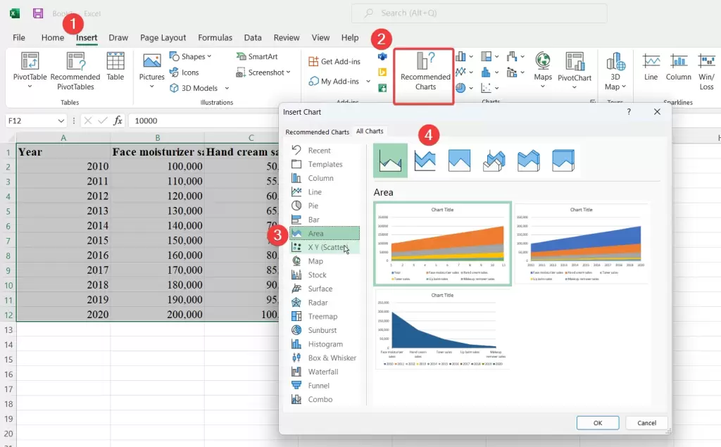
Excel offers options like stacked area charts to depict data series as cumulative areas, highlighting the overall trend.
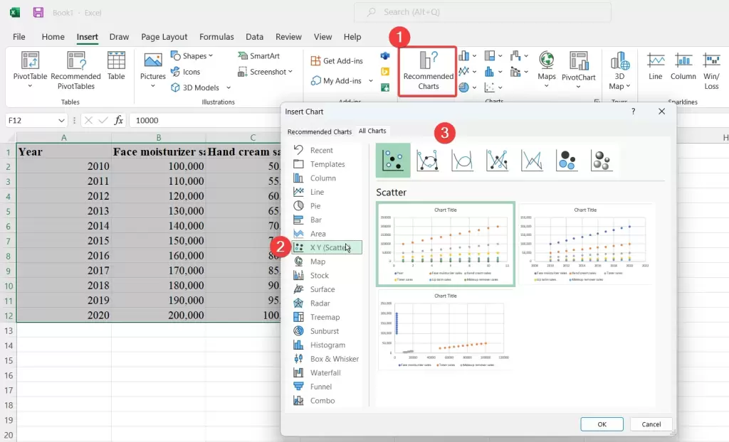
- Scatter Plots: Display the relationship between two sets of data, helping identify correlations or patterns.
Scatter plots are designed to reveal the relationship between two sets of data points. To create a scatter plot, select your data, then access the Insert tab.
Click on the Scatter chart type, and pick the specific scatter plot style that aligns with your data exploration goals, such as scatter plots with straight lines connecting data points to show trends or bubble charts for adding a third dimension with varying data point sizes.
Explore our comprehensive ‘Mastering Data Cleaning in Excel: A Step-by-Step Guide’ for invaluable insights on efficiently cleaning and organizing your data within Excel.
The Importance of Data Visualization in Analysis
The significance of data visualization in analysis cannot be overstated due to several compelling reasons.
Firstly, it offers clarity and facilitates comprehension. Visual representations simplify complex data, making it more accessible and interpretable. Charts and graphs provide an intuitive format for our brains to process information, significantly enhancing data understanding compared to raw numerical data.
Secondly, data visualization serves as a powerful tool for identifying trends, patterns, and outliers that might remain hidden in extensive datasets. This capability contributes to valuable insights, aiding in informed decision-making and problem-solving.
Additionally, effective data visualization fosters communication by providing a clear and concise means of conveying findings and insights to various stakeholders, including team members, clients, or stakeholders. Furthermore, it promotes exploration and discovery, allowing analysts to interactively manipulate charts to unveil concealed insights, thus facilitating a dynamic and iterative analysis process.
Gain expert guidance and maximize your efficiency with our Microsoft Excel Consulting Services, tailored to meet your specific business needs and challenges.
Moreover, visualizations play a pivotal role in error detection. Deviations from expected chart patterns can signal potential data anomalies or quality issues, prompting further investigation and ensuring data accuracy.
Additionally, data storytelling becomes possible through well-crafted visual narratives, guiding audiences through key insights and enhancing data-driven storytelling. Lastly, visualizations offer valuable decision support by presenting data in an actionable format, providing a foundation for understanding trends and facilitating well-informed choices in analytical processes.
Real-World Applications
Here’s a real-world application of using Excel data analysis tools, each with step-by-step instructions and screenshots.
Creating Data Visualizations in Excel
Excel provides a range of chart and graph options to assist in data visualization. Follow these steps to create data visualizations in Excel:
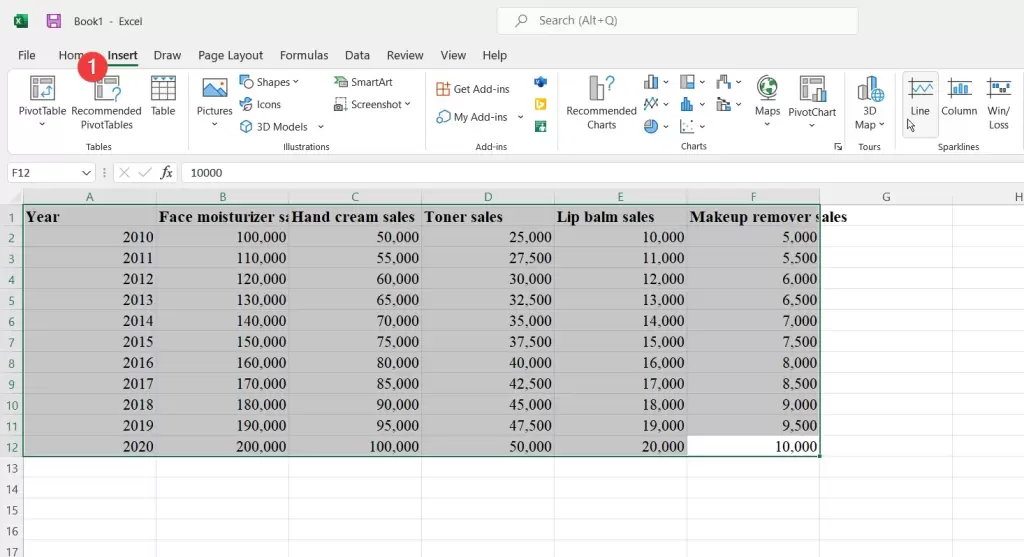
Step 1: Data Organization
Begin by arranging your data neatly in rows and columns within your Excel worksheet. Clearly label each row and column to ensure data clarity and facilitate visualization.
Step 2: Data Selection
Click and drag your cursor to select the data you wish to incorporate into your visualization, encompassing both the data points and their corresponding row and column labels.
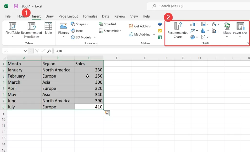
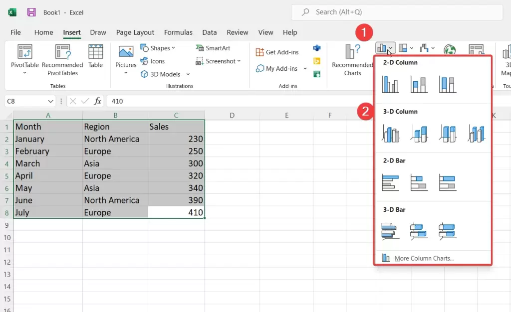
Step 3: Select a Chart Type
Navigate to the “Insert” tab within the Excel ribbon. In the “Charts” section, you’ll encounter a diverse range of chart options, including Column, Line, Pie, Bar, Area, Scatter, and more.
Click on the dropdown arrow below the chart type you want to use, and select a specific chart style from the options that appear.
Step 4: Choose a Specific Chart Style
Click the dropdown arrow beneath the chosen chart type, then select a specific chart style from the available options.
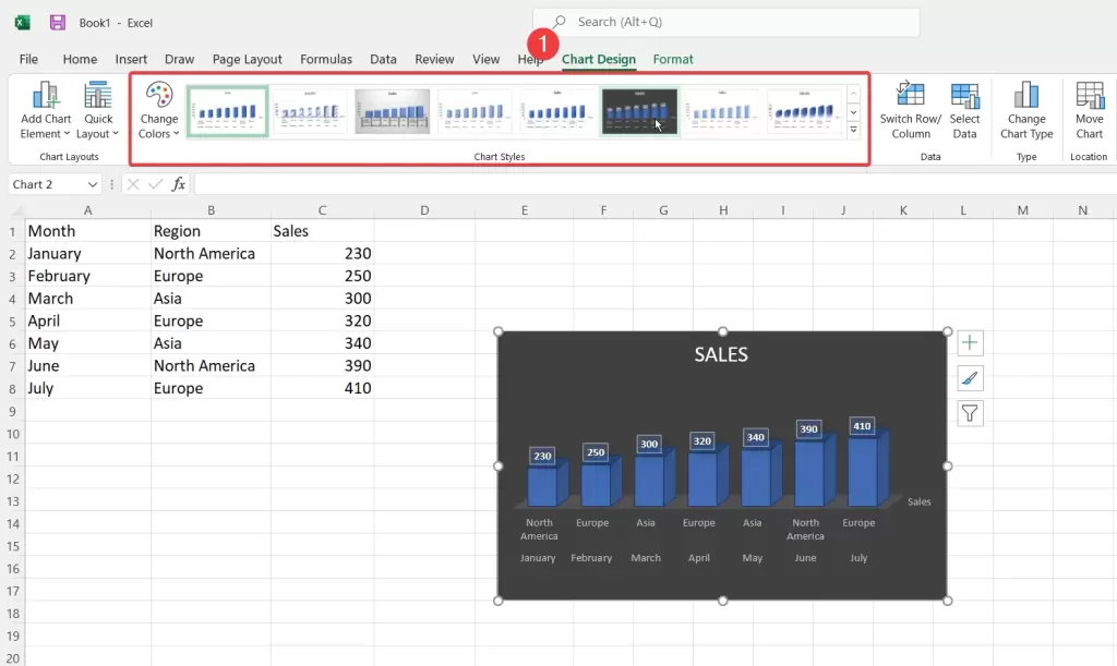
Step 5: Customize Your Chart
For additional chart editing, click on the chart to highlight it. Excel will reveal the “Chart Tools” with two supplementary tabs: “Design” and “Format.”
Leverage these tabs to personalize the chart’s visual attributes, style, and layout. You have the flexibility to modify elements such as the chart title, axis labels, legend, data labels, and more.
Step 6: Modify Data
If you need to make alterations to your data after constructing the chart, edit the data within the worksheet. Excel will automatically adapt the chart to incorporate these changes.
Conclusion
In conclusion, data analysis is essential but often comes with challenges. Effective Excel data analysis tools are crucial in overcoming these hurdles. Excel provides a wide range of tools, from basic functions to advanced features, making it a versatile choice for data analysis.
Advanced data analysis tool in Excel like PivotTables, PivotCharts, and Power Query allow for in-depth analysis. Excel’s charting capabilities enhance data visualization, aiding in clarity and trend identification.
Through practical examples, we’ve seen how Excel’s tools can be applied effectively. By mastering these tools, individuals and businesses can extract valuable insights and make informed decisions in our data-driven world.
FAQs
Can I perform a regression analysis in Excel without additional software?
Yes, you can conduct regression analysis in Excel without the need for additional software. Excel provides built-in tools that facilitate basic regression analysis, particularly linear regression, which is a commonly used method for modeling the relationship between two variables.
It’s worth noting that Excel’s built-in tools are a great starting point for regression analysis, but they have limitations in terms of handling complex models or performing certain types of regression analysis, such as logistic regression. Depending on your specific analysis needs, you may need to explore additional software or statistical packages to fulfill more advanced requirements.
What are some Excel add-ins for advanced data analysis?
Excel 365’s PivotTables summarize and identify trends, while PivotCharts visualize data. Power Query imports and transforms data, Solver optimizes solutions, and Data Analysis ToolPak offers statistical functions.
Power BI connects to data sources, Tableau provides user-friendly visualizations, and R is a powerful but challenging language for statistics and machine learning.
Are there any limitations to Excel’s built-in Data Analysis Tools?
Yes, Excel’s built-in Data Analysis Tools have certain limitations. Firstly, they may not encompass advanced statistical techniques, making them less suitable for complex analyses.
Secondly, Excel can struggle with large datasets, potentially leading to performance issues. Moreover, the tools lack extensive automation and scripting capabilities, hindering efficiency.
Handling messy or unstructured data can also be challenging, as specialized tools like Power Query or programming languages may be more adept at data transformation. Additionally, for advanced machine learning, replicable research, and sophisticated data visualization, Excel’s tools may fall short.
Lastly, Excel’s platform dependency and limitations in collaborative cross-platform environments can pose challenges when sharing analyses or working with diverse teams.
Our experts will be glad to help you, If this article didn’t answer your questions. ASK NOW
We believe this content can enhance our services. Yet, it’s awaiting comprehensive review. Your suggestions for improvement are invaluable. Kindly report any issue or suggestion using the “Report an issue” button below. We value your input.